
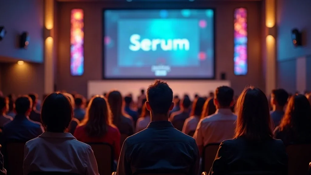
In many churches, worship slides have quietly become a problem no one mentions. Fonts are elegant, gradients are pretty, backgrounds are moving, and yet the people who matter most—the congregation—are squinting, distracted, or simply disengaged from what’s on the screen.
Typography for worship is not a design trend or a “nice-to-have” aesthetic upgrade. It’s a pastoral, theological, and practical issue. If people can’t clearly see and read the lyrics, they can’t fully sing truth, respond in faith, or engage in worship together.
My work with churches across the UK has convinced me of this: the most powerful typography for worship is radically simple, relentlessly functional, and almost invisible. When done well, no one comments on the slides—they just worship.

Why ‘Pretty’ Fails: The Invisible Trap Sabotaging Church Typography
If your font distracts, your message dissolves.
Dan Nichols - Church Graphic Design (CGD)
There’s a quiet misconception driving a lot of bad typography for worship: the belief that elegance equals effectiveness. I often see churches reach for script fonts, decorative lettering, and cinematic backgrounds because they want worship to “feel beautiful” or “look excellent. ” The intention is good. The outcome is often disastrous.
The misconception: elegance over function in worship presentations
When elegance becomes the goal, legibility becomes negotiable. Suddenly, fine serifs, thin strokes, and artistic flourishes start to invade worship slides. Those details might look refined on a printed wedding invitation, but on a projector 20 metres away, they simply collapse into noise.Clarity and accessibility beat trendiness—every time
Typography for worship is not about impressing the design-savvy. It’s about serving the entire room—from the teenager at the back to the elderly member with weaker eyesight. A basic, bold, sans serif font will always outperform the most stylish decorative type when it comes to helping people actually sing the words.Why ornate typefaces and moving backgrounds work against your message
Add in moving video backgrounds, light flares, or colourful gradients behind already delicate type, and you create a perfect storm of distraction. The brain has to work harder to separate text from background, to distinguish letters, to re-focus after movement. That effort competes directly with what worship is meant to do: lift eyes to Christ, not to the graphics.
When typography tries to be seen, it stops doing its job. The best typography for worship quietly disappears behind the words it carries.

Dan Nichols’ Clarity Method: The 3 Principles of Impactful Worship Typography
Over years of working with churches, I’ve landed on a simple framework for typography for worship that any church—large or small, high-budget or low-tech—can implement straight away. I call it the Clarity Method. It’s built on three principles:
1. Choose Sans Serif, Bold, and Big: The Readability Rule
If I could change just one thing in most churches, it would be this: switch every worship slide to a clear, bold, sans serif font at a genuinely large size. This single move would instantly improve readability for almost everyone in the room.
Sans serif fonts amplify legibility on projectors
Serif fonts (with small decorative strokes on each letter) were designed for print, not projection. On screens and projectors, especially at lower resolutions or from long distances, those fine details blur and break. Sans serif fonts (think fonts similar in style to Arial or Helvetica) have clean, simple letterforms that hold up far better under real-world church conditions.Bold weight prevents washed-out type under worship lighting
In some churches, lighting is far from static. Stage lights shift, haze machines add atmosphere, ambient light varies across the room. Thin or light-weight fonts simply don’t survive in that environment. A bold weight gives each character enough visual mass to remain clear even when the projector isn’t at its brightest or the room isn’t perfectly dark.Size matters: bigger font sizes ensure everyone, everywhere sees the lyrics
If someone at the back row has to squint, the text is too small. As a rule of thumb, I aim for as few words per line as possible and as few lines per slide as the lyrics allow. Bigger type forces you to simplify layouts and break lyrics into manageable chunks. The reward is immediate: more confident singing, less guessing, and fewer people silently mouthing what they think the words might be.
For churches looking to refine every aspect of their worship visuals, it's helpful to consider how your core beliefs about communication and accessibility shape your design choices. Exploring your church’s foundational values can provide clarity on why simplicity and legibility matter so much in every presentation. For a deeper look at how these principles align with your mission, see what we believe about church graphic design and its impact on worship.
2. Contrast Conquers Distraction: Make Every Word Pop
After font choice, the next critical factor in typography for worship is contrast. Without high contrast, even the best font becomes difficult to read. I always design as though someone in the room has less-than-perfect eyesight, because many do.
Prioritise white text on black backgrounds for ultimate clarity
There’s a reason film credits and subtitles often use this pairing: it works. White on black gives the sharpest contrast in typical church environments. It cuts through ambient light, stage wash, and coloured lighting far better than mid-tone backgrounds or fancy textures. It also creates a consistent visual field where nothing competes with the text.Avoid decorative colours and shadow effects that reduce impact
Colourful text, drop shadows, glows, and gradients might feel creative, but they usually reduce clarity. Light colours on light backgrounds, dark colours on dark images, or text layered over busy visuals all force the eye to work harder. The more work the eye does, the less attention the heart and mind can give to the content of the lyrics.Simple high-contrast design focuses attention on lyrics, not graphics
When you settle on a strong, high-contrast approach—such as white text on a solid black or very dark background—you remove noise. The slide stops trying to be a mini-piece of art and becomes what it should be: a clean, supportive platform for the words of worship.
3. Purpose Before Performance: Ditch Entertainment Trends
We live in a digital, entertainment-saturated world. It’s no surprise that churches sometimes borrow visual cues from concerts, TV, and social media. The problem comes when the stage and screen start to feel more like a show than a shared act of worship.
Moving backgrounds and busy visuals undermine worship focus
Video loops, swirling colours, abstract animations—these may look impressive on a design reel, but during worship they compete for attention with the words themselves. The eye is drawn to movement before it processes text. That means a constantly moving background is constantly pulling people away from the lyrics they’re trying to sing.Resist the urge to mimic entertainment venues—worship is different
Churches are not cinemas or concert halls. The goal is not to build a visually overwhelming “experience,” but to create a space where people can clearly see and respond to truth about God. When typography for worship tries to match the flashiness of a music venue, it unintentionally shifts the focus from participation to performance.Functional design helps the congregation engage with truth, not spectacle
A functional, minimal slide design doesn’t say, “We don’t care about excellence.” It says, “We care most about what people are singing.” The best performance is not the most visually complex; it’s the one that quietly supports a room full of people singing with understanding and clarity.
Simple, bold fonts serve the gospel—fancy ones distract from it.
Dan Nichols - CGD
Avoid These Common Typography Pitfalls in Worship Settings
When I review worship slides with churches, the same problems show up again and again. Avoiding these pitfalls will immediately raise the quality and accessibility of your typography for worship.
Serif fonts: harder to read on projections, especially from a distance
Even if they look classy up close, serif fonts become fuzzy and fragile under real projection conditions. Over distance, the fine details that make them “elegant” are exactly what make them hard to read.Coloured text: poor legibility under typical church lighting
Blues, reds, yellows, and other colours might feel on-brand, but once stage lights and ambient brightness are involved, coloured text often loses contrast. What looked fine on your design laptop in a dark room looks weak and washed out from the middle row on a Sunday.Overusing effects: shadows, gradients, animations
Effects are usually added with good intentions—to make text “stand out” or “feel dynamic.” In practice, they tend to clutter the slide, create visual ambiguity around letter edges, and draw focus to the design rather than the lyrics.Lyrics over videos or animated backgrounds create confusion
Placing text over video or complex imagery almost always reduces readability. Different scenes and colours behind the text cause the contrast to constantly change. Parts of the text become momentarily invisible or difficult to distinguish as the video shifts.
Clarity on the screen means clarity in worship.
Dan Nichols - CGD
Key Takeaways: Typography that Elevates, Not Distracts
Typography for worship doesn’t need to be complicated. In fact, the power lies in disciplined simplicity. If you remember only a few things, make it these:
Stick to sans serif, bold fonts for visibility
Make legibility your non‑negotiable. Choose a clean sans serif, keep the weight bold, and size it so that no one in the room is left guessing the words.Use high-contrast colour palettes—white on black wins
Prioritise contrast over creativity. A strong, consistent high-contrast setup will outserve any number of creative, colourful experiments when it comes to supporting congregational worship.Keep the design simple and the message central
If an element doesn’t directly help people read and sing, it’s probably in the way. Build a culture in your church where “simple and accessible” is celebrated as a form of excellence, not a lack of imagination.
FAQs: Practical Typography Questions for Church Leaders
What is the best font family for worship lyrics?
The “best” font family is one that is clean, sans serif, and holds up well when projected large. Fonts in the vein of Helvetica, Arial, or other simple, geometric sans serifs tend to perform well. The key is consistency—pick one strong, readable font family and use it across all your worship slides so people’s eyes never have to re-adjust to new styles.How big should lyrics be for optimal readability in a typical church?
Exact sizing depends on your room length and projector resolution, but the principle is the same everywhere: bigger than you think. Aim for as few words per line as possible, and test your slides from the very back row. If anyone has to strain or squint, increase the size and consider reducing the amount of text on each slide.Should we ever use video or photo backgrounds?
They can be used sparingly and thoughtfully, but they should never compromise clarity. If a video or image background makes the text even slightly harder to read, it’s not serving your congregation. If you do use them, keep them subtle, slow-moving, and darkened enough that your white text still has strong contrast.What’s the best colour combination for worship projection?
In most churches, white text on a black or very dark background is the most reliable option. It stands up well under various lighting conditions and keeps the focus firmly on the lyrics. If you introduce other colours, do so carefully and always test them live in the room rather than trusting how they look on your design screen.How can we test accessibility for people with visual impairments?
Start by sitting in different parts of the room and asking, “Can I read this instantly without effort?” Then actively invite feedback from older members and those who wear glasses or have known visual challenges. You can also use basic contrast-checking tools online to ensure your colour combinations meet accessibility guidelines, but live, honest feedback from your own congregation is invaluable.
Your Next Step: Make Every Moment of Worship Visually Clear
Before you overhaul everything, start with one simple audit. Look honestly at your current typography for worship through the eyes of the people you’re serving.
Assess your current slides: Is every lyric instantly legible from every seat?
Walk to the back, the sides, and any awkward viewing angles. If there’s any hesitation in reading a line, that’s a design issue, not a personal eyesight problem.Simplify your templates based on the Clarity Method
Switch to a bold sans serif, increase the font size, move to high-contrast backgrounds, and strip away unnecessary effects. You don’t need to redesign everything at once—start with your main worship set and build from there.Test slides during rehearsals for maximum impact
Use worship team rehearsals as your typography testing ground. Project the slides, move around the room, ask for feedback, and make tweaks before Sunday, not during it.
Take Action: Elevate Your Church’s Message With Clarity
Functionality isn’t just design—it’s discipleship.
When people can clearly see and understand the words they’re singing, they’re better equipped to respond in faith, remember truth, and grow.Accessible typography ensures every worshipper connects with the message.
Good typography for worship is radically inclusive. It says to every person in the room—young, old, visually strong, or visually limited—“You are seen. You are included. You can join in.”Set a new, distraction-free standard for your community.
You have the opportunity to model a different value system: one that prizes clarity and participation above visual spectacle. Over time, that quiet commitment to accessibility will shape the culture of your worship gatherings.
Ready To Transform Your Worship Experience?
If you’re serious about improving your typography for worship, you don’t have to figure it out alone. A short, focused conversation can save you months of trial and error and help you avoid costly technology or design decisions that won’t actually serve your people.
Expert-led evaluation of your church’s graphic design
I work specifically with churches, so my feedback is grounded in real worship contexts, not just general design theory.Concrete, actionable feedback tailored to your church’s needs
You’ll get specific recommendations you can implement quickly with the tools and team you already have.Start a clear visual journey that elevates the gospel message
The goal isn’t prettier slides; it’s clearer worship. Every design choice can move you closer to that.
Your slides should invite worship—not compete with it.
Dan Nichols - CGD
Book Your Free 15-Minute Church Typography Consultation
If you’d like help applying this Clarity Method to your own context, I offer a free 15-minute consultation for church and ministry leaders.
Get a custom assessment from Dan Nichols, Church Graphic Design
We’ll look at your current slides, your space, and your setup, and identify your quickest wins.Discover how to implement the Clarity Method for your church
You’ll leave with a clear, practical path to improve your typography for worship—without needing a full-time designer or a huge budget.-
Transform your visuals:
Small, intentional changes to your typography for worship can remove invisible barriers and free your congregation to focus on what truly matters: the God you’re singing to, not the slides you’re singing from.
If you’re eager to continue developing a holistic approach to church communication, consider exploring the foundational beliefs that drive effective design and worship environments. Understanding the deeper convictions behind your visual strategy can help you lead your team with confidence and clarity. Discover more about the guiding principles that shape our approach by visiting our statement of what we believe—it’s a valuable next step for leaders who want to align every aspect of church life with their mission.
To enhance your understanding of effective typography in worship settings, consider exploring the following resources:
“Top 5 Fonts for Worship Lyrics” This article discusses five fonts that are particularly effective for worship lyrics, emphasising readability and clarity. It provides insights into selecting fonts that enhance congregational engagement during worship services.
“Choosing the Best Font for Your Worship Lyrics” This resource offers guidance on selecting fonts that are both aesthetically pleasing and functional for worship settings. It highlights the importance of readability and provides recommendations for font choices that can improve the worship experience.
These resources offer practical advice and specific font recommendations to help you create clear and engaging worship presentations.
...
Author Information
Dan Nichols BSc
Founder & Creative Designer, Church Graphic Design, Chesterfield, UK
Email: dan@churchgraphicdesign.co.uk
Website: churchgraphicdesign.co.uk
Dan has over 8 years of experience helping UK churches improve their visual communications and digital presence. He holds a Bachelor's degree and has worked with many churches across the UK to develop effective design and communication strategies.
Editorial Team
Ken Johnstone MBA BSc
Executive Editor, DYLBO Digital Media & Biblical Living Unlocked
Email: ken@dylbo.com
The Editor Role typically provides an overall Content Quality Review (using Google’s Search Quality Rating 6 0.0 Guidelines), fact-checking typographic claims, evaluating accessibility guidance, and reviewing pastoral framing.
Last updated: 17 July 2026
This article represents a collaborative effort between design professionals and communication specialists with extensive experience in church ministry and digital marketing.



Write A Comment