
Most churches still treat church bulletin design as a necessary chore: cram in as many notices as possible, print it, hand it out, and hope people read it.
The result? A weekly information dump that people skim (at best) and bin (at worst).
I see something very different when I look at a church bulletin. I see one of the most underused tools for building genuine community connection, belonging, and participation in the life of a church. When church bulletin design is intentional, clear, and consistent with your mission, it stops being a throwaway notice sheet and becomes an ongoing invitation into church family.
That’s what I help churches do every week through Church Graphic Design, and in this article I want to show you how to rethink your bulletin so it actually connects with people—especially those who are new, hesitant, or on the fringes.

Why Traditional Church Bulletin Design Misses the Mark
A church bulletin isn’t a noticeboard; it’s an invitation to belong.
Dan Nichols - Church Graphic Design (CGD)
Most traditional church bulletin design grew up around one assumption: “We have information. People need information. Let’s give them information. ” On the surface that sounds sensible, but it completely ignores how people actually read, feel, and decide whether to take part.
If your bulletin reads like a weekly memo, it will be treated like one. People don’t connect with lists; they connect with stories, clarity, and a sense of being wanted and welcomed. When the bulletin lacks warmth and purpose, it quietly reinforces the idea that church is an event to attend, not a family to join.
The “Info Dump” Trap—and How to Avoid It
The “info dump” bulletin usually has three consistent problems.
Overloaded, cluttered layouts
Everything is important, so nothing stands out. You see tiny margins, dense paragraphs, long lists of dates, and little breathing space. From a design and communication perspective, that instantly increases cognitive load; people give up before they’ve really started.Missing purpose: lists without stories or context
“Prayer meeting – Wednesday, 7.30pm.” “Youth social – Friday, 7pm.” If you already belong, you might decode these. But for newcomers or fringe attenders, there’s no “why”, no sense of who it’s for or what it’s like. Your church bulletin design should connect events to a bigger narrative: how this helps people grow, connect, serve, or explore faith.Neglecting visual warmth and accessibility
Unreadable fonts, tiny type, no visual hierarchy, and no sense of visual welcome. If the bulletin looks cold or chaotic, it quietly says, “We didn’t really think about you.” That’s not the message any church wants to send, but it’s the message a lot of bulletins are delivering.
To avoid the info-dump trap, you have to flip the question. Instead of asking, “What do we need to tell people this week?” ask, “How can this week’s bulletin invite people more deeply into our church community and mission?” That shift in thinking completely changes how you approach content, hierarchy, and layout.

Church Bulletin Design that Engages and Unites
Engagement thrives where clarity, consistency, and invitation work together.
Dan Nichols - CGD
Effective church bulletin design is not about clever graphics for their own sake. It’s about using visual communication to do what good pastoral ministry is always trying to do: welcome people, connect them, and help them take their next step.
When the bulletin aligns with your wider communications—your website, social media, signage, and verbal notices—it stops being a standalone sheet and becomes one thread in a coherent experience. That coherence builds trust: people start to feel, “These people know who they are, and they know where they’re going. ”
For churches looking to ensure their bulletin design truly reflects their core beliefs and values, it’s helpful to revisit and clarify what your church stands for. Aligning your communications with your foundational principles can make every notice and invitation more meaningful—discover more about how your church’s beliefs can shape your messaging for deeper connection.
Dan Nichols’ Community Connection Framework
When working with churches across the UK, I’ve found that church bulletin design that truly builds community always comes back to three simple but demanding principles.
Clarity before clutter—every word and element matters
The best bulletins are ruthlessly clear. They don’t try to say everything; they say the right things, in the right order, in the right way. That means shorter copy, plain English, strong headings, and clear actions: “Here’s what this is. Here’s who it’s for. Here’s what to do if you’re interested.” Every extra sentence or graphic you add should earn its place.Consistent branding echoes your church’s lived mission
Branding is not about looking trendy; it’s about aligning what people see with what you say you value. Colours, fonts, and layout choices should echo your church’s personality and mission. When people see your bulletin, website, and signage, they should intuitively know, “This is the same church, with the same heartbeat.” That consistency builds recognition and, over time, deeper connection.Visual invitation—design that draws people to participate
The bulletin should feel like an open door, not a wall of text. White space, approachable typography, friendly imagery, and clear calls to action all play a role. The question I often ask when designing church bulletins is: “Does this page invite someone to take part, or does it just inform them that something exists?” That difference is where community begins.
Real Results: Walton Evangelical Church’s Transformation Story
One of the churches I’ve worked with, Walton Evangelical Church, offers a helpful example of what happens when you take church bulletin design seriously as a tool for community connection.
-
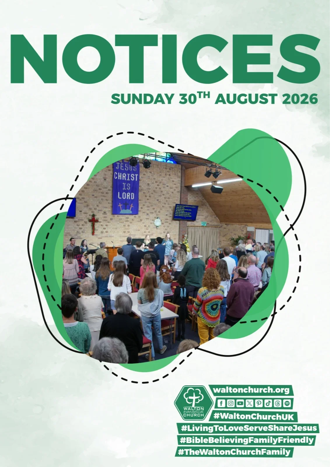
Rooting every resource in the mission: living to love, serve, and share Jesus
Walton’s mission—“living to love, serve, and share Jesus”—wasn’t just a strapline tucked away on a page; it became a design and content filter. Every notice, every section in the bulletin had to answer: Which part of our mission does this serve? That clarity shaped what stayed, what went, and how we communicated the rest.Notable boost in participation and community spirit
As the church bulletin design aligned with the church’s mission and branding, people began to report feeling more informed and more involved. Ministries saw better awareness of events and opportunities. Newer people felt less like observers and more like they were being invited in. While this wasn’t only down to the bulletin, the bulletin became a reliable weekly touchpoint reinforcing the same clear, welcoming message.

Consistency in design is consistency in mission made visible.
Dan Nichols - CGD
Design Principles for Church Bulletins That Build Belonging
So how do you move from theory to practice? Here are the core principles I use when shaping church bulletin design that genuinely fosters community connection.
Keep messaging clear and concise—avoid jargon
Many bulletins are full of internal language: “Home groups”, “AGM”, “CU”, “reading rota”. Long-term members may understand these instantly; newcomers often do not. Clarity means using everyday language: “Small groups that meet in homes during the week”, not just “home groups”. If you must use shorthand, add a short explanation. Your words should make people feel included, not confused.Consider visual hierarchy—help readers find what’s vital fast
People scan before they read. Strong visual hierarchy—clear headings, subheadings, consistent type sizes, and bold for emphasis—helps readers quickly locate what’s relevant to them. The most important items should be the most visually prominent. If the baby and toddler group is a key bridge into your church, it shouldn’t be buried at the bottom of a dense paragraph in 9pt type.Stay true to your church identity with colours and typefaces
Choose a simple, legible typeface and a small, consistent colour palette that reflects who you are. A traditional Anglican parish in a historic building may lean towards calmer, more classical choices. A young church plant in a city centre might opt for bolder, more contemporary styles. The goal is not to copy trends but to express your genuine identity through design—and to do that consistently across your bulletin, website, and signage.Engage with invitation: create anticipation, not obligation
The language and layout of your bulletin can either feel like a list of duties or a series of meaningful invitations. “We need more volunteers for…” feels heavy and vague. “Would you like to help welcome people at the door once a month? Speak to Sarah at the welcome desk” feels specific, human, and do-able. Curiosity and anticipation grow when people can imagine themselves in the picture you’re painting.
Frequently Asked Questions: Church Bulletin Design Essentials
Over time, I hear the same questions from church and ministry leaders wrestling with church bulletin design. Here are some honest answers to the most common ones.
What are the top mistakes churches make in bulletin design?
The three big ones are clutter, inconsistency, and assuming people know more than they do. Cluttered bulletins overwhelm readers and hide what really matters. Inconsistent design across weeks, ministries, and platforms confuses people and weakens your sense of identity. And when you assume everyone understands your acronyms, locations, and traditions, you unintentionally put barriers in front of newcomers. The remedy in each case is the same: slow down, simplify, and design for the person who has just walked in for the first time.How can small churches achieve professional-looking bulletins?
You don’t need a large budget or a full-time designer to improve your church bulletin design. Start with a simple, reusable template, limit yourself to one or two fonts, and choose one accent colour that ties into your church’s existing materials. Use clear headings, generous margins, and consistent spacing. Free or low-cost design tools can help, but the real gains come from clarity and consistency, not from fancy graphics. A calm, readable, and consistent bulletin will feel more professional than a busy, over-designed one.How does design influence community involvement?
Design shapes how people feel about the information they receive. As cognitive scientist John Sweller has shown, our brains can only hold so much at once—clutter competes for that limited attention and gets in the way of understanding. Colin Ware's research on visual perception, echoed in usability studies from Nielsen Norman Group, points to the flip side: clear, well-structured layouts are noticed, understood, and acted on. When your bulletin looks thoughtful and organised, people trust that their participation is valued—lowering the barrier to a first step, whether that's signing up, turning up, or simply saying hello.

Action Steps for Church Leaders: Your Next Bulletin, Transformed
You don’t have to redesign everything overnight. Meaningful change in your church bulletin design can start with your very next issue. Here’s a simple, realistic process you can use.
Audit your current bulletin for clutter, consistency, and connection
Print your latest bulletin and look at it with fresh eyes—or better, ask someone who’s newer to the church to do the same. Where does your eye go first? Is anything confusing or overwhelming? What’s missing that would help someone understand how to belong, not just what’s happening?Map bulletin content to your church’s mission
Write your mission statement or core purpose at the top of a page. Then go through each item in the bulletin and ask, “How does this help us live out that mission?” If the answer is unclear, consider rewriting it, moving it, or removing it. When your content clearly reflects your mission, the whole bulletin starts to feel more purposeful and aligned.Involve your team: gather feedback on what’s engaging and what’s not
Bring a small group together—staff, key volunteers, and ideally one or two people who are newer or less involved. Ask them: What parts of the bulletin do you actually read? What do you ignore? What would help you feel more invited into the life of the church? Use that feedback to prioritise the changes that will make the biggest difference to connection.Consider expert consultation to unlock your bulletin’s full potential
Sometimes you’re simply too close to see what needs to change. An outside eye from someone experienced in church communication and design can help you quickly identify what’s working, what isn’t, and how to align your bulletin with your wider communication and mission. Whether that’s a one-off review or an ongoing partnership, it can save you a lot of trial and error.

Ready for Clarity and Connection? Book Your Free Church Communication Discussion
An effective church bulletin design is not a luxury add-on; it’s a practical expression of how seriously you take people, communication, and community. When you move from “information dump” to “intentional, invitational design”, you give people a clearer way to see where they fit in your church family.
If you’d like help assessing your current bulletin or shaping something more aligned with your mission, I offer a free church communication discussion where we can:
Review your existing church bulletin design and other key materials
Identify the main obstacles to clarity and connection in your current approach
Outline simple, realistic steps you can take in the next 3–6 months
You don’t need a bigger budget to make progress; you need clarity, consistency, and a willingness to see your bulletin as an invitation to belonging. That’s where transformation begins.
If you’re inspired to take your church communications to the next level, consider how your bulletin fits into the broader tapestry of your church’s identity and outreach. Exploring your church’s foundational beliefs and how they inform every aspect of your messaging can unlock new opportunities for authentic engagement. For a deeper dive into aligning your communications with your church’s core convictions, visit the What We Believe page and discover how clarity of purpose can transform not just your bulletin, but your entire approach to community connection.
This article is provided by Church Graphic Design, a consultancy specialising in branding, visual identity, and graphic design for churches, charities and other Christian organisations. While the content draws on genuine professional experience and industry best practice, readers should note that Church Graphic Design offers paid design services and may recommend them; the information here is intended to be educational and useful regardless of whether you choose to work with them. In the interests of transparency, please see the full Business Interest Disclaimer here: Business Interest Disclaimer.
Author
Dan Nichols BSc
Founder & Creative Designer, Church Graphic Design, Chesterfield, UK
Email: dan@churchgraphicdesign.co.uk
Website: churchgraphicdesign.co.uk
Education: BSc mathematics and statistics with management; Qualified Teacher Status (QTS)
Dan has over 8 years of experience helping UK churches improve their visual communications and digital presence. He holds a Bachelor's degree and has worked with many churches across the UK to develop effective design and communication strategies.
Editorial Review
This article was content-reviewed by:
Ken Johnstone MBA BSc
Executive Editor, DYLBO Digital Media & Biblical Living Unlocked
Email: ken@dylbo.com
The Editor Role typically provides an overall Content Quality Review (using Google’s Search Quality Rating 6 0.0 Guidelines), fact-checking typographic claims, evaluating accessibility guidance, and reviewing pastoral framing.
Last updated: 26 August 2026
This article represents a collaborative effort between design professionals and communication specialists with extensive experience in church ministry and digital marketing.





Write A Comment