
Most churches treat sermon series graphics like a decorative afterthought: pick a heading, drop it on a vague background, and call it done. The problem is, that kind of design doesn’t serve the message, the congregation, or your wider community. It fills a screen, but it doesn’t shape hearts, jog memory, or spark curiosity.
For over eight years, I’ve helped churches across the UK move beyond “just a heading” and start using sermon series graphics as a powerful communication tool—something that links people to the Bible passage in the room on Sunday, and then quietly continues that work throughout the week on websites and social media.
When you treat your sermon series visuals as part of your preaching strategy, not just your presentation slides, the impact is completely different. People remember more. They recognise the series instantly. They’re more likely to stop scrolling and click through. And often, that’s the moment someone chooses to lean in rather than drift past.
This is how I think about designing impactful sermon series graphics that genuinely enhance your message delivery—both in church and online.
Why Most Sermon Series Graphics Miss the Mark

A catchy heading isn’t enough—great sermon series graphics spark curiosity and connect hearts.
Dan Nichols - Church Graphic Design (CGD)
The ‘Just a Heading’ Trap: More Than Words and Stock Images
When I first talk with church leaders about their sermon series graphics, a common pattern appears: the design is essentially a sermon title in a nice font floating on a generic image. It might look “fine”, but it rarely feels rooted in Scripture or the actual content of the series. It’s decoration, not communication.
Common misconception: relying solely on text-heavy graphics
It’s easy to assume that if the title is strong, the graphic will naturally work. So the whole design becomes about squeezing the heading, subheading, dates, and sometimes even the preacher’s name into one visual. The result is something that’s technically legible but visually overwhelming, especially at a distance on a projector or on a small mobile screen.Why imagery that resonates with the scripture passage is vital
The real power of a sermon series graphic lies in its ability to act as a visual shorthand for the message. When the imagery is tightly linked to the Bible passage or the main theme, it becomes a mental hook. Every time someone sees that graphic—on the screen, on the website, in their social feed—their mind is quietly pulled back to the truth that was preached. Over time, this repetition helps the series embed itself not just in people’s notebooks, but in their memory and imagination.How forgettable or generic graphics undermine message impact
Generic stock photos, abstract swirls, or “nice” but meaningless backgrounds might feel safe, but they’re also forgettable. If your congregation can’t picture the graphic when they think of the series, they lose a major memory cue. Online, those same generic visuals blend into the sea of similar content; there’s nothing distinct enough to make someone pause and wonder, “What’s that about?” When the visual doesn’t carry weight, the message has to work harder to be remembered.
Good design doesn’t replace faithful preaching—but poor design can quietly dilute its impact. The goal is to make every visual decision serve the passage, not compete with it.
Unlocking Engagement: The Dual Power of Sermon Graphics
If your sermon graphic grabs attention online, it’s already doing half your outreach work.
Dan Nichols - CGD

From Pews to Social Feeds: Graphics That Bridge the Gap
When I design sermon series graphics, I’m always thinking in two directions at once: how it feels on a big screen in a Sunday gathering, and how it performs as a tiny thumbnail on a phone screen mid-week. The most effective graphics are the ones that work seamlessly in both environments.
For churches looking to take their visuals to the next level, exploring dedicated sermon series graphics resources can provide practical inspiration and examples of what works in real-world settings. Seeing how other ministries approach design can spark new ideas for your own context.
Making visuals memorable for both in-church and digital audiences
In the room, clarity is everything. People need to recognise the series instantly from the back row, often in just a few seconds as they settle into their seats. Online, the same visual needs to be recognisable at a glance as people quickly scroll. That’s why I focus on a strong central motif and a restrained colour palette—so whether it’s full-screen on a projector or a square on Instagram, it’s unmistakably that series.Practical impact: From Sunday morning to website and social media
A good sermon series graphic becomes a workhorse. It anchors your slide deck, your website header, your podcast thumbnail, your YouTube cover, your Facebook events, your Instagram posts, even printed invites if you use them. Instead of making a new visual for each platform, you extend one well-thought-through design across all of them. That consistency builds recognition and trust: people learn that when they see that image, it’s part of the same ongoing message.Case example: Roman columns for 1 Corinthians—context in every pixel
At Walton Evangelical Church, we created a series graphic for 1 Corinthians using a Roman column as the central image. It wasn’t just “something ancient-looking”—it deliberately echoed the letter’s original context and the grandeur of the culture Paul was addressing. On Sundays, the congregation saw those columns framing the title, visually rooting the teaching in first-century Corinth. Online, the same imagery became a recognisable marker on the website and social media. Even without reading the title, people could see the graphic and immediately think, “That’s the 1 Corinthians series.” The design carried context in every pixel.
When your sermon series graphics are designed with both pews and social feeds in mind, they become a bridge—helping your message travel beyond the service and into everyday life.
Dan Nichols’ Proven Simplicity Framework for Sermon Series Graphics
Simple. Relevant. Memorable. That’s the formula for graphics that stick.
Dan Nichols - CGD
The 3-Point Design Blueprint:
Keep It Simple: Avoid clutter—clarity drives impact.
The temptation with church design is to keep adding: more text, more effects, more symbolism “just in case”. In reality, every extra element competes for attention. I start by asking, “What’s the one idea this graphic needs to communicate?” Then I strip away anything that doesn’t reinforce that idea. Simple design isn’t empty; it’s focused. In a service setting or on a small screen, that focus is what allows people to understand and remember what they’ve seen.Keep It Relevant: Tie visuals directly to scripture themes.
Relevance starts with the Bible passage, not with a design trend. I’ll sit with the text the series is based on and ask: What images naturally arise from this? What metaphors is the passage already using? Is there a clear setting—wilderness, city, sea, temple? Is there a recurring object—lamp, vine, armour, body, temple, seed? Those scriptural cues become my design anchors. Relevance doesn’t mean being literal every time, but it does mean the graphic should feel like an honest extension of the passage, not something bolted on afterwards.Make It Memorable: Choose imagery that lingers in minds and hearts.
Memorability comes from distinctiveness and emotional connection. A slightly unexpected image tied clearly to the theme will stick far longer than a generic “nice background”. For example, a series on creation might avoid the overused space imagery and instead focus on a single, beautifully lit seed breaking through soil—a quieter image, but more emotionally resonant and easier to remember. The test is simple: if you asked someone a month later to describe the graphic, could they?
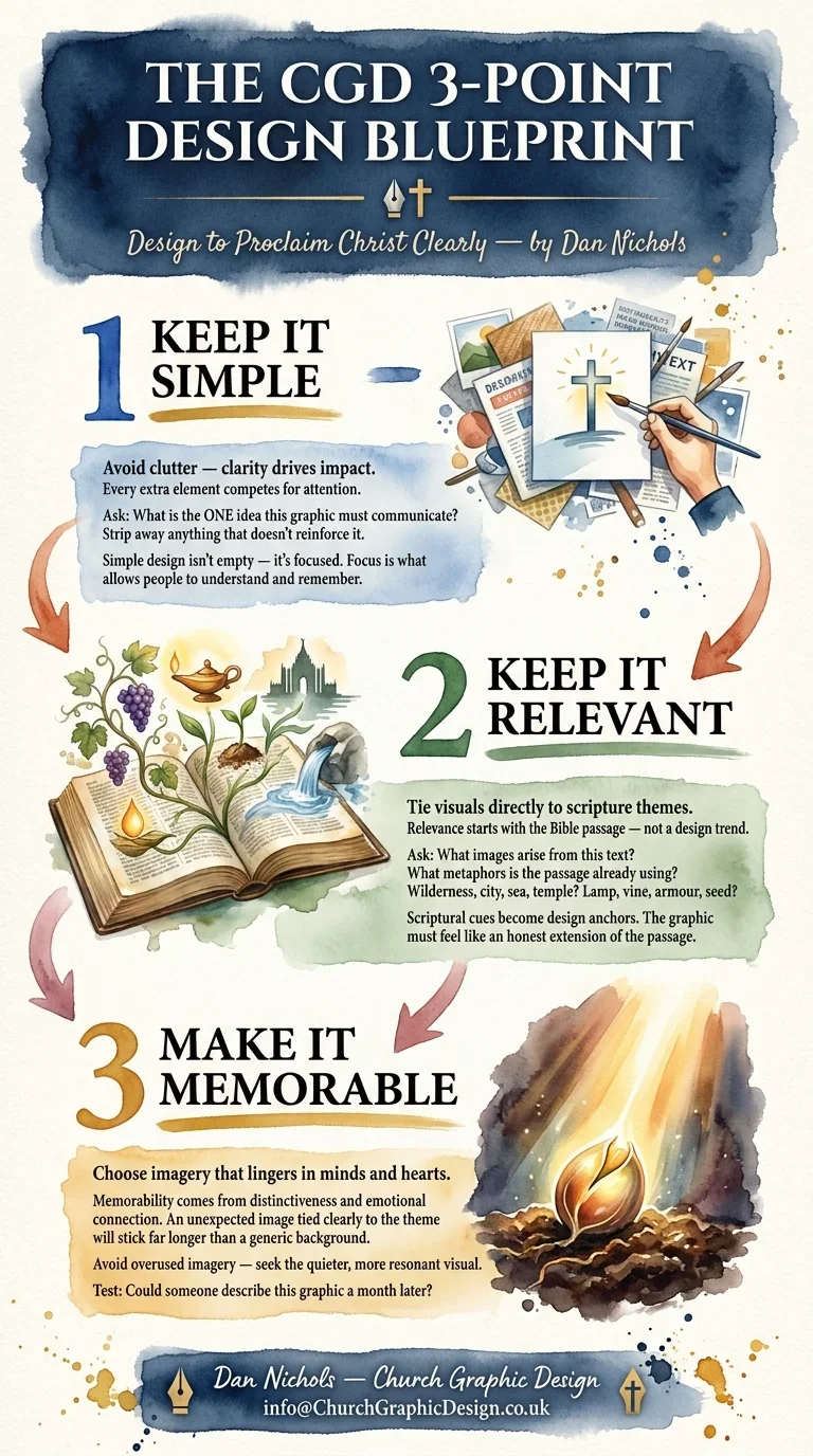
This simplicity framework—simple, relevant, memorable—gives you a grid for every decision. It stops you chasing trends and helps you design sermon series graphics that genuinely serve the message and the people hearing it.
Quick Wins: Actionable Tips for Unforgettable Sermon Graphics
If you’re leading a church or ministry and don’t have hours to spend designing, there are still some very practical steps you can take to dramatically improve your sermon series graphics.
Anchor your graphic in the heart of the Bible passage
Before you touch any design software, spend a few minutes with the text. Ask: What’s the central tension or hope of this series? Is there a metaphor or picture already in the passage that you can bring to life visually? Even a simple, well-chosen symbol—a road for a journey, light breaking into darkness, a table for fellowship—can carry far more meaning than a generic abstract background.Think beyond Sunday—create graphics with social sharing in mind
Design once, use everywhere. When you’re planning a series graphic, imagine how it will appear as: a widescreen slide, a square social post, a vertical story, a website banner, and a podcast thumbnail. Leave enough negative space so that you can crop it into different formats without losing the main idea. This mindset turns your graphic into a mini visual identity for the whole series across every channel.Test your design: does it spark curiosity and reflection?
A really useful filter is to show your draft graphic to someone who hasn’t been in your planning meetings. Ask them two questions: “What do you think this series might be about?” and “Would this make you want to find out more?” If they can’t answer the first clearly, the graphic may be too vague. If they answer the second with a hesitant “not really”, it may not be compelling enough. Adjust until your visual both hints at the theme and invites engagement.

Even small improvements in how you approach your sermon series graphics can lead to big gains in how people engage with the message—both on the day and long after.
Key Takeaways: Elevate Every Message with Powerful Visuals
A well-crafted sermon series graphic bridges the message from the pulpit to the public.
Done well, your visuals link the teaching in the room to the conversations happening online. They act as a visual thread running from Sunday morning through to mid-week reflections, podcast listens, replay views, and social engagement.Relevance and memorability are your visual superpowers.
You don’t need complex design tricks; you need clarity and connection. Graphics that are rooted in Scripture and distinct enough to be remembered will quietly do far more work than the most elaborate but generic imagery.Don’t settle: your next graphic could be what draws someone deeper into faith.
That one image on a website, invite, or Instagram post might be the first contact someone has with your church—or with the gospel. When your sermon series graphics are intentional, simple, and compelling, you give yourself the best chance of catching their eye long enough for the message to reach their heart.

Ready to Transform Your Church’s Visual Communication?
If you’re a church or ministry leader and you recognise that your sermon series graphics are currently “just a heading on a background”, this is a great moment to change direction. You don’t need a massive budget or a full-time designer; you need a clearer process and a commitment to making your visuals serve your message.
This is the heart behind my work at Church Graphic Design in Chesterfield, UK. I help churches create simple, relevant, memorable visuals that carry biblical truth from the pulpit into people’s everyday spaces—on screens, in feeds, and in conversations. Whether you want a full series designed, or you’re looking for guidance and templates your team can use, there are practical ways to raise the bar on your church’s visual communication.
If you’d like to explore how to strengthen your sermon artwork, series branding, and wider visual strategy, you can find out more or get in touch via churchgraphicdesign.co.uk. Let’s make your next sermon series not just heard on Sunday, but seen, remembered, and shared all week long.
For churches aiming to create truly memorable visuals, it’s also worth considering the broader context of your church’s brand identity. Many UK churches face challenges in developing a cohesive brand that supports both their message and their outreach. If you’re interested in understanding why branding can be a struggle—and how to overcome those hurdles—take a look at why UK churches struggle with branding (and how to fix it). This deeper dive will help you connect your sermon graphics to a wider strategy, ensuring every visual touchpoint works together to make your message truly unforgettable.

Author
Dan Nichols BSc – Founder & Creative Designer, Church Graphic Design, Chesterfield, UK
Email: dan@churchgraphicdesign.co.uk
Website: churchgraphicdesign.co.uk
In the interests of transparency, please see my Business Interest Disclaimer: https://churchgraphicdesign.co.uk/blog/business-interest-disclaimer
Editorial Review
Content quality, communication claims, and practical applicability were reviewed by:
Ken Johnstone MBA BSc – Executive Editor, DYLBO Digital Media & Biblical Living Unlocked
Email: ken@dylbo.com





Write A Comment