cropper
update
Church Graphic Design
Church Graphic Design - Logo
update
  • CGD Website
  • Blog Home
  • Blog Categories
    • Faith Branding
    • Identity Workshops
    • Case Studies
    • Expert Interviews
    • Campaign Analysis
    • Brand Consistency
    • Community Engagement
    • News
    • Technology Updates
May 02.2026
1 Minute Read

Why First Impressions: How Design Affects Visitors Matter Now

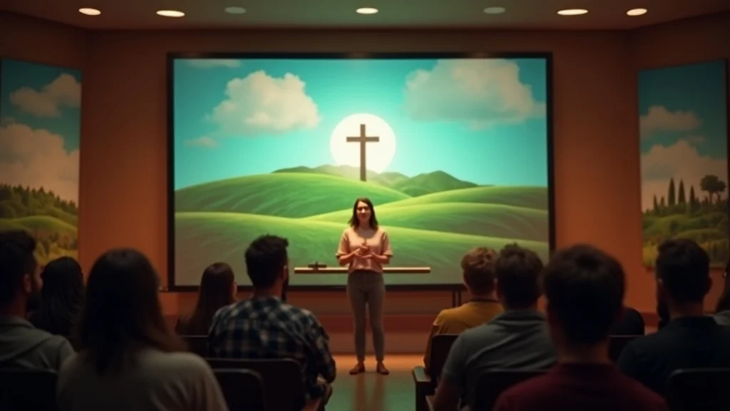
Most churches underestimate how quickly people decide if they will ever come back.

In a digital-first world, that decision often happens long before anyone hears the sermon, meets a pastor, or walks into the building. It happens through design: a logo on Google, a website header, a social post graphic, a welcome slide, a sign in the car park. Those first impressions tell visitors whether this is a church that is clear, trustworthy, and genuinely ready for them - or one they’ll quietly scroll past or never visit again.

Design isn’t decoration. Church branding is communication. Every visual is either opening a door or putting up a wall between your church and the people you’re trying to reach. When design is clear, consistent, and mission-aligned, it supports gospel clarity, strengthens community engagement, and removes friction for newcomers in both in-person and online contexts.

My work with churches across the UK has convinced me of this: first impressions - how design affects visitors, belonging, and engagement - are ministry issues, not marketing extras. When we steward design well, we steward our message well.

Why Outdated Church Branding Turns Visitors Away (And What to Do About It)

When people think about first impressions and church design, they often picture a logo file somewhere on the computer or a sign above the door. But the real issue isn’t whether a church has a logo; it’s whether that logo and the wider branding actually reflect who they are, what they believe, and how they welcome people in.

I see the same pattern again and again. A church name in a basic font. No meaningful symbol. No link to the mission, the gospel, or the local community. In a world where people are surrounded by thoughtful, high-quality branding every day - from banks and supermarkets to apps and charities - this kind of bare minimum design doesn’t just look plain; it quietly communicates, “We haven’t really thought about you. ”

Strong first impressions come when church design expresses something deeper than a name. A well-crafted church logo and visual identity should hint at your story, your mission, your context, and the sort of people you’re ready to welcome. When that’s missing, it’s not just an aesthetic problem - it’s a communication problem.

If your design doesn’t reflect your mission, it puts up walls instead of opening doors.

Dan Nichols, Founder at Church Graphic Design (CGD)

The Real Cost of Ignoring Design: Missed Connections, Lost Opportunities

  • Visitors instantly judge if a church feels welcoming, relevant, or trustworthy via visuals.

  • Poor graphics signal poor communication - especially to digital-first generations.

  • Churches compete for attention in a world of world-class branding and digital noise.

  • Inconsistent design creates confusion, not belonging.

When first impressions are unclear, visitors rarely complain; they simply don’t return. They might never tell you that the website felt cluttered, that the service slides were hard to read, or that nothing online helped them know what Sunday would actually be like. They just drift to a church that feels easier to understand.

This is why first impressions: how design affects visitors, belonging, and engagement isn’t a theoretical topic for me. It shows up in practical ways: whether people can find your service times on Google, whether your livestream looks like it belongs to the same church as your building, and whether your graphics signal care, clarity, and welcome - or confusion and disconnect.

The good news is that churches don’t need to become design agencies to fix this. They need a mission-aligned mindset and a simple, consistent system.

For churches looking to take the next step in refining their visual identity, exploring the essentials of branding and logo design for churches can provide practical guidance on creating visuals that truly reflect your mission and values.

The Mission-Aligned Design Mindset: Clarity, Consistency, and Community Connection

Before any church talks about new logos or templates, there are more important questions to ask: Who are we? Who are we trying to reach? What has God called us to do here, in this community, with these people? If church design doesn’t start there, even the slickest graphics will feel shallow and disconnected.

When I work with churches, I begin with their story and mission. I want to understand their theological convictions, their tone, their local context, and the people they long to welcome - whether that’s young families, students, older generations, or a real mix of all three. From there, design becomes a tool to clarify and amplify, not to distract or impress.

This is especially important in a hybrid, digital-first context. People might see your logo on a Facebook ad, your banner signage on the street, a YouTube thumbnail, and your website hero image before they ever sit in a pew. Those touchpoints need to feel like the same church telling the same story, pointing to the same Christ.

Inviting modern church entrance with diverse visitors walking into a contemporary building with clear, welcoming signage

The “Visual Welcome Strategy”: A Framework for First Impressions

I think about first impressions through a simple framework I call the “Visual Welcome Strategy. ” It helps churches turn abstract ideas about branding into concrete steps that improve visitor belonging and engagement.

  • 1. Clarify: Start with church identity, mission, and the audience you want to reach.

  • 2. Connect: Build graphics that reflect your story, values, and local context.

  • 3. Consistency: Carry the same visual system (logo, fonts, colours) across every platform.

  • 4. Community: Use relevant iconography and messaging to make everyone feel recognised.

Clarity means people understand who you are within seconds - on your website, your signage, your welcome pack. Connection means your visuals feel rooted in your context: your town, your people, your ministry priorities. Consistency means Sunday slides, livestream overlays, and social posts all look like they belong to the same family. Community means visitors see themselves considered, not as an afterthought.

Branding isn’t about looking cool - it’s about making newcomers feel at home and understood.

Dan Nichols, Founder at CGD

Case Study: How Mission-Driven Graphics Transformed Stinson Fields Christian Fellowship

One of my favourite examples of first impressions and mission-aligned design is the logo I created for Stinson Fields Christian Fellowship. The church is set in a green, semi-rural area - surrounded by fields - yet firmly centred on teaching God’s word. We wanted their visual identity to express both: rooted in Scripture, rooted in place.

The logo became a simple but meaningful symbol: an open Bible, shaped and coloured so it also reads as rolling green fields. In one mark, we connected Scripture, landscape, and local community. Visitors didn’t need a paragraph of explanation; the imagery itself helped them feel, “This church cares about God’s word and this place. ”

Designer presenting a new church logo of an open Bible forming rolling fields to an appreciative congregation in a fellowship hall
  • Designed a logo merging the open Bible and rolling fields (the local area).

  • Visuals instantly communicated gospel focus and community roots.

  • Used across print, website, and social to reinforce “welcome” everywhere.

  • Led to stronger first connections and increased engagement from locals.

The key outcome wasn’t simply “a nicer logo. ” It was a clearer first impression of who they are, which supported local engagement and made the church easier to recognise online, on invitations, and in the community. That’s what first impressions: how design affects visitors, belonging, and engagement looks like in practice.

Practical Tips: Elevating Your Church’s Digital and In-Person Welcome

Most church leaders I speak to aren’t looking for clever design theory; they want practical steps that fit limited time, budgets, and volunteer teams. The aim is not to create more work, but to build simple systems that make communication clearer and easier week after week.

Here are some concrete ways to strengthen your first impressions across both digital and in-person contexts, so design genuinely supports your mission and visitor engagement.

Multi-generational church team reviewing website and printed materials together in a modern lounge setting
  • Audit your current branding for clarity, relevance, and consistency.

  • Involve diverse voices (age, background) in feedback.

  • Prioritise templates and systems that volunteers can use easily.

  • Ensure campaign suites for key UK calendar moments feel consistent and mission-centric.

  • Test all digital graphics for clarity and accessibility on every screen.

A simple audit can start with one honest question: If I knew nothing about this church and only saw our website home page, social feed, or noticeboard, what would I think we care about? You can then gather a small group - perhaps a youth leader, an older member, a newcomer - and ask the same question. Their feedback is invaluable.

From there, invest in usable systems: a basic visual identity (logo, colour palette, fonts) and versatile templates for slides, social media, print, and livestream graphics. When volunteers can drop in text and photos without reinventing layouts each week, you gain consistency, save time, and reduce stress - while radically improving first impressions.

Good church design is good stewardship: it multiplies your ministry without multiplying your stress.

Dan Nichols, CGD

FAQs: Church Design and Visitor Belonging

  • Q: Isn’t design just an extra or a distraction from the real mission?
    A: Honest, well-crafted visuals amplify your mission - never replace it. They make your message clearer for outsiders and insiders, reduce confusion, and remove unnecessary barriers so people can focus on what you actually want them to hear: Christ proclaimed.

  • Q: What if we don’t have tech-savvy staff?
    A: You don’t need a full-time designer to improve first impressions. With the right systems and ready-made template packs, any willing volunteer can create engaging, on-brand graphics by simply updating text and images. The heavy lifting happens once when the system is set up; after that, it’s just good stewardship of a tool you already have.

  • Q: Won’t new branding alienate our existing members?
    A: Healthy, mission-aligned branding starts from your story and honours your history. Done well, it helps long-standing members feel proud and clearer about who you are, while opening new doors for visitors. Involving trusted voices early in the process and explaining the “why” behind changes can actually deepen unity rather than threaten it.

Takeaway: Stewardship Through Design – Every Graphic is a Ministry Opportunity

When I think about first impressions and church design, I’m not thinking about trends; I’m thinking about people. The parent searching “churches near me” at midnight. The student watching your livestream before risking a visit. The older neighbour walking past your noticeboard and wondering if they’d be welcome.

Every logo, slide, banner, and social post they encounter either helps them take a step closer or quietly nudges them away. That makes design an issue of stewardship. Every graphic is a ministry opportunity.

Busy church foyer with welcome desk, clear signage, and people being greeted warmly before a service
  • First impressions decide if people stick around long enough to hear your message.

  • Thoughtful design bridges the gap between curiosity and community.

  • Every graphic, banner, sign, or slide is a chance to invite people in.

Ready to Multiply Your Engagement and Welcome More Visitors?

If you recognise that first impressions - how design affects visitors, belonging, and engagement - matter more than ever, the next step is simple: treat design as part of your discipleship and outreach strategy, not as an afterthought.

Start by clarifying your mission, auditing your current visuals, and deciding where consistent, gospel-centred design would make the biggest difference: your website, your livestream, your seasonal campaigns, or your Sunday slides. From there, consider partnering with a specialist who understands both church life and design, so you can build a visual system that genuinely serves your people and your context.

This is exactly why I started Church Graphic Design - to help UK churches translate their God-given vision into clear, meaningful, and manageable visuals that work in the real world. If you’re ready to strengthen first impressions and welcome more visitors into genuine belonging and engagement, I’d love to help you shape what that could look like for your church.

If you’re eager to deepen your understanding of how design can serve your church’s wider mission, consider exploring the broader principles and strategies behind effective church branding and logo design. Delving into these foundational elements can help you move beyond surface-level changes and build a visual identity that truly resonates with your congregation and community. By investing in thoughtful branding, you’re not just updating your look - you’re creating lasting connections and opening doors for meaningful engagement. Take the next step in your church’s journey by discovering how strategic design can amplify your message and foster a sense of belonging for every visitor.

Creating a welcoming and engaging environment for church visitors is crucial for fostering a sense of belonging and encouraging continued participation. The article “How to Welcome Visitors to Church: Building First Impressions That Last” emphasises that visitors often decide whether they’ll return within seconds of arriving, highlighting the importance of first impressions in shaping their experience. (firstimpressions.church)

Similarly, the piece “Designing Welcoming Spaces: How Churches Can Create an Inviting Environment for First-Time Visitors” discusses how thoughtful design elements can make newcomers feel comfortable and valued, promoting inclusivity and hospitality. (faithworksmarketing.com) By focusing on intentional design and a welcoming atmosphere, churches can significantly enhance visitor engagement and foster a stronger sense of community.

Dan Nichols is the Founder and lead Graphic Designer at Church Graphic Design in Chesterfield, UK

Published by Ken Johnstone MBA BSc, Executive Editor at DYLBO digital media (DDM)

Expert Interviews

0 Views

0 Comments

Write A Comment

*
*
Please complete the captcha to submit your comment.
Related Posts All Posts
05.02.2026

First Impressions: How Design Captivates Your Visitors Fast

Most people think “church design” means a nice logo, a tidy sign outside, and maybe some fresh slides for the notices. In reality, those first impressions are doing something far deeper: they are either supporting your mission… or silently working against it. When someone visits your church – online or in person – they’re asking three questions long before they hear a sermon: “Is this for people like me?”, “Do I understand what’s going on?”, and “Do I feel safe to come back?” Your design and branding answer those questions in the first few seconds, whether you’ve planned it or not. That’s why I see first impressions: how design affects visitors, belonging, and engagement as a core part of gospel communication, not a cosmetic upgrade. Good church design doesn’t exist to make you look trendy; it exists to remove friction, proclaim Christ clearly, and help newcomers find their place in the life of your church. Why Good Church Design Isn’t About ‘Looking Cool’—It’s Mission Support Church branding isn’t cosmetic—it’s communication. Dan Nichols When I talk with leaders about first impressions and church design, the same assumption comes up again and again: “We’re not trying to look cool; we just need a logo and a sign. ” Underneath that is often a fear of style over substance, or of copying big churches that feel nothing like real life in a UK context. But church branding, signage, and graphic design are not about chasing trends. They’re about making sure your community actually understands who you are and what you’re inviting them into. Design is simply the visual language that carries your message – from the pavement outside to your website, to your livestream, to the flyer dropped through someone’s letterbox. For churches looking to move beyond surface-level visuals and develop a brand identity that truly reflects their mission, exploring the essentials of branding and logo design for churches can provide practical steps and inspiration for creating meaningful connections from the very first glance. The Status Quo Trap: Mistaking the Name for the Mission Most leaders think design is just a stylish logo or church nameplate. Superficial visuals miss the deeper link: design as the bridge between ministry, message, and the people you want to reach. When churches default to generic or unclear visuals, they confuse, not connect—and visitors don’t linger long enough to hear your message. I’ve lost count of how many times I’ve seen a sign that simply states the church name in a dated font, maybe with a clip-art dove added for good measure. There’s no sense of who this church is for, what they believe, or what life might be like if you actually stepped inside. It’s not that these churches don’t have a heart for mission; it’s that their visuals aren’t reflecting that heart. When we treat design as a surface-level exercise – a quick logo, a cheap banner, a rushed Facebook graphic – we miss the opportunity to connect our ministry and message with the very people we’re praying will come. The result is a kind of quiet confusion. People walk or scroll past, and nothing in what they see tells them, “This is for you. You are welcome here. Here is the good news we’re about. ” A bold logo without meaning is just noise—clarity fuels connection. Dan Nichols The moment we start thinking of church branding as communication – not decoration – everything changes. The questions become: “Does this design clearly communicate our mission?”, “Does it help a newcomer take the next step?”, and “Does it serve or distract from proclaiming Christ?” That is where design becomes genuine mission support. Real Connection: How Thoughtful Design Communicates Belonging from First Sight My Own Epiphany: Discovering Design’s Power at Walton Evangelical The Walton logo: a cross entwined with a tree; tagline: ‘Living to love, serve, and share Jesus’. Symbolism isn’t decoration—it’s a signpost of faith, growth, and welcome. When design and tagline flow from mission, strangers feel the invitation before they hear a sermon. My own thinking on first impressions and church design was shaped deeply by serving at Walton Evangelical Church in Chesterfield. Our logo is simple: a cross that also forms part of a tree. The tagline we use is, “Living to love, serve, and share Jesus. ” At first glance, it’s just a mark and a line of text. But together, they’ve become a visual summary of everything we’re about. The cross in the logo anchors us clearly to the gospel. The tree suggests growth, life, and rootedness in Christ. The tagline connects that symbolism to everyday discipleship and outreach. When someone sees that logo on a banner, booklet, or our website, they’re not just seeing a design; they’re being quietly introduced to our mission: a church seeking to love, serve, and share Jesus in the community we’re planted in. This is where first impressions: how design affects visitors, belonging, and engagement becomes tangible. People have said to me, “I saw your logo and tagline on the leaflet and it made me curious,” or, “It felt welcoming before I even came along. ” The design didn’t save anyone, but it helped them cross the threshold – it signposted that there might be life and hope here worth exploring. A strong church brand answers, ‘Who are we here for?’ before a word is spoken. Dan Nichols That’s the goal of thoughtful church graphic design and branding services: to help people feel the invitation before they know the details. Good signage, well-designed welcome materials, a clear website, consistent Sunday visuals – all of these quietly answer, “You belong here, and we’d love you to discover Jesus with us. ” When that sense of belonging is communicated visually and reinforced from the car park to the notice sheet to the livestream, visitor engagement doesn’t feel forced. It becomes the natural response to clear, consistent, welcoming communication. The Consequence of Neglect: What’s Lost When Design Misses The Mark Missional Impact: From Missed Visitors to Missed Vision Poor design isn’t just forgettable, it’s a barrier to outreach—visitors disengage, assumptions go unchallenged, and community curiosity is wasted. If your branding is confused, so is your message—inside the walls and out on the street. Lack of clarity means newcomers may never discover the heart behind your mission. When churches neglect design, it’s rarely intentional. Time is short, budgets are tight, and communications are often run by faithful volunteers doing their best late at night. But the impact on first impressions is very real. A blurry logo, mismatched colours, hard-to-read signs, or an out-of-date website quietly tell people: “We haven’t really thought about you yet. ” For non-Christians and those completely new to church, a poor first impression can confirm their assumptions – that church is confusing, irrelevant, or only for a certain type of person. They might click away from your website because they can’t find service times on their phone, or they may drive past your building week after week without ever realising there’s a community actively seeking to welcome them in. Inside the church, unclear branding and inconsistent design can cause their own problems. Ministries all create their own styles, notices become cluttered, and the overall message feels fragmented. When the visual communication is confused, people struggle to see the bigger picture of your vision. The tragedy is that the heart of the church may be warm and gospel-centred – but many will never stay long enough to find out. This is why I see design as stewardship. Investing in clearer first impressions is not about vanity; it’s about removing unnecessary barriers so that people can encounter Christ and His people without avoidable confusion. The ‘Belonging by Design’ Framework: Four Essentials for Impactful Church Branding 1. Clarity: Your visuals must unmistakably communicate your mission (logo, tagline, signage). 2. Consistency: From the website to Sunday slides, visuals should reinforce belonging and brand identity, online and offline. 3. Accessibility: A digital-first approach ensures both in-person and online visitors get the same welcome. 4. Stewardship: Quality design saves time, reduces volunteer workload, and keeps focus on ministry—not fixing graphics. Over years of working with churches across the UK, I’ve found that impactful church branding and graphic design come down to four core principles. Together, they shape how first impressions influence visitor belonging and engagement in a digital-first, hybrid ministry world. Clarity is about making your message unmistakable. Your logo, tagline, exterior signage, welcome banners, notice sheets, and social graphics should all point to the same simple truth: who you are, who you’re for, and why you exist. If someone can’t answer those questions after a quick visit to your website or one Sunday in your building, the visuals aren’t doing their job yet. Consistency turns that clarity into trust. When your website, livestream overlays, social posts, and Sunday slides all feel like the same church, visitors relax. They know they’re in the right place. This is where digital-first identity systems are so powerful – a reusable set of logo files, fonts, colours, and templates that your whole team can use. Even with multiple volunteers involved, the church still speaks with one visual voice. Accessibility is increasingly critical. For many people, “visiting” your church starts with a Google search or a social media link. If your online presence is hard to use, not mobile-friendly, or visually disconnected from your building, you’re losing people before they arrive. A clean, easy-to-navigate website and clear “Plan Your Visit” style pages help turn online curiosity into in-person attendance. Stewardship recognises that leaders and volunteers only have so many hours in the week. Well-designed templates, subscription graphic packs, and a simple brand system mean that you’re not reinventing the wheel every time an event comes up. That saves time, reduces burnout, and allows your team to focus their energy back on people and pastoral care. Quick Wins for Leaders: Where to Start This Season Audit your current logo, signage, and online presence—does it connect purpose to people? Ensure campaign graphics (Christmas, Easter, Back to Church) speak with one clear voice. Invest in ready-to-go, customisable templates for your next outreach—reduce burnout and amplify impact. If all of this feels a bit overwhelming, the good news is you don’t need to fix everything overnight. There are some simple, high-impact steps you can take this term or this year to improve your first impressions and strengthen visitor engagement. Start with a quick audit. Look at your church through the eyes of a first-time visitor. Stand across the road from your building; is it obvious what happens there and when? Open your website on your phone; can you immediately see service times, location, and what to expect? Scroll through your social media; does it feel like the same church as your Sunday gathering? Next, focus on seasonal campaigns – Christmas, Easter, Harvest, Remembrance Sunday, Back to Church Sunday, Thy Kingdom Come, Alpha, Christianity Explored. These are key missional moments in the UK calendar where your community is more open to invitations. Create a simple campaign suite: flyers, social graphics, outdoor banners, and a matching landing page on your site. When everything shares the same look and message, your invitations feel clearer and more compelling. Finally, consider investing in ready-to-go, customisable templates or subscription packs. These give your team a bank of UK-relevant graphics for Sundays, social media, livestreams, and outreach events. Instead of starting from scratch every week, your volunteers can simply drop in the right text and go, confident that it will look consistent and on-brand. FAQ: How Does Design Affect New Visitor Retention in 2024? Q: Can good design actually help our church grow? A: Yes—clarity attracts, confusion repels. Good design won’t grow your church on its own, but it can remove a lot of unnecessary friction. When people can easily understand who you are, how to join in, and what you believe, they’re far more likely to move from occasional visitor to committed participant. In a culture with so many options and distractions, clarity is a powerful form of hospitality. Q: How do digital graphics help in-person ministry? A: Consistent identity removes friction for newcomers. When your online presence matches your in-person experience, newcomers feel a sense of familiarity and reassurance. If they see the same branding on your website, your livestream, your building signage, and your welcome pack, it signals that they’re in the right place and that you’ve thought carefully about their journey. That consistency frees them to focus less on logistics and more on listening and engaging. Q: Do we have to be techies to manage this? A: No—choose subscription packs and templates optimised for volunteer teams. You don’t need a full-time designer or advanced software to improve your first impressions. Well-built template systems are designed so that volunteers with basic computer skills can update text, swap photos, and create new materials within clear boundaries. The key is choosing tools and design systems created with churches in mind, so they fit your rhythms, your seasons, and your team capacity. Key Takeaways: Your First Impression Shapes Lasting Engagement Design isn’t for vanity—it’s for ministry impact. Invest in clarity, not clutter. Every visual element should draw visitors towards belonging and mission. If there’s one thing I want church leaders to grasp, it’s that first impressions: how design affects visitors, belonging, and engagement is not a side project. Your signage, your website, your graphics, your livestream visuals – they are all part of how you communicate the gospel and welcome people into the life of your church. When you treat church branding and design as mission support and good stewardship, rather than a cosmetic extra, you start asking better questions: “Does this help someone new take a step closer to Jesus?”, “Does this help our church family understand and live out our vision?”, and “Does this make life easier or harder for our volunteers?” Those questions lead to healthier decisions and more sustainable systems. Ready to Transform Your Church’s First Impression? Discover how digital graphic subscriptions can boost your church’s engagement and unlock effective, consistent branding—without burning out your staff or volunteers. If you’re ready to strengthen your first impressions – from the kerbside to the search results to the Sunday stream – you don’t have to tackle it alone. This is exactly why I created Church Graphic Design: to partner with UK churches and Christian organisations who want to communicate clearly, welcome warmly, and steward their time and resources well. Through digital-first identity systems, seasonal campaign suites, and subscription-based graphic packs, I help churches build consistent, gospel-centred visuals that volunteers can actually use week in, week out. The result is simple: less stress for your team, clearer communication for your community, and more space for you to focus on the people God has entrusted to your care. If that sounds like the kind of support your church needs in this season, now is a good moment to take that next step and start reshaping your first impressions with purpose. As you consider the next steps for your church’s visual identity, remember that branding is more than just a logo—it’s the foundation for every connection you make. If you’re interested in exploring how a strategic approach to branding and logo design can help your church communicate its unique mission and values, there are resources and expert guidance available to support your journey. Investing in your brand is an investment in your community’s sense of belonging and your church’s long-term impact. Take the opportunity to discover new ways to express your vision and invite others into the story God is writing through your congregation. The right design choices today can open doors for deeper engagement and lasting growth tomorrow. To further explore how design influences visitor engagement and fosters a sense of belonging, consider the insights from the article “Using Church Design for Maximum Engagement and Community Connection. ” This resource delves into strategies for creating worship spaces that enhance community connection and spiritual growth. Additionally, the piece “Designing Welcoming Spaces: How Churches Can Create an Inviting Environment for First-Time Visitors” offers practical advice on crafting environments that leave lasting positive impressions on newcomers. If you’re serious about improving your church’s first impressions, these resources will provide valuable guidance on creating engaging and welcoming spaces.

Terms of Service

Privacy Policy

Core Modal Title

Sorry, no results found

You Might Find These Articles Interesting

T
Please Check Your Email
We Will Be Following Up Shortly
*
*
*