cropper
update
Church Graphic Design
Church Graphic Design - Logo
update
  • CGD Website
  • Blog Home
  • Blog Categories
    • Faith Branding
    • Identity Workshops
    • Case Studies
    • Expert Interviews
    • Campaign Analysis
    • Brand Consistency
    • Community Engagement
    • News
    • Technology Updates
May 02.2026
1 Minute Read

First Impressions: How Design Captivates Your Visitors Fast

Most people think “church design” means a nice logo, a tidy sign outside, and maybe some fresh slides for the notices. In reality, those first impressions are doing something far deeper: they are either supporting your mission… or silently working against it.

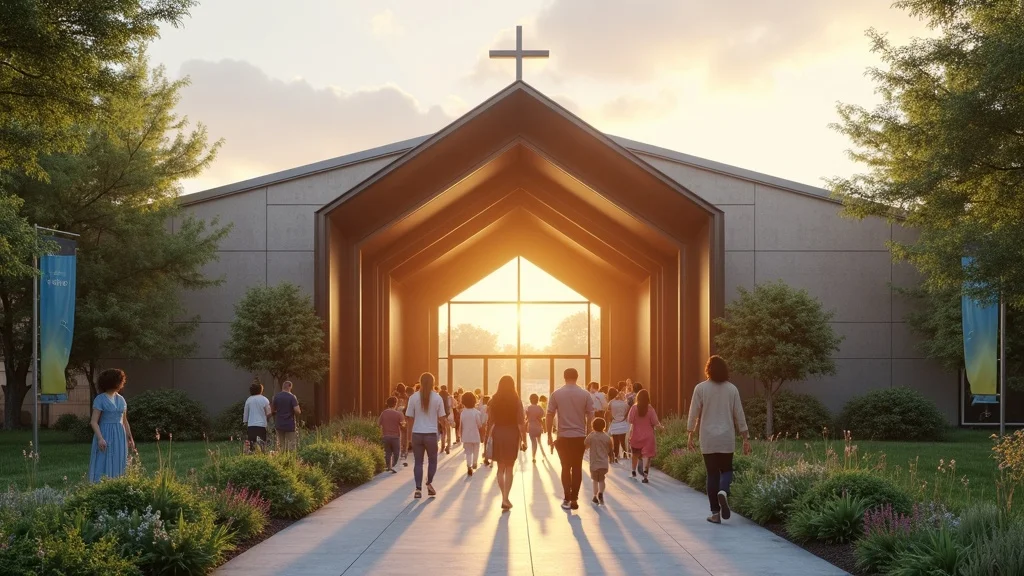
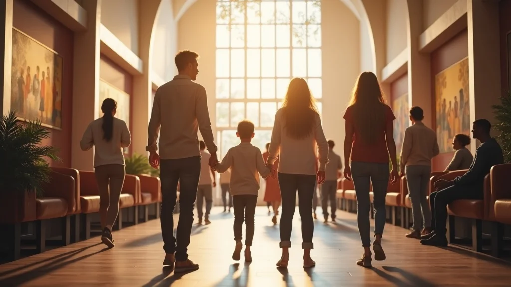
When someone visits your church – online or in person – they’re asking three questions long before they hear a sermon: “Is this for people like me?”, “Do I understand what’s going on?”, and “Do I feel safe to come back?” Your design and branding answer those questions in the first few seconds, whether you’ve planned it or not.

That’s why I see first impressions: how design affects visitors, belonging, and engagement as a core part of gospel communication, not a cosmetic upgrade. Good church design doesn’t exist to make you look trendy; it exists to remove friction, proclaim Christ clearly, and help newcomers find their place in the life of your church.

Inviting modern church entrance with contemporary signage, greenery, and diverse families approaching in warm sunrise light

Why Good Church Design Isn’t About ‘Looking Cool’—It’s Mission Support

Church branding isn’t cosmetic—it’s communication.

Dan Nichols

When I talk with leaders about first impressions and church design, the same assumption comes up again and again: “We’re not trying to look cool; we just need a logo and a sign. ” Underneath that is often a fear of style over substance, or of copying big churches that feel nothing like real life in a UK context.

But church branding, signage, and graphic design are not about chasing trends. They’re about making sure your community actually understands who you are and what you’re inviting them into. Design is simply the visual language that carries your message – from the pavement outside to your website, to your livestream, to the flyer dropped through someone’s letterbox.

For churches looking to move beyond surface-level visuals and develop a brand identity that truly reflects their mission, exploring the essentials of branding and logo design for churches can provide practical steps and inspiration for creating meaningful connections from the very first glance.

The Status Quo Trap: Mistaking the Name for the Mission

  • Most leaders think design is just a stylish logo or church nameplate.
  • Superficial visuals miss the deeper link: design as the bridge between ministry, message, and the people you want to reach.
  • When churches default to generic or unclear visuals, they confuse, not connect—and visitors don’t linger long enough to hear your message.

I’ve lost count of how many times I’ve seen a sign that simply states the church name in a dated font, maybe with a clip-art dove added for good measure. There’s no sense of who this church is for, what they believe, or what life might be like if you actually stepped inside. It’s not that these churches don’t have a heart for mission; it’s that their visuals aren’t reflecting that heart.

When we treat design as a surface-level exercise – a quick logo, a cheap banner, a rushed Facebook graphic – we miss the opportunity to connect our ministry and message with the very people we’re praying will come. The result is a kind of quiet confusion. People walk or scroll past, and nothing in what they see tells them, “This is for you. You are welcome here. Here is the good news we’re about. ”

Traditional church foyer with dim lighting, generic signage, and an uninspired atmosphere

A bold logo without meaning is just noise—clarity fuels connection.

Dan Nichols

The moment we start thinking of church branding as communication – not decoration – everything changes. The questions become: “Does this design clearly communicate our mission?”, “Does it help a newcomer take the next step?”, and “Does it serve or distract from proclaiming Christ?” That is where design becomes genuine mission support.

Real Connection: How Thoughtful Design Communicates Belonging from First Sight

My Own Epiphany: Discovering Design’s Power at Walton Evangelical

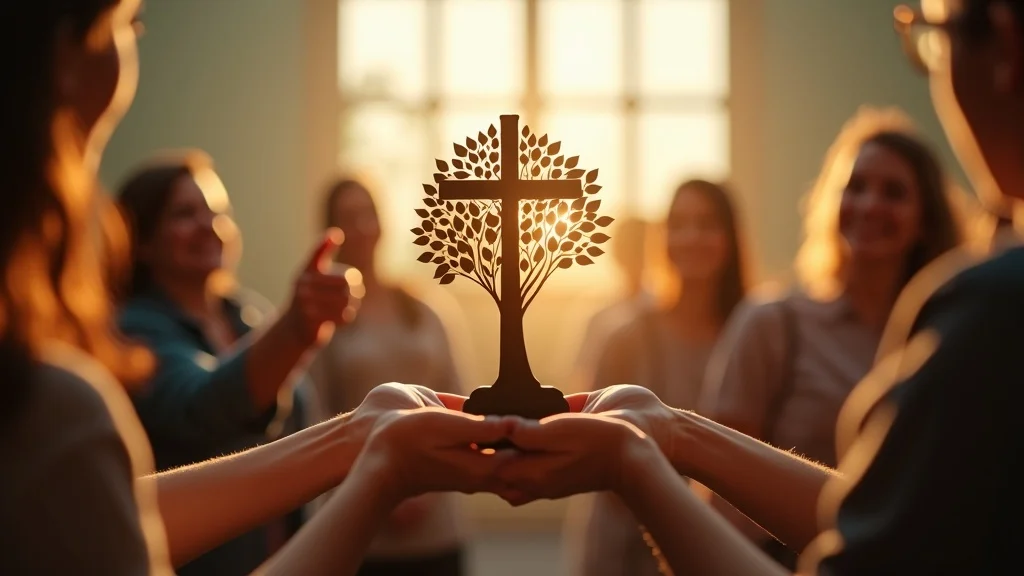
  • The Walton logo: a cross entwined with a tree; tagline: ‘Living to love, serve, and share Jesus’.
  • Symbolism isn’t decoration—it’s a signpost of faith, growth, and welcome.
  • When design and tagline flow from mission, strangers feel the invitation before they hear a sermon.

My own thinking on first impressions and church design was shaped deeply by serving at Walton Evangelical Church in Chesterfield. Our logo is simple: a cross that also forms part of a tree. The tagline we use is, “Living to love, serve, and share Jesus. ” At first glance, it’s just a mark and a line of text. But together, they’ve become a visual summary of everything we’re about.

The cross in the logo anchors us clearly to the gospel. The tree suggests growth, life, and rootedness in Christ. The tagline connects that symbolism to everyday discipleship and outreach. When someone sees that logo on a banner, booklet, or our website, they’re not just seeing a design; they’re being quietly introduced to our mission: a church seeking to love, serve, and share Jesus in the community we’re planted in.

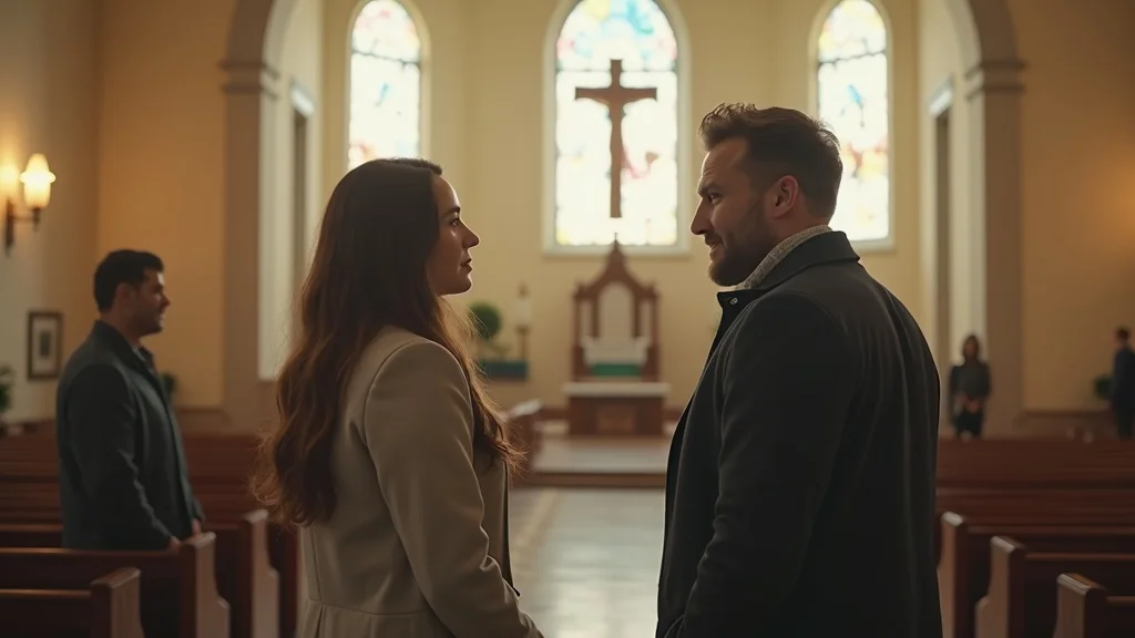
This is where first impressions: how design affects visitors, belonging, and engagement becomes tangible. People have said to me, “I saw your logo and tagline on the leaflet and it made me curious,” or, “It felt welcoming before I even came along. ” The design didn’t save anyone, but it helped them cross the threshold – it signposted that there might be life and hope here worth exploring.

Church members admiring a new cross-and-tree logo sculpture in a bright community space

A strong church brand answers, ‘Who are we here for?’ before a word is spoken.

Dan Nichols

That’s the goal of thoughtful church graphic design and branding services: to help people feel the invitation before they know the details. Good signage, well-designed welcome materials, a clear website, consistent Sunday visuals – all of these quietly answer, “You belong here, and we’d love you to discover Jesus with us. ”

When that sense of belonging is communicated visually and reinforced from the car park to the notice sheet to the livestream, visitor engagement doesn’t feel forced. It becomes the natural response to clear, consistent, welcoming communication.

The Consequence of Neglect: What’s Lost When Design Misses The Mark

Missional Impact: From Missed Visitors to Missed Vision

  • Poor design isn’t just forgettable, it’s a barrier to outreach—visitors disengage, assumptions go unchallenged, and community curiosity is wasted.
  • If your branding is confused, so is your message—inside the walls and out on the street.
  • Lack of clarity means newcomers may never discover the heart behind your mission.

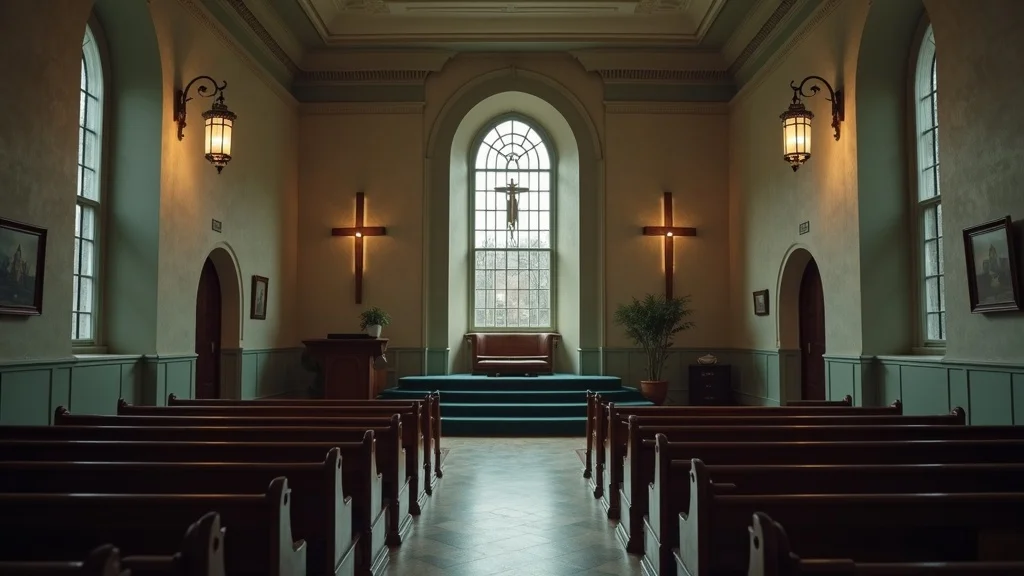
When churches neglect design, it’s rarely intentional. Time is short, budgets are tight, and communications are often run by faithful volunteers doing their best late at night. But the impact on first impressions is very real. A blurry logo, mismatched colours, hard-to-read signs, or an out-of-date website quietly tell people: “We haven’t really thought about you yet. ”

For non-Christians and those completely new to church, a poor first impression can confirm their assumptions – that church is confusing, irrelevant, or only for a certain type of person. They might click away from your website because they can’t find service times on their phone, or they may drive past your building week after week without ever realising there’s a community actively seeking to welcome them in.

Inside the church, unclear branding and inconsistent design can cause their own problems. Ministries all create their own styles, notices become cluttered, and the overall message feels fragmented. When the visual communication is confused, people struggle to see the bigger picture of your vision. The tragedy is that the heart of the church may be warm and gospel-centred – but many will never stay long enough to find out.

Newcomers looking uncertain in a bland church entrance with poor signage and mismatched colours

This is why I see design as stewardship. Investing in clearer first impressions is not about vanity; it’s about removing unnecessary barriers so that people can encounter Christ and His people without avoidable confusion.

The ‘Belonging by Design’ Framework: Four Essentials for Impactful Church Branding

  • 1. Clarity: Your visuals must unmistakably communicate your mission (logo, tagline, signage).
  • 2. Consistency: From the website to Sunday slides, visuals should reinforce belonging and brand identity, online and offline.
  • 3. Accessibility: A digital-first approach ensures both in-person and online visitors get the same welcome.
  • 4. Stewardship: Quality design saves time, reduces volunteer workload, and keeps focus on ministry—not fixing graphics.

Over years of working with churches across the UK, I’ve found that impactful church branding and graphic design come down to four core principles. Together, they shape how first impressions influence visitor belonging and engagement in a digital-first, hybrid ministry world.

Clarity is about making your message unmistakable. Your logo, tagline, exterior signage, welcome banners, notice sheets, and social graphics should all point to the same simple truth: who you are, who you’re for, and why you exist. If someone can’t answer those questions after a quick visit to your website or one Sunday in your building, the visuals aren’t doing their job yet.

Consistency turns that clarity into trust. When your website, livestream overlays, social posts, and Sunday slides all feel like the same church, visitors relax. They know they’re in the right place. This is where digital-first identity systems are so powerful – a reusable set of logo files, fonts, colours, and templates that your whole team can use. Even with multiple volunteers involved, the church still speaks with one visual voice.

Accessibility is increasingly critical. For many people, “visiting” your church starts with a Google search or a social media link. If your online presence is hard to use, not mobile-friendly, or visually disconnected from your building, you’re losing people before they arrive. A clean, easy-to-navigate website and clear “Plan Your Visit” style pages help turn online curiosity into in-person attendance.

Stewardship recognises that leaders and volunteers only have so many hours in the week. Well-designed templates, subscription graphic packs, and a simple brand system mean that you’re not reinventing the wheel every time an event comes up. That saves time, reduces burnout, and allows your team to focus their energy back on people and pastoral care.

Quick Wins for Leaders: Where to Start This Season

  • Audit your current logo, signage, and online presence—does it connect purpose to people?
  • Ensure campaign graphics (Christmas, Easter, Back to Church) speak with one clear voice.
  • Invest in ready-to-go, customisable templates for your next outreach—reduce burnout and amplify impact.

If all of this feels a bit overwhelming, the good news is you don’t need to fix everything overnight. There are some simple, high-impact steps you can take this term or this year to improve your first impressions and strengthen visitor engagement.

Start with a quick audit. Look at your church through the eyes of a first-time visitor. Stand across the road from your building; is it obvious what happens there and when? Open your website on your phone; can you immediately see service times, location, and what to expect? Scroll through your social media; does it feel like the same church as your Sunday gathering?

Next, focus on seasonal campaigns – Christmas, Easter, Harvest, Remembrance Sunday, Back to Church Sunday, Thy Kingdom Come, Alpha, Christianity Explored. These are key missional moments in the UK calendar where your community is more open to invitations. Create a simple campaign suite: flyers, social graphics, outdoor banners, and a matching landing page on your site. When everything shares the same look and message, your invitations feel clearer and more compelling.

Finally, consider investing in ready-to-go, customisable templates or subscription packs. These give your team a bank of UK-relevant graphics for Sundays, social media, livestreams, and outreach events. Instead of starting from scratch every week, your volunteers can simply drop in the right text and go, confident that it will look consistent and on-brand.

Church leaders and volunteers collaborating around laptops and coloured design mockups in a bright meeting space

FAQ: How Does Design Affect New Visitor Retention in 2024?

  • Q: Can good design actually help our church grow? A: Yes—clarity attracts, confusion repels.
    Good design won’t grow your church on its own, but it can remove a lot of unnecessary friction. When people can easily understand who you are, how to join in, and what you believe, they’re far more likely to move from occasional visitor to committed participant. In a culture with so many options and distractions, clarity is a powerful form of hospitality.
  • Q: How do digital graphics help in-person ministry? A: Consistent identity removes friction for newcomers.
    When your online presence matches your in-person experience, newcomers feel a sense of familiarity and reassurance. If they see the same branding on your website, your livestream, your building signage, and your welcome pack, it signals that they’re in the right place and that you’ve thought carefully about their journey. That consistency frees them to focus less on logistics and more on listening and engaging.
  • Q: Do we have to be techies to manage this? A: No—choose subscription packs and templates optimised for volunteer teams.
    You don’t need a full-time designer or advanced software to improve your first impressions. Well-built template systems are designed so that volunteers with basic computer skills can update text, swap photos, and create new materials within clear boundaries. The key is choosing tools and design systems created with churches in mind, so they fit your rhythms, your seasons, and your team capacity.

Key Takeaways: Your First Impression Shapes Lasting Engagement

  • Design isn’t for vanity—it’s for ministry impact.
  • Invest in clarity, not clutter.
  • Every visual element should draw visitors towards belonging and mission.

If there’s one thing I want church leaders to grasp, it’s that first impressions: how design affects visitors, belonging, and engagement is not a side project. Your signage, your website, your graphics, your livestream visuals – they are all part of how you communicate the gospel and welcome people into the life of your church.

When you treat church branding and design as mission support and good stewardship, rather than a cosmetic extra, you start asking better questions: “Does this help someone new take a step closer to Jesus?”, “Does this help our church family understand and live out our vision?”, and “Does this make life easier or harder for our volunteers?” Those questions lead to healthier decisions and more sustainable systems.

Diverse congregation happily connecting in a bright church foyer with modern signage and welcoming atmosphere

Ready to Transform Your Church’s First Impression?

  • Discover how digital graphic subscriptions can boost your church’s engagement and unlock effective, consistent branding—without burning out your staff or volunteers.

If you’re ready to strengthen your first impressions – from the kerbside to the search results to the Sunday stream – you don’t have to tackle it alone. This is exactly why I created Church Graphic Design: to partner with UK churches and Christian organisations who want to communicate clearly, welcome warmly, and steward their time and resources well.

Through digital-first identity systems, seasonal campaign suites, and subscription-based graphic packs, I help churches build consistent, gospel-centred visuals that volunteers can actually use week in, week out. The result is simple: less stress for your team, clearer communication for your community, and more space for you to focus on the people God has entrusted to your care.

If that sounds like the kind of support your church needs in this season, now is a good moment to take that next step and start reshaping your first impressions with purpose.

As you consider the next steps for your church’s visual identity, remember that branding is more than just a logo—it’s the foundation for every connection you make. If you’re interested in exploring how a strategic approach to branding and logo design can help your church communicate its unique mission and values, there are resources and expert guidance available to support your journey. Investing in your brand is an investment in your community’s sense of belonging and your church’s long-term impact. Take the opportunity to discover new ways to express your vision and invite others into the story God is writing through your congregation. The right design choices today can open doors for deeper engagement and lasting growth tomorrow.

To further explore how design influences visitor engagement and fosters a sense of belonging, consider the insights from the article “Using Church Design for Maximum Engagement and Community Connection. ” This resource delves into strategies for creating worship spaces that enhance community connection and spiritual growth. Additionally, the piece “Designing Welcoming Spaces: How Churches Can Create an Inviting Environment for First-Time Visitors” offers practical advice on crafting environments that leave lasting positive impressions on newcomers. If you’re serious about improving your church’s first impressions, these resources will provide valuable guidance on creating engaging and welcoming spaces.

Expert Interviews

33 Views

0 Comments

Write A Comment

*
*
Please complete the captcha to submit your comment.
Related Posts All Posts
06.05.2026

Digital-first church communications: designing for social, mobile, and Sunday screens at once

Most churches still treat Sunday screens like PowerPoint: pick a background, add some text, throw in a few bullet points, job done. On the surface it looks “fine”. But beneath the surface, something vital is being missed: every screen is now a primary expression of your church’s message, your ministry, and your mission strategy.Digital-first church communications—designing for social, mobile, and Sunday screens at once—is no longer a “nice to have. ” It’s become one of the most pressing ministry problems I see in UK churches: how to create professional visuals that work everywhere when you have limited people, time, and budget.I spend my days helping churches wrestle with that exact challenge. And the good news is this: you do not need a huge team or a massive budget. You need a clear system, an audience-first mindset, and a multi-screen workflow that turns one strong idea into many platform-ready visuals.Why ‘Copy-Paste’ Fails: The Real Cost of Ignoring Platform-First Church CommunicationsSunday isn’t a slides problem; it’s a communication problem disguised as PowerPoint.Dan Nichols - Church Graphic Design (CGD)The biggest mistake I see UK churches making is this: using the same design everywhere—Instagram, YouTube, Sunday screen—by simply copying, pasting, and hoping it works. It feels efficient, but in practice it quietly kills engagement.On Instagram, that “Sunday slide” looks cramped and unreadable. On YouTube, it makes a weak thumbnail that no one wants to click. On the projector, the lines are too long, the text is too small, and people at the back are squinting. The result? The church has “content” everywhere, but connection nowhere. The message hasn’t changed, but its impact has been diluted by poor formatting.The painful part is this: churches are already investing time and energy into their visuals. Money is being spent. Volunteers are doing their best. The cost of ignoring digital-first church communications is not just aesthetic—it’s pastoral. People miss key information, feel less connected, and quietly tune out. The fix is not “more content”; it’s better designed, platform-first content.The Multi-Screen Challenge: A New Era for Church Media LeadersDigital-first church communications is now mission-critical — social, mobile, and Sunday services all demand unique approaches.The audience expects engagement: connection, not just content, is the marker of effective church media.Common enemy: the “one-size-fits-all” design trap wastes resources and weakens your message.We now live in a world where your congregation is likely engaging with three or four screens around every Sunday service: the big screen in the room, the phone in their hand, the livestream at home, and the social media feed they scroll later. Each of those screens has its own language, its own expectations, and its own opportunities.Digital-first church communications is about recognising that reality and designing for it intentionally. Social media design strategy, mobile-first layouts, and clear Sunday presentation design are not separate worlds; they’re three expressions of one story. When they clash, the message feels confused. When they work together, your church feels coherent, thoughtful, and trustworthy, whether someone meets you first on Instagram, YouTube, or in the building.As you refine your approach to digital-first communications, it’s worth considering how your church’s visual identity underpins every screen experience. Developing a strong, consistent brand and logo design can make adapting content for multiple platforms far more seamless and recognisable. For practical guidance on building a cohesive visual identity, explore the branding and logo design essentials for churches.The Epiphany: Unified Church Communication Begins with Audience, Not OutputsWhen churches first come to me, they usually talk in terms of outputs: “We need sermon slides, social posts, YouTube graphics. ” But that’s starting in the wrong place. The turning point comes when they stop thinking about “slides” and “posts” and start thinking about people.Digital-first church communications only really comes alive when everything is built around a real audience: the member sitting near the back, the new visitor at home watching on their phone, the sceptic who stumbles across a reel, the lapsed attendee seeing a YouTube thumbnail in their recommendations. If all you design for is the projector, you’ll miss everyone who never makes it into the room.My Audience-First Framework: The ‘Engage, Convert, Lead’ SystemEngage: Start with your real audience—not just members, but seekers and online visitors.Convert: Adapt content—long videos into Shorts, key messages into Stories—matching platform expectations.Lead: Always present a next step, from Instagram snippet to Sunday invitation.Here’s the simple system I use when shaping digital-first church communications for social, mobile, and Sunday screens at once.Engage. I begin by asking, “Who is this for, really?” Not the imaginary ideal, but the people who are actually watching: busy parents scrolling in the evening, teenagers on the bus, older members catching up on a tablet. What will stop their thumb? What will feel clear on a small screen? What will feel welcoming rather than overwhelming in the room?Convert. Once the core content exists (often as a sermon or long-form video), I look for the gold within it: a quote, a story, a question, a key line. That becomes a 15–30 second Short, a simple Instagram Story, or a static post. I’m not just chopping content; I’m reshaping it so it matches what each platform is built for—short, visual, and to the point on social; clear hierarchy and pacing on Sunday slides.Lead. Engagement without direction is just noise. So every expression—whether a TikTok-style clip, an Instagram reel, or a Sunday series graphic—should gently point to a next step: watch the full message, join a small group, come onsite this Sunday. When you design with “Engage, Convert, Lead,” your visuals become a pathway rather than a pile of content.Design for people, not pixels—if it serves a real person, every platform benefits.Dan Nichols - CGDA £500, 2-Hour Workflow: The Minimum Viable Church Communications PlaybookWhen I sit down with church leaders, I often hear the same two constraints: “We’ve got about £500 to spend” and “We’ve got maybe 2 hours a week to do this. ” That’s the real world for many UK churches. So instead of pretending we all have media departments, I build systems that respect those limits and still deliver professional, multi-screen results.If you gave me just £500 and 2 hours a week to build a brand that works across Instagram, YouTube, and Sunday screens, this is the exact priority system I’d follow.Clarify Your Mission—define the core message for the week across ALL platforms.Build One Master Slide or Graphic—then adapt to Instagram’s square, YouTube’s landscape, and Sunday’s widescreen.Use Templates—batch-create stories, thumbnails, and slides in one sitting.Test and Tweak—gather feedback from both online and in-person congregation.Systemise—document your process for faster, consistent weekly turnaround.Step 1: Clarify Your Mission (Free, Weekly). Before any design work, decide the one core message for the week: a series title, a key verse, a simple phrase. This becomes the foundation for your Sunday presentation design, your social media design strategy, and your YouTube visuals. Without this step, everything feels random and forgettable.Step 2: Build One Master Graphic. Use part of that £500 to invest in a simple, flexible design toolkit—either custom-made or from a trusted template source that fits your church’s style. Each week, create one strong master graphic: clean typography, clear title, space for a short sub-line if needed. Design it first in a landscape or widescreen format, as this will work best for Sunday screens and YouTube thumbnails.Step 3: Adapt, Don’t Start Again. From that master, create three versions: – A widescreen slide for Sunday (minimal text, big type, high contrast). – A landscape graphic for YouTube thumbnail (short title, church logo small, strong focal point). – A square or vertical version for Instagram and Stories (maybe just the title and background, plus a call to action).Step 4: Use Templates and Batch. With your remaining budget, prioritise tools that help you move quickly: a slide template set, a social media pack, maybe a simple content calendar. In your 2-hour weekly slot, batch-produce all your outputs in one go: Sunday slides, YouTube thumbnail, 2–3 Instagram posts or Stories. Because the design system is consistent, every adaptation is quick rather than starting from scratch.Step 5: Test, Tweak, and Systemise. Ask two questions weekly: “Was that easy to read on Sunday?” and “Did anyone interact with this online?” If not, you don’t need more stuff—you need small improvements. Increase font sizes, simplify wording, shorten titles. Write down the steps you take each week so that a volunteer can replicate them. Over a few months, this becomes a robust, minimum viable church communications workflow.Platform Synergy vs Brand Consistency: Finding the Sweet SpotBrand consistency is your backbone—colours, type, tone—but optimise layouts for each platform’s norms.Instagram thrives on punchy visuals; YouTube rewards clickable thumbnails; Sunday screens need clear, readable hierarchy.Don’t waste time “fitting”—design with the destination in mind.Another big mistake I see is churches trying to force identical layouts onto every platform in the name of “consistency. ” What they’re really doing is confusing consistency of style with sameness of design. True brand consistency is about the feel—colours, fonts, tone of voice—not about cloning the exact layout everywhere.Digital-first church communications works best when you hold two things together: a recognisable brand backbone and platform-specific optimisation. On Instagram, that might mean bold typography and minimal text, using your brand colours. On YouTube, the same colours and fonts appear, but the layout shifts to a strong focal image with a short, punchy title. On Sunday screens, those fonts and colours are still there, but the design prioritises legibility from the back row and supports the spoken word, rather than competing with it.The goal isn’t to “fit” one design into every space; it’s to design with the destination in mind while keeping the same visual DNA throughout. That’s how you build trust and recognition without sacrificing clarity or engagement.FAQs: Smart Solutions for Overstretched Church Media TeamsQ: Can I really have professional visuals on a tight budget?A: Yes. Professional doesn’t mean “expensive,” it means “intentional.” When you embrace digital-first church communications, templates, content batching, and a clear audience-first message give you disproportionate impact for the time and money you have. A lean, well-thought-out system will always beat sporadic “one-off” designs.Q: What’s the #1 priority if I’m overwhelmed?A: Start with an audience-first master message, then adapt for format. If you only have energy for one thing, decide the key line or idea you want everyone to remember this week, and make sure that appears clearly on Sunday slides, in your YouTube thumbnail, and in your lead social graphic. Get the message right first; the design is there to serve it.Key Takeaways: Digital-First Church Communication That Actually ConnectsDon’t default to PowerPoint—see every screen as a strategic touchpoint in your ministry, not a background decoration.Build systems, not just slides: a simple weekly workflow will maximise consistency and minimise effort for your team.Measure engagement: if people respond, share, click, or comment, your design is doing its job; if they don’t, adjust and simplify.Ready to Transform Your Multi-Screen Ministry? Download the Church Communications GuideDigital-first church communications—designing for social, mobile, and Sunday screens at once—isn’t about chasing trends or imitating megachurch media. It’s about stewarding the message you already have, with the resources you already hold, in a way that genuinely serves real people where they are.If you’re tired of copy-paste graphics that don’t quite work, or Sunday slides that feel disconnected from what people see online, this is the moment to reset. Clarify your weekly message, build one strong master design, adapt it intelligently for Instagram, YouTube, and Sunday, and put a lightweight system around it. You’ll be surprised how quickly your communication feels more intentional, more consistent, and more human.If you’d like practical help turning this into a repeatable system for your church, I’ve put together a simple Church Communications Guide that walks through tools, templates, and weekly workflows in more detail, specifically for UK churches with limited time and budget. Download it, share it with your team, and use it as a starting point for building a multi-screen ministry that truly connects.As you continue to develop your church’s digital presence, remember that your visual identity is just one part of a broader communications strategy. Investing in a thoughtful branding and logo design process can help unify your message across every platform, making your church instantly recognisable and memorable in a crowded digital landscape.If you’re ready to take your next step and explore how a cohesive brand can amplify your ministry’s impact, discover the principles and practical steps in branding and logo design for churches. This resource will help you build a foundation that supports every aspect of your multi-screen communication journey.______________________Dan Nichols is the Founder and creative Designer at Church Graphic Design in Chesterfield, UKPublished by Ken Johnstone MBA BSc, Executive Editor at DYLBO digital media & Biblical Living Unlocked’

05.29.2026

Story-driven church branding: how to turn ‘who we are’ into visuals

Why 70% of UK churches fail at branding—and the story-driven visual identity that changes everythingMost UK churches think “branding” means having a logo, a colour, and a church name that fits on a noticeboard.That’s why so many church visual identities end up looking almost identical: a cross, some blue, the word “welcome”, and a stock photo of people holding coffee. Technically, that’s branding. Practically, it’s noise!Story-driven church branding is different. It starts with who you are—your history, your people, your place, your mission—and then turns that into visuals. When your church visual identity grows out of your story, it becomes far more than “nice design”. It becomes one of the clearest tools you have for communicating the good news of Jesus and inviting your community into it.When churches miss this, they don’t just miss out on aesthetics. They miss people.The branding mistake holding most churches backIn many traditional churches I work with, visual identity has been reduced to a nameplate and maybe a clip-art dove. The assumption is that as long as the church name is readable and the logo isn’t offensive, the job is done. But church branding isn’t meant to be a label—it’s meant to be a living, visual expression of your story and your mission.A healthy, story-driven church brand does three things at once: it reflects who you are before God, it communicates the good news you’re longing to share, and it invites the wider community to wonder, “Could this place be for me?” That’s why I talk about "story-driven church branding: how to turn ‘who we are’ into visuals that actually connect with real people in real communities".A logo isn’t your story—it’s your invitation.Dan Nichols, Church Graphic Design (CGD)The real cost of ignoring story-driven church brandingWhen churches ignore story, and treat branding as a cosmetic extra, two things usually happen. First, they risk alienating the very people they’re trying to reach—because the visuals feel dated, confusing, or completely disconnected from local life. Second, even if the heart of the church is warm and gospel-centred, the visual identity never communicates that clearly enough for people to notice or be drawn in.Alienates the very community you want to reachFails to communicate your church’s unique callingWastes vital outreach, volunteer, and grant opportunitiesWhen your branding feels invisible, generic, or inconsistent, your mission quietly becomes invisible too. People simply walk past physically and scroll past digitally, never realising there’s a church with a story, a welcome, and a Saviour right there for them.Invisible branding means an invisible mission...Dan Nichols - CGDDan Nichols’ discovery process: excavating your church’s unique visual DNAStory-driven church branding doesn’t start in Adobe Illustrator. It starts in your church hall, your archives, your streets, and your conversations. Before I design anything, I treat each church like a story to be excavated, not a product to be decorated.Every church has a unique visual DNA shaped by its people, place, and history. My job is to uncover that DNA and turn it into authentic church graphics, a coherent church visual identity, and a brand story that can be recognised at a glance—online, on the notice board, and on the high street.Step 1: Audit the landscape—what do your visuals really say?The first step in story-driven church branding is brutally simple: look at everything. I consider every visual touchpoint your church already has and ask what story it’s telling—often without you realising.Assess every touchpoint: notice sheets, signage, website, social mediaAsk: Does this engage or alienate? Does it invite curiosity—or turn it away?When church leaders slow down long enough to do this audit, patterns emerge quickly. Perhaps your website feels friendly but your printed materials feel stern. Perhaps your social media is vibrant but your physical signage is lost and faded. Or perhaps everything looks so generic that no one could tell your church apart from the one three streets away.In story-driven church branding, this audit is the moment of honesty. It’s where you stop assuming your visuals are fine “because no one’s complained” and start asking, “Are our visuals actually serving our mission?”For churches looking to take practical steps beyond the audit, exploring the essentials of branding and logo design for churches can provide a tactical foundation for building a visual identity that truly reflects your story and mission.Step 2: Story-archaeology—uncovering your community, demographics, and missionOnce the audit reveals what your current church visual identity is saying, the next step is to uncover what it should be saying. This is where story-archaeology comes in: digging into who you are, where you are, and who you’re called to reach.Who is your church? What is your vision?How does your history, culture, and local context shape your visual story?Identify overlooked aspects: e.g., do colours or symbols reflect local meaning?I ask questions about your church’s beginnings, the character of your area, and the people who walk past your building every day. Are you surrounded by students, retirees, young families, or a mix? Are you a centuries-old parish in a rural village, or a plant in a fast-changing urban estate? Do locals associate certain colours, landmarks, or imagery with your area? All of this becomes raw material for story-driven church branding.These conversations often uncover details that leaders have lived with for years but never connected to visual identity: a mill that used to run nearby, a local hill, a distinctive community nickname, or an aspect of your church’s hospitality that’s unique in your town. Those elements, handled thoughtfully, can become powerful visual anchors in your church brand storytelling.Step 3: Turning insights into authentic church visualsOnly after the audit and the story-archaeology do we begin designing. At this stage, the goal is to translate your core story into a cohesive visual identity—logo, colours, typography, imagery style—that feels rooted in your actual community, not in a generic “church branding” template.Translate core story elements into visual identity—moving beyond “welcoming cross” clichésExample: Stenson Fields Christian Fellowship’s logo—rolling fields as Bible pages, bringing faith, community, and growth togetherOne of my favourite examples is Stenson Fields Christian Fellowship. Their logo is an open Bible, but the pages curve out into rolling green fields. Instantly, you see three things at once: Scripture at the centre, the agricultural landscape of their local community, and a sense of growth and life. It’s not just “a cross with a swoosh”; it’s their theology, geography, and hope, all in one image.This is what authentic church graphics look like when story drives design. Your church visual identity becomes a visual shorthand for your mission—a symbol that makes sense to your people and piques the curiosity of those who don’t know you yet.Design without story is noise—story-driven design is invitation.Dan Nichols - CGDProving the ROI: how story-driven branding sparks growth and engagementMany UK church leaders are quietly convinced that visual identity matters, but they struggle to justify investing in story-driven church branding to PCCs, elderships, or denominational committees. On paper, “branding” can sound like a luxury—especially when budgets already feel tight.The turning point is when leaders stop framing church branding as “nice design” and start describing it in terms of mission effectiveness: community engagement, digital accessibility, new visitor retention, volunteer mobilisation, and outreach impact. That’s where story-driven church branding becomes a strategic investment, not an aesthetic indulgence.Branding as community engagement, not just pretty picturesWhen I talk with leadership teams, I deliberately use language that connects visual identity to their stated mission and to measurable outcomes. Funders, grant bodies, and denominational boards may not get excited about “refreshing the logo”, but they absolutely understand investing in tools that help a church serve its community better.Visual identity reframed for church grants: “community engagement”, “digital accessibility”, “visitor retention”Equips church leaders to justify investment with real-world growth metricsFor example, a website redesign is not just new colours and fonts; it’s increased digital accessibility for older members and newcomers, clearer information about support groups and community activities, and a smoother path for enquirers who want to attend for the first time. New signage and consistent print materials aren’t simply updated graphics; they’re tools for wayfinding, welcome, and helping nervous first-timers feel like they’re in the right place.By framing story-driven church branding in this way, leaders can connect spending to ROI: more visitors who stay, more volunteers who understand the vision, more effective promotion of community events, and a clearer presence in both the physical and digital neighbourhood.Case in point: results from story-driven brandingWhen churches go all-in on story-driven church branding, the outcomes are often visible much sooner than they expect. I’ve seen modest congregations move from “hidden in plain sight” to being recognised and talked about in their town, simply because their visual identity finally matches the warmth and clarity of their community life.Measurable boost in visitor numbers and volunteer signups after brand refreshEnhanced outreach effectiveness: visual story connecting church with new local familiesOne church, after a full story-driven rebrand and website refresh, began to notice a trend: visitors were no longer stumbling in accidentally—they were arriving having already explored the website, understood service times, children’s work, accessibility information, and what to expect. That reduced anxiety translated into more returning visitors and an easier path into small groups and serving teams.Another church saw a noticeable increase in signups for a community festival once their flyers, social media, and banners were all telling the same clear, locally resonant visual story. It wasn’t magic; it was alignment. The story they were living, the story they were telling, and the visuals they were using finally matched.First steps: how church leaders can begin their brand story excavationYou don’t need a design background to take the first step into story-driven church branding. What you do need is the willingness to pause, look honestly at your current visual identity, and ask what it’s really communicating. From there, you can begin the process of aligning who you are with what people see.Actionable audit: assess the story your visual identity tellsI encourage leadership teams to start with a simple but intentional branding audit. This isn’t about criticising previous efforts; it’s about clarifying the story.Review your church’s branding everywhere it appearsAsk unbiased outsiders for their gut reactionEvaluate: Does every piece reflect your true community story?Lay out your notice sheets, look at your noticeboard from across the street, scroll through your social media feed, click through your website as if you’ve never been to your church before. Then invite a couple of people who are not part of the church—perhaps from another local organisation—to give their honest first impressions.The key question is simple: “If you knew nothing about us, what story would you assume from these visuals?” If the answers don’t sound like the church you know and love, you’ve just discovered your starting point for story-driven church branding.Why an outside perspective fuels authenticityOnce you’ve taken that internal audit, the next step is often to bring in an outside perspective. Not because you don’t know your church, but because you know it too well. You’re used to your building, your history, your quirks, and your language—so much so that it can be hard to see what newcomers actually see.External church branding experts spot disconnects and overlooked strengthsFresh eyes turn hidden history and mission into memorable visualsWhen I work with churches, I can often see strengths they’ve taken for granted: a deep culture of hospitality, strong work with children, a long-standing commitment to a particular estate, or a unique architectural feature that locals recognise. These elements are gold for story-driven church branding, but they’re easy to miss from the inside.Likewise, an external eye can sensitively highlight where current visuals might be unintentionally off-putting—colour choices that feel harsh, typefaces that are hard to read for older eyes, or imagery that suggests a demographic that isn’t actually present. That outside clarity is what helps turn “who we really are” into visuals that feel both authentic and accessible.Key takeaways for mission-driven visual identityStory-driven church branding isn’t about chasing trends or copying the megachurch down the road. It’s about aligning your visual identity with your God-given story so that when people encounter your church—online, on a flyer, or on the pavement—they glimpse something true, compelling, and inviting.Visual identity is mission delivery, not just aestheticsYour story—history, values, and context—must drive every design choiceAudit first, then excavate your distinctiveness before designingBy taking time to audit your current visuals, excavate your story, and then design intentionally, you move from “having a logo” to having a visual identity that actually serves your preaching, your pastoral care, your outreach, and your community presence.Story-driven church branding: how to turn ‘who we are’ into visuals—is ultimately about integrity. It’s about making sure that what people see lines up with what you believe, what you preach, and how you welcome.Ready to make your church story visibly compelling?If you sense that your visual identity no longer reflects who you are—or never really did—this is a strategic moment. The gospel you proclaim is rich, hopeful, and life-giving. Your visuals should help people see that, not hide it.Your mission is too important for generic visuals—let your story lead your design.Dan Nichols - CGDThe next step is simple: begin with that honest audit, gather your leadership team, and start talking about the story your church is really called to tell in your community. When you’re ready for fresh eyes and a partner to help translate that story into a clear, coherent, and compelling visual identity, I’d be glad to walk that journey with you through Church Graphic Design.Your church already has a story. It’s time your visuals told it.If you’re inspired to take your church’s visual identity further, consider exploring the broader principles and strategies behind effective branding and logo design for churches. Delving into these foundational concepts can help you move beyond surface-level changes and develop a brand presence that resonates deeply with your congregation and community. By understanding the full spectrum of branding—from storytelling to design execution—you’ll be better equipped to create visuals that not only look appealing but also serve your mission and foster lasting engagement. Let your church’s story shine through every touchpoint, and discover how intentional branding can become a catalyst for growth and connection._________________To deepen your understanding of story-driven church branding, consider exploring the following resources:“How To Use StoryBrand For Churches”: This article discusses how churches can apply Donald Miller’s StoryBrand framework to clarify their messaging and effectively communicate their mission. (churchtrainingacademy.com)“Church Branding: Ultimate Guide for Ministries”: This guide provides insights into the importance of church branding, detailing how a well-defined brand can help churches stand out, build trust, and create a consistent identity that resonates with both the congregation and the wider community. (ministrybrands.com)If you’re serious about developing a visual identity that authentically represents your church’s story and mission, these resources offer valuable strategies and insights to guide you through the process.________________Dan Nichols BSc, is the Founder and creative Designer at Church Graphic Design in Chesterfield, UKPublished by Ken Johnstone MBA BSc, Executive Editor at DYLBO digital media & Biblical Living Unlocked’

05.22.2026

Decision-making and stakeholder dynamics: getting consensus without design-by-committee

Most church branding problems are not actually design problems – they’re decision-making problems.The Hidden Enemy: How ‘Design by Committee’ Saps Momentum in Church LeadershipWhen everyone gets an equal say, no one takes real responsibility.Dan Nichols - Church Graphic Design (CGD)In a typical business, decision-making and stakeholder dynamics are fairly clear: a few managers make an executive decision and the team moves. In church life, those same decisions often get passed through layers of meetings, congregation feedback, and “open discussions” that quietly turn into design-by-committee. The intent is good – to be collaborative and caring – but the outcome is often the opposite of what anyone wanted.Instead of united, confident communication, you end up with slower processes, blurred vision, and weaker messaging. Decision-making and stakeholder dynamics, especially around branding, buildings, and ministry initiatives, become a tug-of-war between leadership responsibility and the fear of appearing top-down. The cost is rarely calculated, but it’s very real: lost time, lost clarity, and sometimes, completely stalled mission.Progress Paralysed: The Cost of Consensus Gone WrongDecisions that never conclude because too many people need to approve.Vision dilution as leadership proposals are watered down through endless discussions.Congregational confusion: unclear purpose and process stalls action.When decision-making and stakeholder dynamics are fuzzy, everyone assumes they’re meant to have a say. A logo becomes a referendum. A website becomes a debate. A building project becomes a battlefield of preferences. Because the process isn’t clearly defined at the start, every conversation feels like an opportunity to renegotiate the whole direction.The more voices you add without structure, the weaker the communication tends to become. Fonts are changed to keep someone happy. Colours are softened so they “offend no one”. Language becomes vague in an attempt to be completely safe. In the end, nothing is truly wrong, but nothing is compelling either – and the church’s message deserves better than that.It’s clear that when foundational truths and vision are not communicated with clarity, even the most well-intentioned projects can lose their way.Epiphany Moment: The Power of Clarity in Church Stakeholder DynamicsClarity in leadership isn’t control—it’s a kindness to your whole church.Dan Nichols - CGDI see the same pattern repeatedly: in business, leaders feel responsible to decide; in church, leaders often feel pressure to defer. That pressure usually doesn’t come from theology; it comes from fear – fear of upsetting people, fear of being misunderstood, fear of being seen as “too corporate.” But when leadership hesitates to lead, decision-making and stakeholder dynamics drift into confusion.The turning point for me was realising that clarity about who decides what is not selfish; it’s actually an act of service. When roles, processes, and the purpose of a project are clearly communicated, people are calmer, more trusting, and far more supportive. They don’t need to own every detail as long as they understand the why, the plan, and their place in it.Case Study: How Misaligned Stakeholders Stalled a Church Branding LaunchLeadership team unified on a vision.Congregational feedback derails momentum – “We’re happy with what we’ve got.”Lack of vision and unclear communication stalls the project indefinitely.I once worked with a church whose leadership team were genuinely excited about a new brand identity. We’d walked through their vision, values, and future direction. The designs were approved; everyone around the table was ready to move. On paper, the decision-making and stakeholder dynamics looked healthy: clear leaders, clear decisions.Then came the church meeting. Instead of presenting a clear vision – why this change matters, how it serves the mission, and what the end result would enable – the branding was simply “floated” as an idea. Without a strong narrative, some members questioned the point of change: “We’re happy with what we’ve got. ” What should have been a moment of united vision became a fog of uncertainty. The project didn’t just slow down; it stopped completely. Not because the design was wrong, but because the communication and process were unclear.The Five Essentials: ‘VISION CAST’ Framework for Effective Church Decision-MakingTo stop this happening, I recommend using a simple, practical framework for stakeholder alignment when working with churches on branding, communication, or visual identity. It helps leadership teams get consensus without sliding into design-by-committee, and it keeps decision-making and stakeholder dynamics clear from the outset.V: Vision — Articulate the destination, not every route.Define where you’re going and why it matters: who you’re trying to reach, what you want them to understand, and how this project serves your mission. People are far more likely to support a change when they see the destination clearly, even if they wouldn’t have chosen the exact same route.I: Identify Key Decision-Makers — Know whose input truly matters for which sphere.Before anything goes public, decide who is actually responsible for the final say: eldership, staff, a particular ministry leader. Make the spheres clear – for example, elders approve theology, communications team shapes the visual language, staff implement the plan. Not everyone needs equal authority in every area.S: Structure Feedback — Design controlled avenues for feedback, not free-for-alls.Feedback is valuable when it’s focused, time-bound, and gathered from the right people at the right stage. Unstructured conversation at an open mic is not feedback; it’s scope creep. Use forms, specific questions, and clear boundaries so you hear what you need without losing direction.I: Inform Clearly — Communicate process, purpose, and progress at every step.Don’t spring finished decisions on people with no context, and don’t invite feedback without boundaries. Tell your church what is being decided, who is deciding, what input is being sought (if any), and how progress will be shared. Clarity lowers anxiety.N: Next Steps — Signal exactly what happens after the decision (and who moves it forward).Once a decision is made, state what happens next and who is responsible. This is where many churches stall; the “yes” is given, but no one owns the follow-through. Clearly naming next steps turns agreement into action.Used consistently, this kind of framework for stakeholder alignment turns vague, relationally anxious processes into confident, transparent decision-making that people can trust – even when they don’t personally love every detail.Collaboration vs. Clarity: When to Listen, When to DecideOne of the most strategic skills for church leaders is knowing the difference between genuine collaboration and needed clarity. Decision-making and stakeholder dynamics break down when those two are confused – when leaders ask for collaboration but actually need to provide clarity, or when they declare clarity too early and ignore insights that would have strengthened the outcome.Collaboration belongs at the front end: listening, exploring possibilities, gathering insights from different ministries and age groups. Clarity belongs at the point of commitment: this is the direction, this is why, and this is how we’ll move forward. You honour people by listening well early, and you serve them by deciding well at the right time.CollaborationClarityGathering creative input—early stageConfirming the final direction—decisivelyListening for real concernsStating non-negotiablesInviting suggestions—not approvalsTaking responsibility—leadership alignmentGathering Feedback Without Losing Direction: Three Tactics for Church LeadersControlled Surveys — Limited, structured, targeted questions.If you want input, design a short, focused survey: “What three words describe how you experience our church?” or “What confuses you most about our website?” Keep it time-limited and targeted to the right groups, so feedback is insightful rather than overwhelming.Vision Presentations — Share the ‘why’ before opening the ‘how’ to the floor.Before anyone comments on colours or fonts, walk people through the vision: who you’re trying to reach, what you’re trying to communicate, and how the proposed solution supports that. Vision first; details second. Most resistance fades when the why is clear.Binary Feedback — Seek clear Yes/No consensus at key stages, not open-ended debates.At crucial points, don’t ask, “What does everyone think?” Ask, “Can we move ahead with this direction, yes or no?” Binary feedback forces clarity. You can then listen carefully to any “no” and discern whether it’s highlighting a genuine issue or simply a preference.Key Takeaway: Communication Is the Linchpin of Stakeholder AlignmentThe clearer you communicate roles and process, the faster your church moves forward.Dan Nichols - CGDEvery time I’ve seen church decision-making fall apart, communication was at the root. Not bad motives, not lack of love – just unspoken expectations, undefined roles, and vague processes. When leadership assumes that “everyone understands how this works” but no one has actually explained it, stakeholder dynamics become messy by default.On the other hand, when leaders take the time to outline who is deciding, how feedback will be used, what the timeline is, and how the outcome will be communicated, tension lowers dramatically. People may still have questions, but they’re not left guessing. Clear, structured communication doesn’t just avoid conflict; it creates the confidence your church needs to move forward together.FAQs: Solving Your Church’s Toughest Decision-Making DilemmasHow do you stop a project from getting stuck in endless feedback loops?The key is to define the feedback “window” before you start. Set a clear timeframe, a clear group of contributors, and clear questions you’re asking them to answer. Once that window closes, leadership takes what’s been shared, makes a decision, and communicates it as final. Without a defined end point, feedback simply keeps re-opening the decision, and no project can survive that for long.Who should get the final say in branding, building, or ministry projects?Ultimately, the final say belongs with those whom the church has already recognised as responsible for governance and doctrine – usually the elders or senior leadership team. But within that, it’s wise to delegate authority to relevant spheres: communications or design leads for execution, ministry leaders for contextual insight, staff for implementation. When everyone knows who holds final responsibility at each layer, decisions become both accountable and efficient.How do you handle vocal detractors without stalling the process?Vocal detractors need to be heard, but not necessarily obeyed. Listen carefully to understand whether they’re surfacing a real blind spot or just expressing preference or fear of change. Respond pastorally and clearly – explain the vision, the process you’ve followed, and the safeguards in place. Then, unless there’s a serious concern, proceed as planned. Letting the loudest voice dictate direction trains your church to see volume as power rather than discernment as wisdom.Don’t Let Indecision Stall Your Mission—Move Forward with a Proven FrameworkChurches are not slow because they are spiritual; they are slow when decision-making and stakeholder dynamics are unclear. The gospel you preach is bold and clear; the way you make decisions about branding, communication, and ministry direction should reflect that same conviction and clarity.If you’re about to start (or are currently stuck in) a branding, website, or communication project, you don’t have to risk design-by-committee or stalled momentum. Use a framework like VISION CAST to define vision, clarify decision-makers, structure feedback, inform clearly, and name the next steps. And if you’d value a guide through that process, I’d be glad to help your church move from confusion to clear, confident communication that truly serves your mission.Effective decision-making and stakeholder alignment are foundational for any church seeking to communicate its mission with clarity and conviction.Understanding the depth of your message not only strengthens your church’s identity but also empowers every decision and communication effort. Let your next steps be guided by both practical frameworks and the enduring truths that shape your community’s purpose.To deepen your understanding of effective church leadership practices, consider visiting Clarity and Confidence in Church Leadership, which explores how strong decision-making frameworks foster unity and progress within congregations, offering actionable strategies for church leaders.Additionally, 7 Tips for Effective Church Board and Leadership Team Decision-Making provides real-world solutions for avoiding common pitfalls like design-by-committee and achieving focused consensus in ministry settings. If you're serious about refining your church's decision-making and stakeholder alignment, these resources will give you the practical insights and confidence to move your mission forward.Dan Nichols is the Founder and creative Designer at Church Graphic Design in Chesterfield, UKPublished by Ken Johnstone MBA BSc, Executive Editor at DYLBO digital media & Biblical Living Unlocked

Terms of Service

Privacy Policy

Core Modal Title

Sorry, no results found

You Might Find These Articles Interesting

T
Please Check Your Email
We Will Be Following Up Shortly
*
*
*