
Why Most Church Branding Fails: The Cohesive Message Crisis
Most churches don’t have a “branding problem”; they have a cohesive message crisis.
There might be a logo on the sign outside, a different one on the Facebook page, five different fonts in the notice sheet, and a completely different look again on the website. None of it is malicious. It just happens over years of well‑meaning volunteers, quick fixes, and “it’ll do for Sunday”. But the result is always the same: a confusing visual identity that quietly undermines the church’s mission.
When I talk about a church branding guide, I’m not talking about something cosmetic or corporate. I’m talking about a simple, practical framework to ensure that every visual touchpoint says the same thing about who you are, what you believe, and why you exist. That means your social media, church website, signage, brochures, notice sheets, welcome packs and even PowerPoint slides are all singing from the same hymn sheet.
That cohesion matters because people are constantly asking, often subconsciously: “Who are you, and can I trust you?” In a culture where attention is fragmented and trust is fragile, a clear church visual identity is part of your witness. You’re not just decorating; you’re communicating. When your icon, colours, and type all work together across every platform, they reinforce your message: This is our icon. This is our branding. This is who we are as a church. This is our message. This is what we’re trying to communicate.
A church brand without clarity is a mission without a message.
Dan Nichols - Church Graphic Design (CGD)
Church Branding Guide Keywords That Actually Matter
Let me ground this church branding guide in the real language you’re probably using in leadership meetings:
Church visual identity – the overall look and feel that people instinctively recognise as “you”.
Church logo design – the specific icon or mark that appears on everything from signage to social profiles.
Faith-based branding – making sure your visuals genuinely reflect your theology, values, and mission.
Church communication strategy – how your words and visuals work together across platforms.
Church signage – one of the most visible and often most neglected brand touch-points.
Religious brand consistency – the disciplined repetition of the same look, feel, and message over time.
Memorable church icon – the simple, distinctive mark people remember after a quick glance.
Christian organisation branding – how churches, charities, and ministries present themselves in a crowded landscape.
Congregational engagement – how your visuals help people feel connected, informed, and invited to participate.
Branding for churches – the overall discipline of stewarding your visual identity for the sake of the gospel.
All of this sits under one conviction: your brand is part of your communication of Christ. It won’t preach the gospel for you, but it can either support that proclamation or get in the way of it.

The Core of Effective Church Branding: Consistency, Clarity & Community Impact
When I start a project with a church, I don’t begin with colours or fonts. I begin with a simple question: “If someone in your town saw you once online and visited once in person, would they know it was the same church?” For many churches, the honest answer is no. That’s where an intentional church communication strategy makes all the difference.
Consistency across social media, church websites, signage, brochures, and internal literature is essential to reinforce your mission. If your Sunday slides look one way, your church signage another, and your social posts a third, you’re effectively asking people to reconnect the dots every time. Visual consistency is like a familiar voice in a crowd – it helps people recognise you quickly and feel at ease.
A cohesive visual identity embodies the church’s values and message—transcending mere aesthetics. A calm, uncluttered look can support a message of welcome and rest. Strong, bold colours might reinforce a dynamic, outward-facing mission. The point isn’t to be trendy; the point is to be true to who you are in Christ and how you’re called to serve your community.
A well-crafted church brand enables both congregation and newcomers to immediately recognise and engage with your identity. When people see your memorable church icon on a flyer, then again on Instagram, then again on the building, it builds familiarity and lowers the barrier to entry. Over time, it becomes a quiet but powerful invitation: “You belong here; this is a place for you.”
For churches looking to deepen their understanding of how visual identity supports their mission, exploring the foundational beliefs that shape your messaging can be invaluable. You might find it helpful to review how core beliefs inform church branding and communication, ensuring your visuals and values remain aligned at every touchpoint.
When your branding is memorable, it becomes your invitation to the community.
Dan Nichols - CGD

The 4 Pillars of Our Resonance Branding Framework
After years of working on branding for churches, I kept seeing the same pattern: the healthiest, most effective church brands weren’t the flashiest. They were the clearest. That’s why I built a simple framework I call the Resonance Branding Framework, built on four pillars: Simplicity, Uniqueness, Versatility, and Memorability.
Simplicity: Uncluttered icons and designs ensure instant recognition. If your church logo design only works when it’s huge, full colour, and surrounded by white space, it’s too complex. A strong mark works on a tiny social avatar, a WhatsApp group icon, a printed notice sheet, or etched into a sign. In practical terms, this usually means clean shapes, limited detail, and minimal text.
Uniqueness: A unique mark differentiates your church from the crowd. In many towns, several churches are using near-identical crosses, doves, or generic swooshes. There is nothing wrong with these symbols in themselves, but when they’re overused they lose distinction. A thoughtful church visual identity can still incorporate historic Christian symbols while expressing something specific about your congregation’s story and calling.
Versatility: The visual identity must work across digital, print, and physical spaces. That means testing your design on a church website, social feeds, internal slides, church signage, banners, brochures, kids’ work materials and more. A good church branding guide will show variations for light and dark backgrounds, full colour and single colour, and clear rules for spacing so volunteers can use the assets with confidence.
Memorability: A design that lingers in hearts and minds—sparking curiosity about Christ. People should be able to sketch a rough version of your logo from memory after a couple of exposures. That mental “hook” helps with congregational engagement and helps newcomers remember you when they pass your building or scroll past your posts. The aim isn’t just recall; it’s recognition connected to warmth, welcome and the gospel.

Tweetable Callout: Simplicity draws people in—complexity pushes them away.
Simplicity draws people in; complexity quietly pushes them away.
Dan Nichols - CGD
Case Study Spotlight: Holmgate Evangelical’s ‘Home & Cross’ Mark
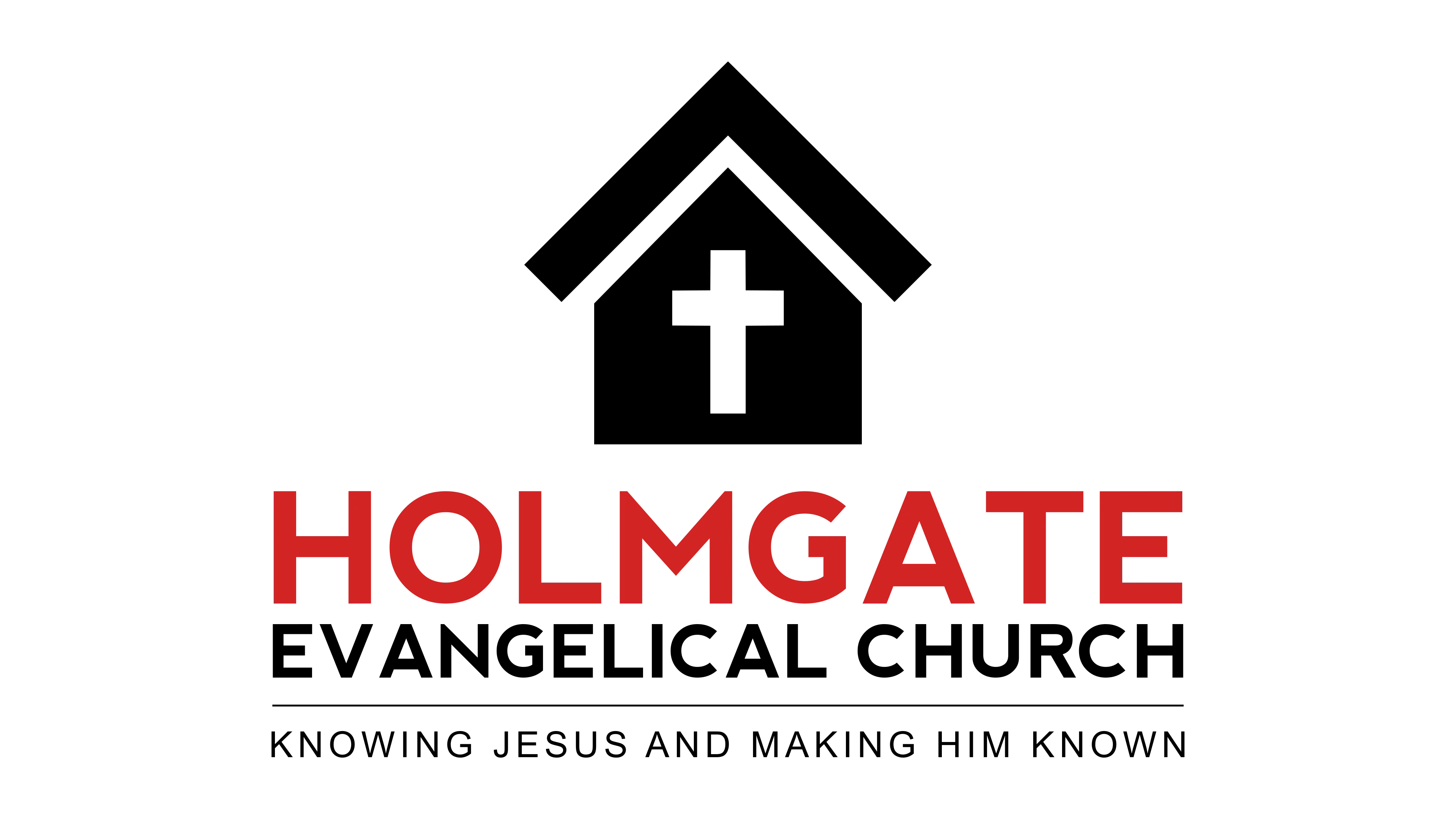
Iconic design: The ‘home’ motif combined with a cross tells a powerful story—belonging and faith as one. The icon uses a simple house outline with a cross integrated within the structure. Instantly, it communicates “a home where the cross is central.” For someone in the community, even with no church background, the imagery of a home is recognisable and inviting. It’s a memorable church icon because it’s both visually simple and emotionally loaded.
Typography: Clear, readable, and chosen to reflect both tradition and forward-thinking mission. The fonts are clean and consistent across web, print, and signage. They’re not trendy for the sake of it, but they also don’t feel dated. That balance communicates, “We honour our heritage and we are engaged in today’s world.” Good typography is one of the most underestimated parts of faith-based branding, yet it massively shapes first impressions.
Mission tie-in: Visual elements centralise the church’s message—‘Knowing Jesus and making Jesus known’. The cross in the home visually reinforces the mission statement: Christ at the centre of community, worship and everyday life. This is where church communication strategy and design meet – the words and visuals say the same thing. Over time, this consistency has helped reinforce Holmgate’s identity both for the congregation and the wider community.
This is what effective branding for churches looks like at its best: not spectacle, but clarity. An identity that feels like your church family, points to Christ, and is repeated so consistently that people recognise it in a split second.
Memorable Church Branding: Practical Takeaways for Leaders
Leaders often ask where to start. You don’t need a design degree to make big improvements. You do need honesty, focus, and a willingness to simplify. Here’s a practical set of steps you can walk through with your team as you shape your own church branding guide.
Audit your current visual touchpoints—does every piece shout the same message? Lay everything out: website screenshots, social posts, newsletters, printed leaflets, event posters, church signage, kids’ work materials. Look for mismatched logos, clashing colours, inconsistent fonts and varying tones of voice. This audit will show you how fragmented (or aligned) your current church visual identity really is.
Focus on a single, memorable icon that works at any size, anywhere. If you’ve got multiple logos in circulation, choose one direction. Test it small (social icon, WhatsApp bubble) and large (banner, exterior sign). A strong church logo design will be legible, recognisable, and distinctive even when stripped back to a simple silhouette.
Keep brand assets—fonts, colours, marks—consistent across all media. Choose a small palette of colours (often 2–3 main colours plus neutrals) and 1–2 font families. Document them in a simple one- or two-page church branding guide that volunteers can access. This is how you move towards genuine religious brand consistency without overwhelming your team.
Test designs for recall within your congregation and wider community: what adjectives do people associate after seeing your brand? Show a draft logo and ask people to describe it after a short break. Can they remember it? What words come to mind – “warm”, “modern”, “traditional”, “busy”, “confusing”? This feedback will help you evaluate both memorability and whether your visuals match your desired tone and mission.
Remember: Your brand’s job is to invite, not confuse. The goal is not to impress other designers or compete with commercial brands. The goal is to remove distractions and friction so that people can clearly see who you are and who you belong to. A calm, consistent brand gives you more emotional and cognitive space to communicate the gospel.
Working through these steps turns branding from a vague, intimidating concept into a concrete leadership task that supports congregational engagement and mission growth.

FAQ: Church Branding in Action
How often should a church refresh its visual identity?
In my experience working with churches over many years, a visual identity refresh every 6–10 years helps churches to be better able to communicate consistently across changing platforms.
That doesn’t mean reinventing everything; often it’s a careful evolution that honours your history while updating for clarity, legibility, and digital use.
How do you handle legacy branding without losing connection to older members?
The key is to treat legacy branding as an asset, not an obstacle. I normally identify what people are emotionally attached to – perhaps a particular symbol, colour, or phrase – and look for ways to carry that element forward into a cleaner, more versatile system. Involving older members in the process, explaining the missional reasons for change, and clearly showing “before and after” examples helps people see that you are stewarding the church’s story, not discarding it.
What’s the best way to get feedback before relaunching a new brand?
I recommend getting feedback in three layers: leaders, core congregation, and community. Start with the leadership team to refine theological and missional alignment. Then test with a diverse group in the congregation (different ages and backgrounds) to uncover practical issues around readability and tone. Finally, if possible, show the designs to a few people outside the church to see what impressions they get with no explanation. You’re looking for clarity, warmth, recognisability, and alignment with your intended message.
Your Church Branding Next Step: Start the Journey to Consistency & Clarity
Strong church branding is not about chasing trends or trying to look like a tech company. It’s about stewarding your visual voice so that everything you put into the world supports, rather than dilutes, your mission. A clear church visual identity, a simple and memorable church logo design, and consistent use of those elements across all media give people a stable, trustworthy picture of who you are.
If you’re feeling overwhelmed, start small: run a visual audit, commit to one logo, choose a limited set of fonts and colours, and begin using them consistently. As those changes bed in, you can expand into a fuller church branding guide that supports volunteers, staff, and ministries across the church. Over time, that consistency will help deepen congregational engagement and make your church more recognisable in the community you’re trying to reach.
If you’d like help shaping or refreshing your church’s visual identity, I’d be glad to walk that journey with you. At Church Graphic Design, I work specifically with churches and Christian organisations to create faith-based branding that is simple, biblical, and effective in today’s digital landscape. Whether you need a full rebrand, a logo refinement, or just a practical, concise branding guide your volunteers can actually use, you don’t have to figure it out alone.
Your next step: set aside time with your leadership team in the next month to review your current branding, identify inconsistencies, and decide what “clarity and consistency” should look like for your church in the years ahead. That conversation is the first, crucial step toward a visual identity that truly resonates and serves your mission.

Author
Dan Nichols BSc – Founder & Creative Designer, Church Graphic Design, Chesterfield, UK
Email: dan@churchgraphicdesign.co.uk
Website: churchgraphicdesign.co.uk
In the interests of transparency, please see my Business Interest Disclaimer: https://churchgraphicdesign.co.uk/blog/business-interest-disclaimer
Editorial Review
Content quality, communication claims, and practical applicability were reviewed by:
Ken Johnstone MBA BSc – Executive Editor, DYLBO Digital Media & Biblical Living Unlocked
Email: ken@dylbo.com





Write A Comment