
If I walked into your church for the first time, I’d probably see your graphics before I ever heard your sermon.
The noticeboard in the car park. The slide on the screens. The social post that made me curious enough to visit in the first place. In a media-saturated world, those visuals are preaching long before you stand up to speak.
That’s why church graphic design mistakes are not “just cosmetic. ” They quietly sabotage the message you care about most. When your visual identity looks amateur, generic or outdated, people subconsciously assume your message is the same.
Most churches don’t get this wrong because they don’t care. They get it wrong because they’re trying to be faithful with limited time, volunteers and budget. I see it all the time in my work with UK churches at Church Graphic Design.
What follows are the 10 most common church graphic design mistakes I see—and how to avoid them so your visuals actually support your mission instead of undermining it.
If your church visuals look like an afterthought, your message sounds like one too.
Dan Nichols - Church Graphic Design (CGD)
Why Most Church Graphic Design Falls Flat
The 21st Century Attention Deficit: Competing Against Media Saturation
Every person you’re trying to reach is scrolling past a wall of polished content every day—Netflix thumbnails, Spotify covers, high-end ads, and beautifully designed social posts. According to Statista (2023), people are exposed to well over 5,000 marketing messages daily across TV, online, outdoor and mobile channels. Whether they realise it or not, their eyes have been trained to filter out anything that looks weak, cluttered or cheap.
Today’s audiences are exposed to thousands of marketing messages daily (Statista, 2023), setting a very high bar for visual quality.
Generic or outdated church designs are simply drowned out in that digital noise; they don’t even get a second glance.
A strong, meaningful visual identity is now essential—not optional—for churches that want their message to be noticed and taken seriously.
The hard truth is this: when your church graphics look like they were cobbled together in five minutes, people don’t just ignore the design; they instinctively downgrade how seriously they take your message.
Understanding the importance of visual identity is just one piece of the puzzle—aligning your graphics with your church’s core beliefs can further strengthen your message. For practical ways to ensure your visuals reflect your values, explore how your church’s beliefs can shape your design choices.

Mistake #1: Settling for DIY Designs Over Impactful Branding
Don’t DIY your church’s mission—your design is your digital handshake.
Dan Nichols - CGD
The most common church graphic design mistake I see is simple: trying to do it all in-house because it feels cheaper and quicker. Someone who’s “good with PowerPoint” or “has Canva” gets asked to make the sermon series graphics, the event flyers, the social posts, the welcome banners…the list goes on.
To save money, many churches ask staff or volunteers to create graphics in-house, on top of everything else they do.
Those DIY graphics usually focus on squeezing the church name, date and time into a layout, rather than creating a memorable visual that actually engages people.
Without professional insight, you miss the opportunity to build a recognisable, trustworthy visual identity that sticks in people’s minds.
This isn’t a criticism of volunteers—most are doing their absolute best. The problem is structural. When I design for a church, I’m not just “making things look nice. ” I’m thinking about how fonts, colour, composition and imagery work together to make the message clear and compelling to the people you’re trying to reach. That kind of intentional branding is very hard to achieve as an afterthought in the spare ten minutes before the service.
Mistake #2: Failing to Craft a Memorable, Mission-Centric Logo
Why Visual First Impressions Matter
Your logo is often the first and most frequent touchpoint people have with your church. It sits on your website, your signage, your social profiles, your invitations and your printed materials. It’s more than decoration; it’s your visual signature.
Logos are the church’s signature—what people remember and recognise when they see you online or in the community.
A memorable logo can quietly encapsulate both your mission and your message, creating emotional resonance long before anyone hears you preach.
A weak logo—generic cross, random clip-art dove, or just the church name in a default font—communicates very little. Worse, it can signal that your church is stuck, inward-looking or out of touch. A thoughtful logo, on the other hand, can embody what you’re about in a way people instantly “feel,” even if they can’t quite explain why.
Case Study: Newthorpe Church’s Heartfelt Logo
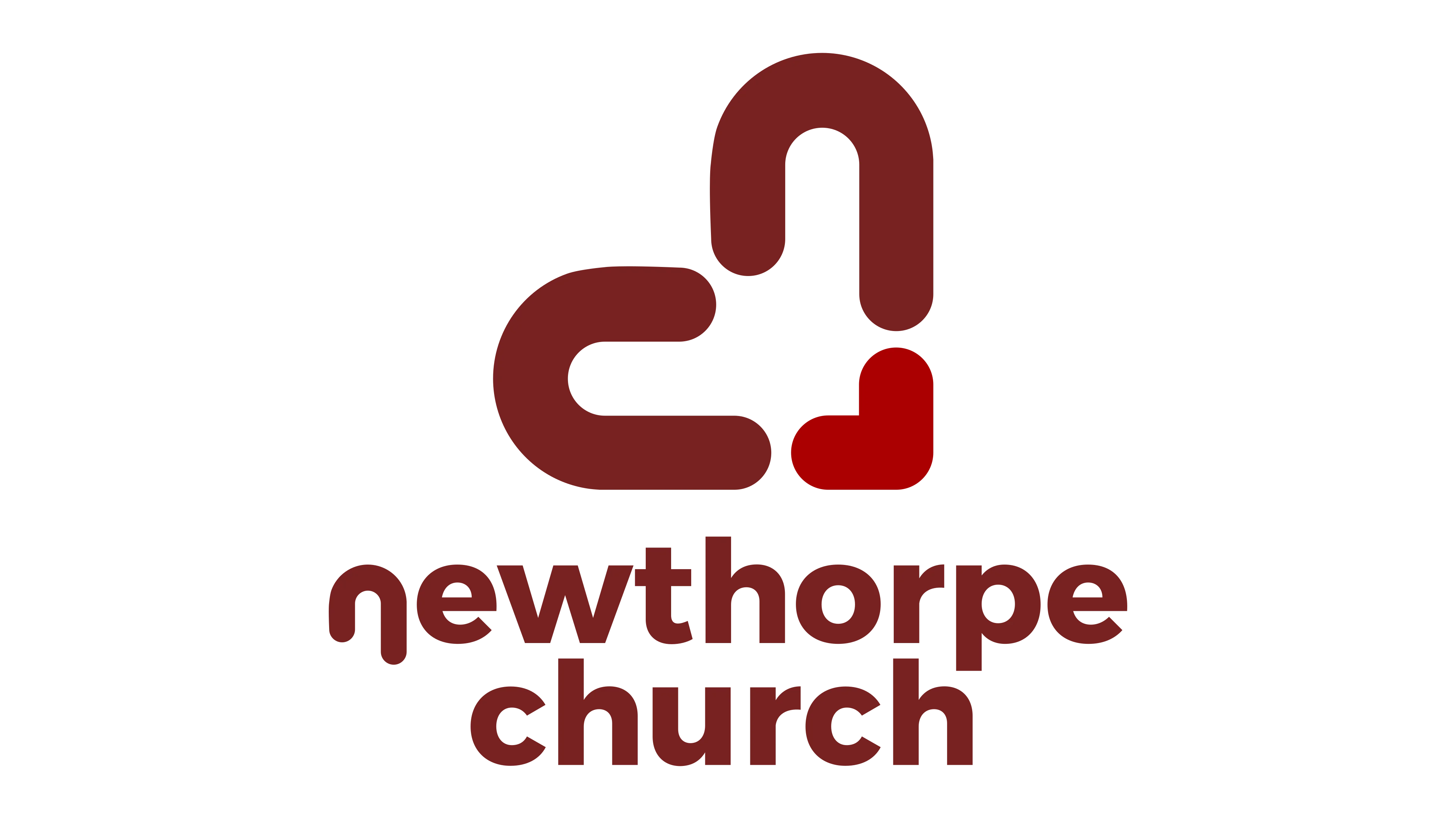
In the final mark, the “N” from Newthorpe and the “C” from Church were integrated in such a way that they formed a heart, visually embodying Christ’s love at the core of their identity.
Because we’d designed it as a flexible system, they could use it consistently across social media, their website, printed materials and signage without it ever feeling forced.
The result was stronger, more immediate recognition from both the congregation and the surrounding community—people saw the logo and instantly connected it with a church that genuinely cared.
That’s the power of getting your logo right: it quietly preaches your values before a single word is spoken.

Mistake #3: Overlooking Audience and Message Alignment
Design isn’t decoration—it’s one of your evangelism tools.
Dan Nichols - CGD
Another subtle but serious church graphic design mistake is treating visuals like wallpaper. A background. Something to fill a space. In reality, design is communication. Every choice—typeface, image, colour, layout—is saying something to someone.
Effective graphics should echo your church’s distinct voice and the real needs, questions and culture of the people you’re trying to reach.
When your visuals don’t match your message or your audience, you send confusing signals and unintentionally dilute your outreach.
If your church is warm and relational but your graphics are cold and corporate, people get mixed messages. If you’re trying to engage young families but your designs feel like a 1990s clip-art catalogue, they’ll assume you don’t understand their world. Design that is aligned with both message and audience becomes a bridge; misaligned design becomes a barrier.
Mistake #4: Ignoring Consistency Across All Church Materials
Visual inconsistency is one of the fastest ways to weaken trust without realising it. I’ve seen churches where the Sunday slides look one way, the website another, the social media posts yet another, and the printed notices like they belong to a different organisation altogether.
Inconsistent design weakens trust and brand recognition because people can’t easily connect all the pieces to a single, coherent church identity.
Unified visuals across social media, websites, flyers, screens and print build familiarity, credibility and a sense of belonging.
When your colours, fonts, logo usage and general style are consistent, people start to recognise your church at a glance. That recognition builds comfort: “I know these people; I’ve seen them around; I trust them more. ” Consistency isn’t about being fancy—it’s about being reliably yourself in every space you show up.

Mistake #5: Neglecting Professional Expertise—Why Going It Alone Rarely Works
The Value of External Insight
Most church teams are already stretched thin with preaching, pastoral care, youth work, admin and outreach. Adding “also be a professional designer” to someone’s job description is rarely fair or effective. There’s a reason people train and work for years in this field.
Experienced graphic designers know how to translate your mission into visuals that connect emotionally and spiritually with real people.
Working with a professional partner keeps your church visually relevant in a rapidly evolving media world without you having to constantly chase trends yourself.
Bringing in external expertise also introduces healthy objectivity. I’m not emotionally attached to “how we’ve always done it,” which means I can ask better questions: Who exactly are you trying to reach? What do they actually see in their feeds every day? Where does your current visual language help—or hinder—that connection?
My “Message-First” Framework
When I work with churches, I use a simple but powerful framework. It’s not about trends or personal taste; it’s about making sure the message leads the design every time.
Clarify the core message. Before opening any design software, I help you define what you’re actually trying to say. What do you want people to feel and do after encountering this graphic?
Map the target audience. We explore who you’re speaking to—their age, culture, digital habits, and spiritual starting points—so we’re not just designing for “people in general.”
Build one compelling visual language. From there, I craft a unified visual system—logos, colours, fonts, imagery style—that ties that message and that audience together everywhere you show up.
When you stop going it alone and start designing from a message-first perspective, your visuals become ministry tools rather than last-minute tasks.

Mistake #6–10: Common Pitfalls in Church Design (And Quick Fixes)
Beyond the big-picture branding issues, there are a handful of practical church graphic design mistakes that crop up again and again. The good news is they’re often easy to improve once you can see them.
Using outdated fonts and colours. Retro can be a deliberate style, but most of the time old-fashioned typefaces and muddy colours simply signal irrelevance. Research in church communications (e.g. Church Marketing Sucks, 2022) notes that dated visuals are commonly associated with a church being out of touch. Quick fix: Choose two or three clean, modern fonts and a simple, well-contrasted colour palette—and stick to them.
Text-heavy graphics. If your sermon slide or event graphic reads like a notice sheet, people won’t read it. Visual clutter drowns your core message. Quick fix: Aim for one clear main idea per graphic, supported by a short headline and minimal supporting text. Move details to the caption, website or a follow-up link.
Ignoring accessibility. Tiny text, low contrast, and colour combinations that are hard for colour-blind users to see will quietly exclude people—often older members or those viewing on small screens. Quick fix: Use large enough text, high contrast between foreground and background, and tools like colour-contrast checkers to ensure readability for as many people as possible.
Over-relying on generic stock photos. Stock images of perfect strangers praying in perfectly staged chapels rarely reflect your actual congregation or community. They may look “nice” but they don’t build local connection. Quick fix: Use authentic photography of your real people and spaces wherever possible—even a simple, well-lit smartphone photo often feels more genuine than polished stock.
Neglecting feedback and iteration. Many churches create one design, use it for years and never pause to ask if it’s actually working. No feedback means no growth. Quick fix: Ask a few people from different age groups and backgrounds how your graphics feel to them. What confuses them? What attracts them? Use that feedback to make small, regular improvements.
Key Takeaways: Elevate, Don’t Undermine, Your Church’s Message
Professional, consistent, mission-led church graphic design builds recognition and trust so people are more ready to hear the gospel you share.
When you prioritise both your message and your audience in every visual, you open doors to deeper, more meaningful engagement inside and outside the church.
The way your church looks online and on print often determines how willing your community is to listen offline.
In a media-rich age, you can’t avoid making a visual statement—you can only choose whether it’s intentional and aligned with your mission, or accidental and undermining it.
FAQ: Church Graphic Design Mistakes in Practice
How do we know if our design is working?
I look for two kinds of feedback: quantitative and qualitative. Quantitatively, you might see higher engagement on social posts, more people noticing and sharing your content, or increased awareness of events. Qualitatively, listen for comments like “I’ve seen your stuff around a lot” or “That series really caught my eye”—those are signs your visuals are cutting through and reinforcing your message.How much should churches expect to invest?
Investment varies depending on your context, but I encourage churches to think in terms of long-term value, not one-off cost. A well-crafted logo and visual identity can serve you for years across every channel, which often makes it one of the most efficient communications investments you can make. Even modest budgets can go a long way if you focus on core assets—logo, type, colour and templates—rather than endlessly redesigning from scratch.Can small churches still afford impactful visuals?
Absolutely. Impactful doesn’t have to mean extravagant. Smaller churches can get a lot of mileage from a simple, well-designed visual system and a small set of reusable templates. Partnering with a professional for a focused project, then rolling that out consistently in-house, is often far more effective than years of ad-hoc DIY that never quite works.What’s a quick first step to improve our graphics?
The fastest win is usually to simplify and standardise. Choose one or two fonts, a restrained colour palette, and start using your logo consistently everywhere. Then, for each new graphic, ask: “What is the one thing we want people to remember from this?” Design for that single message, and move everything else into supporting channels like your website or announcement time.
Ready for a Clearer Message? Let’s Talk
You don’t have to fix every church graphic design mistake overnight, and you certainly don’t have to figure it out alone. The key is to move from “we need something on the screen” to “we want our visuals to serve our mission. ”
Book a free discovery discussion with me at Church Graphic Design, and we’ll look together at where your visuals are helping—or hindering—your message.
Get personalised, practical advice on your church’s next design steps so your graphics, logo and online presence clearly reflect the hope of Jesus you long to share.
If you’d like to talk, you can reach me via dan@churchgraphicdesign.co.uk or visit churchgraphicdesign.co.uk.
As you continue refining your church’s visual identity, remember that design is most powerful when it’s rooted in your core convictions. If you’re looking to deepen the connection between your church’s beliefs and every aspect of your communication, take a moment to review what truly shapes your church’s message and mission. Exploring your foundational values can inspire not only better graphics, but also a more unified and compelling presence—online, on print, and in the hearts of your community.

Author Information
Dan Nichols BSc
Founder & Creative Designer, Church Graphic Design, Chesterfield, UK
Email: dan@churchgraphicdesign.co.uk
Website: churchgraphicdesign.co.uk
Education: BSc Mathematics and Statistics with Management; Qualified Teacher Status (QTS). I have over 8 years of experience helping UK churches improve their visual communications and digital presence, working with congregations of different sizes and traditions to develop clear, effective design and communication strategies.
Editorial Review
This article was reviewed by Ken Johnstone MBA BSc, Executive Editor, DYLBO Digital Media & Biblical Living Unlocked (ken@dylbo.com). Ken evaluated the communication claims against current research, fact-checked the examples and processes for accuracy and practicality, and reviewed the pastoral framing for consistency with evangelical ecclesiology.
In the interests of transparency, please see our Business Interest Disclaimer: https://churchgraphicdesign.co.uk/blog/business-interest-disclaimer.





Write A Comment