
“Most churches don’t realise their logo is communicating something long before anyone hears a sermon. ”
Before anyone hears your preaching, experiences your worship, or meets a single member of your church, they’ve already met your logo.
On your website. On a flyer. On a noticeboard they pass on the school run. That simple mark is telling them something about who you are, how you see them, and how relevant the gospel might be to their life.
When I audit church logos, I’m not just looking at colours and shapes. I’m asking: does this logo make the church feel like a living, welcoming community… or like a distant club for insiders?
That’s why I take the church logo audit: what makes a logo effective (and what usually goes wrong) so seriously. A church logo won’t save anyone, but it can either clear the way to the gospel—or quietly get in its way.
The Hidden Power of Your Church Logo: Why First Impressions Matter More Than You Think
Most church leaders I speak to underestimate how much their logo shapes first impressions. They’ll happily spend weeks on a sermon series title, but the logo that sits above it? That often hasn’t been touched in 15 or 20 years.
Yet for most people in your community, your logo is their first contact with your church. Not your welcome team. Not your preaching. A tiny image on Google Maps or on a Facebook event.
When I ask leaders what their logo is “about”, the answer is often something like, “Well, it’s our church name and a cross. ” That’s a start—but it’s not enough. An effective church logo should:
- Echo the heart of the gospel
- Reflect the character of your particular church family
- Hint at your vision, ministry focus, or tagline
- Offer a “hook” into the wider community you’re trying to reach
If your logo doesn’t do any of that, your church can easily be perceived as just another building, another service time, another religious option with no clear reason to care.
A church logo either opens the door—or shuts it—before anyone walks in.
Dan Nichols
The church logo audit: what makes a logo effective (and what usually goes wrong) really comes down to this: does your logo quietly say “this is for people like you” or “this is for people who already belong”?

The Common Trap: Why Outdated and Generic Logos Make Churches Invisible
When I review logos, I see the same problems again and again. They’re not malicious decisions—just inherited ones. But over time, they make churches visually invisible.
-
Mistaking a logo for just a church name or cross
Many churches assume that writing the name in a decent font and adding a cross is enough. The result is something technically “correct” but emotionally empty. It doesn’t express the life, warmth, or mission of the church in any meaningful way. -
Relying on tired, generic visuals without meaning
Clip-art doves, glowing globes, random swooshes. If a symbol could belong equally to ten other churches—or to a charity or conference—it isn’t really saying anything about your particular church or your particular community. -
Ignoring how the logo relates to the wider community
A logo that only speaks an “insider language” quietly tells outsiders, “This isn’t for you.” If your visuals don’t in some way connect with the people, place, and everyday realities around you, they will never feel like an open invitation. -
Holding onto dated designs out of habit or nostalgia
I often hear, “But we’ve always had this logo,” or, “Someone in the church designed it years ago.” Sentiment is understandable, but a logo that once felt fresh can now make your church look frozen in time—even if your ministry is vibrant and active today.
The tragedy is that many churches doing faithful, gospel-centred work are let down by logos that make them look dusty, confusing, or simply forgettable.
If your logo looks like every other church, your message disappears.
Dan Nichols

Why Logos Fail: The Real Reasons Churches Miss the Mark
The surface problems—odd colours, awkward fonts, cluttered icons—are usually symptoms of deeper issues. When I carry out a church logo audit, I’m really probing four root causes.
-
Failure to communicate the church’s unique vision or gospel focus
Many churches design logos in isolation from their theology, teaching emphasis, or ministry priorities. An effective logo doesn’t need to illustrate every doctrine, but it should point to something distinctive about how you live out and share the gospel where you are. -
Neglecting the church’s story, mission, and local heartbeat
Your church has a history, a people, and a place. Logos often fail because they could belong anywhere, to anyone. When a logo flows from your story—how you began, who you serve, what you long to see God do—it stops being decoration and becomes meaningful. -
Inconsistency across print, digital, and signage
I frequently see one version of a logo on the website, another cropped version on the sign, and yet another variation on the notice sheet. That inconsistency erodes trust. People wonder, often subconsciously, “If they can’t be clear visually, will they be clear in other areas?” -
Complexity that confuses instead of invites
Overdetailed crests, tiny text, multiple symbols all fighting for attention—these are common mistakes. A logo has to work on a phone screen, a road sign, and a social media avatar. Complexity makes it harder to remember and harder to relate to.
Just as a church logo should reflect your unique mission and connect with your community, the way you manage your time and priorities can deeply influence your ministry’s impact. For a practical look at how intentional choices shape both family and church life, consider exploring these insights on understanding parenting and time from Ben Sasse, which offer valuable lessons for leaders seeking to build authentic, welcoming environments.
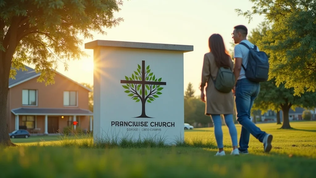
The Walton Evangelical Example: How One Logo Sparked Growth
At Walton Evangelical Church, where I serve as a deacon, we wanted a logo that did more than place a cross above some text. We wanted something that spoke both of the cross of Christ and the life and growth that flow from it into our local community.
-
Combined the cross within a living tree—merging tradition and community relevance
The cross forms the trunk and branches of a tree, grounding everything in Christ while expressing life and growth. It honours historic Christian symbolism but avoids feeling sterile or generic. -
Symbolised both faith’s roots and outreach into the community
The spreading branches visually echo reaching out into our neighbourhood. It’s a simple way of saying, “The gospel is rooted here, but it doesn’t stay here. It grows outward.” -
Resulted in increased local recognition and engagement
As we applied it consistently—to our website, banners, flyers, and signage—people began to say, “Oh, that’s the church with the tree logo.” It gave us a recognisable hook in the community and a natural conversation starter about who we are and what we believe.
This is what the church logo audit: what makes a logo effective (and what usually goes wrong) looks like in real life: a simple, thoughtful visual that makes your presence clearer and your message more approachable.
A well-designed logo can help a church feel alive and approachable—not just another building on the street.
Dan Nichols
Dan Nichols’ “3C Framework” for an Effective Church Logo Audit
When I work with churches, I use a simple but robust grid: Clarity, Consistency, Community Connection. These three Cs quickly reveal why a logo is working—or why it isn’t.
-
Clarity: Is the logo simple, instantly recognisable, and meaningful?
Can someone glance at your logo and understand it in a split second? Does it reproduce well at small sizes? Is there one clear idea, or several competing ones? Clarity is what makes a church logo memorable and effective. -
Consistency: Is it used everywhere—website, flyers, signage?
A good logo, used inconsistently, becomes a weak logo. Repetition builds recognition. If your church sign, website, social media, and printed materials all look different, your visual identity feels fractured. Consistency quietly builds trust. -
Community Connection: Does it reflect who you are and engage those you want to reach?
Does your logo, and the way you use it, say anything about the people, place, and community you serve? Is there any sense of warmth, welcome, or relevance to everyday life? If not, you risk feeling like an insular club rather than good news for real people.

Your logo shouldn’t just mark your church. It should invite your community into it.
Dan Nichols
How to Rethink and Refresh: Simple Steps for Church Leaders
You don’t have to overhaul everything overnight. A thoughtful church logo audit can start with a few intentional steps. Here’s a simple process I encourage church leaders to follow.
-
Review: Ask if your current logo truly sums up your identity and purpose.
Print it out. Put it on the screen. Sit with your leadership team and honestly ask: does this still represent who we are? Does it reflect our gospel heart, our current ministries, and the community we’re trying to reach—or just who we were 20 years ago? -
Include: Gather feedback from both leaders and newcomers.
Don’t only ask long-term members, who may be attached to the logo. Ask newcomers, fringe attenders, and people who live locally but don’t attend. What does this logo say to you? How does it make the church feel: welcoming, distant, dated, vibrant? -
Simplify: Trim complexity—focus on a design anyone can remember.
If your logo relies on tiny details, multiple fonts, or several different symbols to “explain” everything, it’s probably too complex. The strongest church logos are simple enough to be doodled from memory, yet rich enough in meaning to spark conversation. -
Unify: Use the logo everywhere, building trust through repetition.
Once you’ve refined or refreshed your logo, commit to using it consistently. Website, social media, noticeboards, screens, banners, kids’ work, outreach events—the same mark, the same colours, the same sense of identity. Over time, this creates a strong, trustworthy presence. -
Connect: Ensure your visuals welcome, intrigue, and reflect your gospel mission.
Stand back and ask: if I knew nothing about Jesus, would this visual identity make me curious? Would it feel like an open invitation? Your logo, colours, and overall design language should make the good news look like what it is—good news for real people, right here, right now.

FAQs: Church Logo Audit Essentials
-
How often should we review our church logo?
I recommend informally reviewing your logo every 3–5 years, and more thoroughly every 7–10. That doesn’t mean you must redesign it each time, but you should ask whether it still reflects your current church life, ministries, and community context. Culture changes, your church grows, and your visual identity should be able to keep pace. -
What’s the difference between a logo and full church branding?
Your logo is a single mark; your branding is the wider visual language around it—colours, fonts, imagery, tone, layouts, and how everything works together. A logo on its own can’t solve communication problems, but as part of thoughtful, consistent church branding it can help people recognise you, trust you, and feel more at ease engaging with your ministries. -
Can you modernise without losing tradition?
Absolutely. Some of the best church logo refreshes I’ve worked on have kept historic elements—like a cross, traditional colours, or a long-standing symbol—but refined them into a cleaner, more flexible style. The goal isn’t to chase trends; it’s to express timeless truth in a way that doesn’t feel stuck in a previous decade. -
How do you know when it’s time to refresh?
It’s usually time for a refresh when your logo feels out of step with who you are now, when it’s hard to use across modern platforms, or when newcomers consistently describe it as confusing, old-fashioned, or unwelcoming. If your visuals say “club for members” rather than “good news for this community”, a church logo audit is overdue.
Key Questions for Every Church Logo Audit
If you do nothing else after reading this, take ten minutes with your team and honestly answer these questions about your current logo and visual identity.
-
Does our logo reflect who we are—as a church and a community?
Is there a genuine relationship between what people experience when they meet your church family and what they see on your signage, website, and printed materials? Or is there a noticeable mismatch between the warmth of your people and the stiffness of your visuals? -
What’s the story our visuals tell—outdated, insider-only, or open and relevant?
Look at your logo, colours, fonts, and overall style. Do they quietly say, “You’d need to understand our history to get this”, or, “This is how we’ve always done it”? Or do they suggest, “We’re here, we’re alive, and this good news really is for people like you”? -
Are we building trust and welcome with every first impression?
People make snap judgements. A clear, consistent, carefully considered identity says, “We’ve thought about you. We care that you understand what we’re about.” That visual clarity can lower barriers and help people feel safer stepping through your doors—or even just clicking a link.

Is Your Logo Helping or Hurting Your Mission? It’s Time for an Audit
Logos don’t preach, but they do prepare the ground. They can either help people see your church as a living, welcoming community centred on Christ—or reinforce the stereotype of a closed, dated religious club.
If you’re serious about the church logo audit: what makes a logo effective (and what usually goes wrong), start by asking the hard questions:
- Does our logo still represent who we are and what we believe?
- Does it connect with the people we’re trying to reach right now?
- Is it clear, consistent, and genuinely welcoming?
Clarity, welcome, trust, and relevance start with your visuals. Audit your logo; audit your impact.
Dan Nichols
Transform Your Church’s Identity – Get Your Free Logo Consultation 07968 804 636
If you’re looking at your current logo and wondering whether it’s helping or quietly hindering your mission, I’d love to help. At Church Graphic Design, I specialise in coming alongside churches to review, rethink, and refresh their visual identity in a way that’s gospel-centred, practical, and sensitive to your context.
Call me on 07968 804 636 for a free, no-pressure logo consultation, and let’s explore how your visuals can better serve the message you proclaim and the community you long to reach.
If you’re ready to take your church’s visual identity to the next level, remember that effective communication extends beyond logos and branding. The principles of clarity, consistency, and connection are just as vital in how you lead, serve, and relate to your congregation and community. For a deeper dive into building meaningful relationships and stewarding your influence—whether in church, family, or everyday life—explore the broader lessons on intentional living and time management from Ben Sasse. These insights can help you foster a culture of welcome and purpose, ensuring your church’s message resonates far beyond its walls.
To further deepen your understanding of designing meaningful and effective church logos, the resource The Ultimate Guide to Church Logos offers comprehensive strategies on logo development tailored to modern church needs. Additionally, 10 Church Logo Design Tips: How to Create a Great Church Logo provides actionable tips to ensure your logo communicates the heart of your church and resonates with your community. If you’re serious about perfecting your visual identity, these resources will give you proven frameworks and practical steps to create a logo that truly supports your mission.


Write A Comment