cropper
update
Church Graphic Design
Church Graphic Design - Logo
update
  • CGD Website
  • Blog Home
  • Blog Categories
    • Faith Branding
    • Identity Workshops
    • Case Studies
    • Expert Interviews
    • Campaign Analysis
    • Brand Consistency
    • Community Engagement
    • News
    • Technology Updates
June 26.2026
1 Minute Read

Overcoming Common DIY Church Graphic Design Problems: Expert Tips for Ministry Leaders

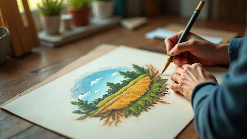
Most DIY church graphic design fails before anyone even opens Canva!

Not because leaders don’t care, and not because they’re not trying hard enough, but because the design process starts in the wrong place: inside the building, not out in the community.

When I speak with ministry leaders, I often hear, “We just need a nicer flyer,” or “We need better social media posts. ” But the deeper problem isn’t aesthetic; it’s strategic. The visuals don’t reflect the people the church is called to reach, so the message simply gets ignored in a crowded digital world.

In a culture where people “judge the book by its cover” in 1. 5 seconds while scrolling, DIY church graphic design isn’t a side issue - it’s a frontline tool for evangelism, hospitality, and discipleship. When your graphics are unclear, inconsistent, or inward-looking, people never even get close enough to hear the good news you desperately want to share.

My aim in this article is simple: to help you overcome the most common DIY church graphic design problems with practical, mission-shaped strategies you can start using immediately - even if you don’t have a much of a budget or access to a professional designer.


Why Most DIY Church Graphic Design Falls Flat - and How to Break Through

“If your visuals don’t reflect your community, your message won’t be noticed.”

Dan Nichols - Founder, Church Graphic Design (CGD)

The Invisible Trap: Designing for the Congregation Instead of the Community

The most common mistake I see in DIY church graphic design is an almost total inward focus. The question being asked - consciously or not - is, “What do we like as a congregation?” rather than, “Who actually lives in our community, and what will connect with them?”

  • The internal focus dilemma: why many churches miss their true audience

It’s natural to think about current members first. You know their preferences, their history, their traditions. So the graphics end up reflecting that internal culture: familiar imagery, insider language, and designs tailored to people who are already in the room. The result? You create visuals that feel comfortable to the congregation but invisible to the wider community you’re hoping to reach.

  • The cost of ignoring your community’s demographics

Every community has a unique mix of age ranges, cultures, educational backgrounds, and digital habits. A retirement-heavy village will engage very differently to a city-centre student population. If I ignore that—and just design what “feels churchy”—I effectively ask my neighbours to cross a cultural bridge before they even hear the message. Poorly targeted design silently says, “This isn’t for you,” long before words like “welcome” or “Jesus” appear.

  • Failing to connect mission, vision, and visuals

A lot of DIY design is reactive: “We need a poster by Sunday,” or “We must post something about the new series. ” The mission and vision are rarely allowed to shape the visuals. When my graphics don’t clearly echo what my church exists to do—who we serve, why we’re here, how we want to bless people—then they become decoration, not communication. Mission-drift often starts on the noticeboard and the Instagram grid long before it shows up in the pulpit.

Effective DIY church graphic design doesn’t ask, “What do we like?” It asks, “Who is God sending us to, and how can our visuals make that invitation impossible to miss?”

Warm and diverse church congregation chatting and connecting in a bright modern church lobby with natural light and community-focused décor

The Digital Age Demands Attention—Here’s How Churches Can Compete

“In a world of vivid graphics, mediocre design becomes invisible. ”

Dan Nichols - CGD

We live in a digital age where every swipe, tap, and scroll is a battle for attention. Netflix, brands, influencers, and charities all invest heavily in visuals that are sharp, bold, and beautifully crafted. The church is entering that same space—whether it wants to or not.

  • Why digital-first visuals are no longer optional for ministry outreach

For many people in your town, the first encounter with your church won’t be through the doors; it will be through a screen. A Facebook event image, an Instagram story, your website homepage, a YouTube thumbnail—that’s your new front door. If that digital “front door” feels dated, messy, or unclear, they quietly decide, “This isn’t for me,” and move on, sometimes without even realising they’ve made that decision.

  • How eye-catching design can help your church ‘stop the scroll’

“Stopping the scroll” doesn’t mean chasing trends or being gimmicky. It means offering something arresting enough, relevant enough, and human enough to make someone pause. Strong colour contrast, simple headlines, uncluttered layouts, and imagery that reflects real people in your community are all simple tools you can apply in your DIY church graphic design today. The goal isn’t to show off; it’s to create just enough visual friction for someone to say, “Wait—this might matter to me. ”

For churches looking to ensure their visuals truly reflect their beliefs and values, it’s helpful to revisit the foundational statements that guide your ministry. Reviewing resources like What We Believe can help align your design choices with your church’s core message, ensuring every graphic communicates both identity and invitation.

  • Key insight: most people think in pictures before they think in words

A huge percentage of people process information visually. Imagery and design create emotional context long before anyone reads your copy or watches your sermon. Well-crafted graphics bridge the gap between theological truth and everyday life, helping people feel, “This is relevant and understandable,” not, “This is abstract and distant. ” When my visuals do that work well, the gospel message doesn’t just arrive; it lands.

Close-up of hands pausing mid-scroll on a smartphone displaying a colourful church-branded social media post in a modern cosy workspace

The “Open Field” Framework: A Ministry Design Success Story

Case Study: Stenson Fields Christian Fellowship’s Visual Transformation

One of my favourite examples of mission-shaped design in practice is the story of Stenson Fields Christian Fellowship. They’re based in a rural context, surrounded by fields, farms, and people whose lives are closely tied to the land. For years, their identity and graphics looked like almost any church anywhere—generic cross icons, muted gradients, and clip-art style imagery.

  • From generic branding to community-responsive identity

When we started rethinking their DIY church graphic design, we began not with colours or fonts, but with questions: Who lives here? What do they value? What does “good news” feel like in this place? We listened, walked the local area, and paid attention to the language people used about their town. Only then did we move towards visuals that could honestly say, “This church understands where you live and what your life looks like. ”

  • How a logo with rural imagery built an authentic connection

Their new logo uses the picture of an open book that, at first glance, looks like a field. The “pages” are shaped like leaves—suggesting growth, creation, and life. It’s simple, but layered: Scripture as seedbed, the local fields as mission field, and the church as a place of growth. People in the area immediately recognised themselves and their environment in the mark. It felt both local and hopeful.

  • What changed for engagement, attendance, and outreach

Once that visual foundation was in place, everything else followed: event invitations, sermon graphics, social media posts, signage. Their communications started to feel coherent, warm, and rooted in place. Small comments like that are early signs of deeper engagement—people shifting from ignoring to noticing, from noticing to exploring. Design didn’t replace preaching, prayer, or pastoral care, but it removed a barrier many didn’t even know was there.

“Your design is the front door to your church’s vision—make it inviting. ”

Dan Nichols - CGD

Graphic designer sketching a rural-inspired church logo with open fields and leaf-like pages on a desk surrounded by creative tools and mood boards

Dan Nichols’ “Step-Back Strategy” for DIY Church Graphic Design

Five Key Questions Before You Start Designing

Before I open any design software, I follow a simple “Step-Back Strategy. ” Instead of rushing straight into making something, I deliberately pause and ask questions that align my design with mission, people, and context. If you apply this to your own DIY church graphic design, you’ll solve half your problems before you’ve chosen a single font.

  1. Who really is my community—beyond our current congregation?
    I map out who actually lives around the church: ages, life stages, work patterns, culture, digital habits. I consider who rarely or never comes on a Sunday. Those people are part of the community I’m called to serve, and my visuals should make sense to them too.

  2. What message or story does our church need to share?
    Every graphic should have a clear purpose. Am I inviting? Explaining? Encouraging? Celebrating? I write that message in one simple sentence first, then design something that amplifies that sentence rather than distracting from it.

  3. Does our visual identity reflect our mission and vision?
    I compare the visuals with the church’s stated values and vision. If the mission speaks of warmth, welcome, and community but the graphics feel cold, busy, or corporate, I know something’s off. The look and feel should embody what the church says it is.

  4. What demographic are we hoping to engage through design?
    Different audiences respond to different approaches. A youth event for teenagers will look and feel different from a bereavement support group or a toddler group. I don’t try to make one graphic speak to everyone at once. I design with a specific person in mind.

  5. Who can help us move from DIY to missional design excellence?
    DIY doesn’t mean “do it alone.” I ask who in the church has an eye for design, communication, or photography—and where I might need outside help. Sometimes a short-term partnership with a specialist can create templates, brand guides, or core assets that make ongoing DIY work far more effective.

Those five questions turn design from a last-minute task into a ministry practice—one that serves people, not just fills space.

DIY Graphic Design Pitfalls—and How to Avoid Them

  • Ignoring context: why stock designs miss the mark

Stock templates and generic “church graphics” can be a helpful starting point, but if I use them without adapting them to my context, I send a bland, copy-and-paste message. In my town, life isn’t set in a flawless UK suburb or a sleek large church auditorium. They live where they live. Swapping in local photography, contextual language, and imagery that reflects real people immediately makes design feel more human and more credible.

  • Consistency is key: how to build recognisable church branding

Random fonts, shifting colours, and constantly changing styles are some of the quickest ways to confuse people. Consistency in DIY church graphic design doesn’t require a huge budget; it requires decisions. A small set of brand colours, 1–2 fonts, a simple logo, and a general style for photography or illustration can instantly raise the sense of trust and professionalism. When people repeatedly see the same look and feel, they learn, “This is that church,” often before they read a word.

  • Practical steps to elevate visuals even without a big budget

Even if resources are tight, there are practical moves you can make:

  • Use fewer elements, not more—simplicity looks more professional than clutter.

  • Choose high-quality, royalty-free images and avoid grainy, stretched, or pixelated photos.

  • Limit your colour palette and stick to it across all channels.

  • Use hierarchy—make the main message big and clear; keep details smaller.

  • Create reusable templates for recurring items (sermon series, events, quotes) to save time and maintain consistency.

The aim isn’t perfection; it’s clarity and integrity. When your visuals are simple, consistent, and community-aware, they become a genuine extension of your ministry, not a distraction from it.

Volunteer church team member reviewing colour swatches and logo variations for consistent church branding at a tidy, modern workspace

Key Takeaways: Unlocking Community Connection with DIY Church Graphic Design

  • Align your visuals with both your mission and the people you’re called to serve
    Every piece of DIY church graphic design should sit at the intersection of who your church is and who your community is. If either side is missing—mission or people—the visuals will ring hollow.

  • Great design is your first impression in a crowded digital world
    For many, your graphics will be the first sermon they “hear.” When they are thoughtful, warm, and clear, they open the door for deeper engagement: services, conversations, discipleship, and ultimately, encounters with Jesus.

  • The most effective graphics blend gospel truth with creative storytelling
    Design isn’t about being flashy; it’s about telling the right story in the right way. When your visuals echo the gospel—hope, grace, truth, community—in a style that resonates with your actual neighbours, you create a powerful bridge between Sunday message and weekday life.

Diverse community enjoying a vibrant outdoor church event with banners and creative visual displays in a sunny church courtyard

FAQs: Answering Church Leaders’ Most Common Graphic Design Questions

  • Do I need a professional designer to get started?
    No, you don’t need a professional designer to begin improving your DIY church graphic design, but you do need intentionality. Start by clarifying your audience, mission, and visual foundations (colours, fonts, and style). Then, as you grow, consider partnering with a professional to create core assets or a simple brand guide that your team can confidently use and build upon.

  • How often should we update our church graphics?
    Core branding elements—logo, colour palette, typography—should stay consistent over several years so people recognise you. Within that framework, update your graphics regularly to reflect new series, seasons, and events. If your visuals feel dated or confusing, it may be time for a refresh, but evolution is usually better than constant reinvention.

  • What tools and resources are best for small church teams?
    Tools like Canva, Adobe Express, or similar browser-based platforms are ideal for small teams doing DIY church graphic design. They offer templates, drag-and-drop functionality, and easy sharing. Combine these with a simple shared brand kit (logo files, colours, fonts) and a central folder of approved images, and your volunteers can produce far more consistent, high-quality visuals without needing advanced design skills.


Ready to Transform Your DIY Church Graphic Design?

Confident church leader welcoming people in front of a visually engaging, well-designed church welcome area in a bright modern entryway

Before you design your next flyer, sermon graphic, or social media post, pause.

Step back. Ask who your community really is, what your church is uniquely called to communicate, and whether your current visuals are opening doors or quietly closing them. The smallest changes—simpler layouts, consistent colours, community-reflecting imagery—can begin to shift how people see your church and, more importantly, whether they notice your message at all.

  • A recap of the Step-Back Strategy and framework

Start with people, not preferences. Clarify the message. Align visuals with mission and vision. Design for a specific demographic, not a vague “everyone. ” And recognise where partnering with someone experienced can help you move from surviving DIY to flourishing, missional design.

  • Encouragement for ministry leaders: your church’s message matters—don’t let bad design bury it

The gospel you preach is life-changing. Your community needs to hear it. Don’t let unclear, inconsistent, or purely inward-looking graphics hide that message in plain sight.

If you’re ready to reshape your DIY church graphic design around the people you serve and the mission you carry, I’d love to help you take that next step. Your visuals can do more than fill a noticeboard; they can become a welcoming, creative front door to the life of your church and the good news of Jesus.

As you continue to refine your church’s visual identity, consider exploring broader strategies for communicating your mission and values. Delving into topics like what we believe as a church can provide a strong foundation for every aspect of your outreach, from design to messaging. By integrating your beliefs with your creative approach, you’ll be better equipped to foster genuine connections and lasting impact in your community.


To enhance your church’s graphic design efforts, consider utilizing resources like ChurchTrac’s Beginner’s Guide to Church Graphic Design, which offers practical tips for creating visually appealing media that effectively communicates your message. Additionally, Epic Life Creative’s 20 Tips for Eye-Catching Church Graphics provides insights into modern design strategies tailored for church contexts. These guides can help you develop graphics that resonate with your community and reflect your church’s mission.

________________________________

Author Information

Dan Nichols BSc
Founder & Creative Designer, Church Graphic Design, Chesterfield, UK
Email: dan@churchgraphicdesign.co.uk
Website: churchgraphicdesign.co.uk

Dan has over 8 years of experience helping UK churches improve their visual communications and digital presence. He holds a Bachelor's degree and has worked with many churches across the UK to develop effective design and communication strategies.

Ken Johnstone MBA BSc
Executive Editor
, DYLBO Digital Media & Biblical Living Unlocked
Email: ken@dylbo.com

This article represents a collaborative effort between design professionals and communication specialists with extensive experience in church ministry and digital marketing.

Expert Interviews

0 Views

0 Comments

Write A Comment

*
*
Please complete the captcha to submit your comment.
Related Posts All Posts
06.19.2026

Understanding ROI in Church Graphic Design: Measuring Impact Beyond Visual Appeal

Too many church leaders still treat graphic design as window dressing – a “nice to have” that makes things look modern, fresh, and maybe a bit more attractive on social media. The unspoken assumption is that if something looks pretty, it must be working. It rarely does.When I think about ROI in church graphic design, I’m not asking, “Does this look good?” I’m asking, “Does this move anyone closer to Jesus – and can we see it in their behaviour?” If a design doesn’t ultimately lead to engagement, response, or next steps, it may be beautiful, but it’s not effective.In a world where people are bombarded with content and endlessly scrolling on their phones, design that simply “sits there and looks nice” is a waste of kingdom opportunity. Design should work. It should stop the scroll, stir the heart, and make the next step unmistakably clear. That’s where real ROI in church graphic design lives.Why Pretty Isn’t Enough: The Dangerous Trap Church Leaders Fall Into With Graphic DesignThe biggest misconception I see is this: leaders assume the primary goal of church design is visual appeal. If the flyer looks polished, if the sermon series graphic feels “on trend,” if the social media post looks professional, the job is considered done. But that mindset keeps churches stuck measuring the wrong things and missing genuine ROI.Good design is not decoration; it’s communication. When I design for a church, I’m not decorating a noticeboard; I’m building a bridge between a message and a person. That bridge has to be strong enough to carry someone from curiosity to a clear next step: visiting, signing up, giving, inviting a friend, starting a conversation, or exploring faith.If the only thing a design achieves is a passing “Oh, that’s nice,” it has failed. The real measure of ROI in church graphic design is what happens after people see it: do they respond, do they move, do they take action?A beautiful graphic that doesn’t lead to a next step is just digital wallpaper.Dan Nichols - Church Graphic Design (CGD)From Scroll-Stopping to Soul-Stirring: The Real Impact of ROI in Church Graphic DesignIn today’s digital culture, everyone is fighting for the same few seconds of attention. A striking church graphic might stop a thumb mid-scroll, but the real test is what happens in the next three seconds. Does the design simply entertain, or does it create a moment of genuine curiosity and invitation?For church leaders, this is where ROI church graphic design becomes far more than a vanity metric. Your graphics are often the very first sermon people encounter – long before they ever hear a message from your pulpit. They should make people want to know more: about your church, your community, and ultimately, about Jesus.It’s worth noting that the effectiveness of your church’s visual communication is deeply connected to the core beliefs you’re aiming to express. For a deeper understanding of how foundational values shape every aspect of your messaging, explore the principles outlined in What We Believe.Case Study: When Cultural Relevance Sparks Gospel CuriosityOne of the most effective approaches I’ve seen is when churches consciously link their graphics to something already alive in people’s imaginations – a TV series, a cultural moment, a shared reference that’s instantly familiar. Done well, this can massively increase ROI in church graphic design, because you’re not starting from zero attention; you’re tapping into existing interest.Take something like the TV show Traitors. It’s visually distinctive, widely recognised, and people are already emotionally engaged with its themes of trust, betrayal, and hidden motives. Now imagine a church designing an Easter graphic around the idea of “We Are the Traitors” – not as a gimmick, but as a thoughtful bridge into the story of Jesus, Easter, and the radical forgiveness of the cross.Leverage trending visuals (like TV themes) to connect church messaging with real-world interests.Bridge familiar culture and core gospel truths to create memorable engagement.Example: an Easter graphic inspired by the “Traitors” TV show that sparks questions, conversations, and ultimately, attendance.Suddenly, people who would never normally stop at an Easter invite are pausing. They recognise the visual style, their minds join the dots, and then the question lands: “In what way am I a traitor? What does that have to do with God, or with the cross?” That’s ROI you can’t see in the pixels themselves, but you absolutely see it in the conversations and responses that follow.Effective church design grabs attention; transformative church design turns that attention into curiosity about Jesus.Dan Nichols - CGDCutting Through the Digital Noise: What Truly Drives Engagement in Today’s Church DesignMost people now encounter church graphic design through a small rectangle: a mobile screen. They’re half-distracted, multi-tasking, and scrolling quickly. If design doesn’t work in that environment, it doesn’t work. This is why “pretty” alone is such a poor target; it ignores the brutal reality of how people actually see and process your content.To cut through the noise, your church graphics need three things working together: relevance, clarity, and direction. Relevance makes people stop. Clarity helps them instantly understand what they’re looking at. Direction shows them exactly what to do next. Miss any of those three, and your ROI in church graphic design will always be lower than it could be.The ECE Framework: Engage, Captivate, EmpowerI often think in terms of a simple three-step flow when planning effective church design – especially for digital and social media: Engage, Captivate, Empower. It’s a useful lens for both creating and evaluating campaigns if you’re serious about measuring ROI.Engage: Stop the scroll with on-trend, bold graphics tailored for mobile audiences. Think strong contrast, clear imagery, and typography that works at small sizes.Captivate: Build instant relevance by echoing cultural and community themes – seasons, local events, pop culture, or felt needs like anxiety, hope, or belonging.Empower: Embed clear calls-to-action that guide people from curiosity to commitment – “Book your seat,” “Ask a question,” “Plan your visit,” “Join the course.”When church leaders ask why their posts get impressions but no signups, the problem is almost always in that last step. The design wins the eye but never clearly invites the next step, so any potential ROI simply evaporates.Don’t measure design by how many people saw it; measure it by how many people knew what to do because of it.Dan Nichols - CGDMeasuring What Matters: Beyond Likes to True ROI in Church Graphic DesignIf you want to talk seriously about ROI church graphic design, you have to stop obsessing over likes and start paying attention to behaviour. Likes are encouragement, not evidence. They can tell you that something resonated visually, but they don’t prove anyone’s discipleship journey moved even a step forward.Real ROI is about alignment between design and mission: are your graphics helping more people take the steps your church believes are crucial – exploring faith, connecting in community, serving, giving, or inviting others? That means attaching metrics to the moments that matter and tracking whether design changes make any difference to those numbers over time.Key Metrics Every Church Should TrackYou don’t need enterprise-level software to get meaningful insight; you just need to track the right things consistently. When I work with churches on improving the ROI of their graphic design, I focus them on a handful of practical indicators.Clicks on event promotions and sermon series: Are more people clicking through when you refresh your graphics? Compare click-through rates before and after design changes.New visitor connections and signups post-campaign: Did a particular series graphic, invite card, or social campaign lead to more “Plan a visit” forms, newsletter signups, or first-time visitor cards?Increased participation in church initiatives after graphic design revamps: When you redesign your small group promotions, serving opportunities, or giving campaigns, do you see a measurable lift in signups, attendance, or responses?Over time, these numbers start telling you a story: which visual styles resonate, which calls-to-action work, which platforms actually drive real engagement. That story is your real-time report on the ROI of your church graphic design – and it gives you something concrete to learn from, rather than just guessing what “looks good. ”The Core Question: What’s the Message Driving Every Design?When I strip everything back – trends, platforms, tools – the most important question I ask with any church graphic is painfully simple: What’s the message? Not the slogan, not the style, not the colour palette – the actual truth, invitation, or hope you want someone to encounter.If the message is fuzzy, the design will be fuzzy. If the message is generic, the design will feel generic. ROI in church graphic design starts upstream, at the level of clarity. If you can’t answer in one or two sentences what you’re trying to say and what you want people to do, no designer in the world can rescue that campaign.Articulate the gospel truth in every creative asset: Whether it’s an Easter series, an Christianity Explored course invite, or a food bank appeal, know what aspect of the gospel or kingdom you’re highlighting.Design with a clear action in mind - invite, inform, inspire: Decide the primary action before you design: “Register,” “Invite a friend,” “Ask for prayer,” “Join us in person.” Then build everything – copy, imagery, layout – around making that step easy.When your message is sharp and your desired action is clear, design stops being ornamental and becomes missional. At that point, you’re no longer asking, “Does this look nice?” You’re asking, “Is this the clearest, most compelling way to help someone take this step towards Jesus?” That’s where ROI becomes both measurable and deeply meaningful.Key Takeaways: Elevate ROI in Your Church’s Visual StoryBringing all of this together, there are a few non-negotiables I’d encourage every church leader to hold onto when thinking about ROI in church graphic design.Effective church graphic design is about action, not aesthetics: Visual beauty is a tool, not the target. Always ask what next step this design is helping someone take.Leverage cultural trends, but always anchor in your church’s unique message: It’s powerful to connect with TV shows, events, or cultural moments – as long as they’re a bridge into gospel truth, not a distraction from it.Measure impact through engagement and next steps—not just impressions: Track clicks, signups, visit plans, attendance, and participation. Those are the numbers that reflect real kingdom impact.When you make these shifts, design stops being a line in the budget and starts becoming a language your church uses to invite people into the story of God.Ready to Transform Your Church’s ROI in Graphic Design?If you’ve ever looked at your social feeds, sermon graphics, or event flyers and thought, “These look fine, but I’m not sure they’re doing anything,” you’re not alone. The good news is that with a clearer strategy and a stronger link between message, design, and measurable outcomes, you can dramatically increase the ROI of your church’s graphic design.I spend my time helping churches all over the UK move from “nice-looking” to “powerfully effective” – from designs that simply fill space to visuals that genuinely draw people in and help them take meaningful next steps. That’s not about chasing trends for the sake of it; it’s about stewarding attention well and building visual bridges to the gospel.ROI in church design isn’t about beauty; it’s about building clear, compelling bridges from your community to the gospel.Dan Nichols - CGDIf you’re ready to rethink how your church measures and maximises ROI in graphic design, I’d love to help you get there. Start by asking one question of every design you produce: “What response am I expecting from this?” Then build everything – from concept to colours – around that answer.And if you’d like support in turning that mindset into a tangible visual strategy for your church, you can reach me at info@churchgraphicdesign.co.uk or visit churchgraphicdesign.co.uk. Together, we can make sure your design isn’t just admired – it’s aligned with your mission and actively advancing it.As you continue refining your church’s approach to graphic design, remember that every visual element is an opportunity to reinforce your church’s identity and mission. If you’re interested in exploring the foundational beliefs that inform every creative decision, take a moment to review our statement of faith and values. Understanding these core convictions can help you craft visuals that not only capture attention but also authentically represent your church’s heart. Let your next design project be more than just eye-catching - let it be a true reflection of what your church stands for and the story you’re inviting your community to join._________________________To further enhance your understanding of the impact of graphic design in church communications, consider exploring the following resources:“Church Graphic Design Tips: 20 Tips for Eye-Catching Church Graphics (2026)” (epiclifecreative.com)“Church Graphic and Print Design Guide for 2026” (slammedialab.com)These articles provide practical advice and modern strategies to ensure your church’s visual communications are both effective and engaging.________________________Dan Nichols BScFounder & Creative Designer, Church Graphic Design, Chesterfield, UKEmail: dan@churchgraphicdesign.co.ukWebsite: churchgraphicdesign.co.ukDan has over 8 years of experience helping UK churches improve their visual communications and digital presence. He holds a Bachelor's degree and has worked with many churches across the UK to develop effective design and communication strategies.Ken Johnstone MBA BScExecutive Editor, DYLBO Digital Media & Biblical Living UnlockedEmail: ken@dylbo.co.ukThis article represents a collaborative effort between design professionals and communication specialists with extensive experience in church ministry and digital marketing.

06.05.2026

Digital-first church communications: designing for social, mobile, and Sunday screens at once

Most churches still treat Sunday screens like PowerPoint: pick a background, add some text, throw in a few bullet points, job done. On the surface it looks “fine”. But beneath the surface, something vital is being missed: every screen is now a primary expression of your church’s message, your ministry, and your mission strategy.Digital-first church communications—designing for social, mobile, and Sunday screens at once—is no longer a “nice to have. ” It’s become one of the most pressing ministry problems I see in UK churches: how to create professional visuals that work everywhere when you have limited people, time, and budget.I spend my days helping churches wrestle with that exact challenge. And the good news is this: you do not need a huge team or a massive budget. You need a clear system, an audience-first mindset, and a multi-screen workflow that turns one strong idea into many platform-ready visuals.Why ‘Copy-Paste’ Fails: The Real Cost of Ignoring Platform-First Church CommunicationsSunday isn’t a slides problem; it’s a communication problem disguised as PowerPoint.Dan Nichols - Church Graphic Design (CGD)The biggest mistake I see UK churches making is this: using the same design everywhere—Instagram, YouTube, Sunday screen—by simply copying, pasting, and hoping it works. It feels efficient, but in practice it quietly kills engagement.On Instagram, that “Sunday slide” looks cramped and unreadable. On YouTube, it makes a weak thumbnail that no one wants to click. On the projector, the lines are too long, the text is too small, and people at the back are squinting. The result? The church has “content” everywhere, but connection nowhere. The message hasn’t changed, but its impact has been diluted by poor formatting.The painful part is this: churches are already investing time and energy into their visuals. Money is being spent. Volunteers are doing their best. The cost of ignoring digital-first church communications is not just aesthetic—it’s pastoral. People miss key information, feel less connected, and quietly tune out. The fix is not “more content”; it’s better designed, platform-first content.The Multi-Screen Challenge: A New Era for Church Media LeadersDigital-first church communications is now mission-critical — social, mobile, and Sunday services all demand unique approaches.The audience expects engagement: connection, not just content, is the marker of effective church media.Common enemy: the “one-size-fits-all” design trap wastes resources and weakens your message.We now live in a world where your congregation is likely engaging with three or four screens around every Sunday service: the big screen in the room, the phone in their hand, the livestream at home, and the social media feed they scroll later. Each of those screens has its own language, its own expectations, and its own opportunities.Digital-first church communications is about recognising that reality and designing for it intentionally. Social media design strategy, mobile-first layouts, and clear Sunday presentation design are not separate worlds; they’re three expressions of one story. When they clash, the message feels confused. When they work together, your church feels coherent, thoughtful, and trustworthy, whether someone meets you first on Instagram, YouTube, or in the building.As you refine your approach to digital-first communications, it’s worth considering how your church’s visual identity underpins every screen experience. Developing a strong, consistent brand and logo design can make adapting content for multiple platforms far more seamless and recognisable. For practical guidance on building a cohesive visual identity, explore the branding and logo design essentials for churches.The Epiphany: Unified Church Communication Begins with Audience, Not OutputsWhen churches first come to me, they usually talk in terms of outputs: “We need sermon slides, social posts, YouTube graphics. ” But that’s starting in the wrong place. The turning point comes when they stop thinking about “slides” and “posts” and start thinking about people.Digital-first church communications only really comes alive when everything is built around a real audience: the member sitting near the back, the new visitor at home watching on their phone, the sceptic who stumbles across a reel, the lapsed attendee seeing a YouTube thumbnail in their recommendations. If all you design for is the projector, you’ll miss everyone who never makes it into the room.My Audience-First Framework: The ‘Engage, Convert, Lead’ SystemEngage: Start with your real audience—not just members, but seekers and online visitors.Convert: Adapt content—long videos into Shorts, key messages into Stories—matching platform expectations.Lead: Always present a next step, from Instagram snippet to Sunday invitation.Here’s the simple system I use when shaping digital-first church communications for social, mobile, and Sunday screens at once.Engage. I begin by asking, “Who is this for, really?” Not the imaginary ideal, but the people who are actually watching: busy parents scrolling in the evening, teenagers on the bus, older members catching up on a tablet. What will stop their thumb? What will feel clear on a small screen? What will feel welcoming rather than overwhelming in the room?Convert. Once the core content exists (often as a sermon or long-form video), I look for the gold within it: a quote, a story, a question, a key line. That becomes a 15–30 second Short, a simple Instagram Story, or a static post. I’m not just chopping content; I’m reshaping it so it matches what each platform is built for—short, visual, and to the point on social; clear hierarchy and pacing on Sunday slides.Lead. Engagement without direction is just noise. So every expression—whether a TikTok-style clip, an Instagram reel, or a Sunday series graphic—should gently point to a next step: watch the full message, join a small group, come onsite this Sunday. When you design with “Engage, Convert, Lead,” your visuals become a pathway rather than a pile of content.Design for people, not pixels—if it serves a real person, every platform benefits.Dan Nichols - CGDA £500, 2-Hour Workflow: The Minimum Viable Church Communications PlaybookWhen I sit down with church leaders, I often hear the same two constraints: “We’ve got about £500 to spend” and “We’ve got maybe 2 hours a week to do this. ” That’s the real world for many UK churches. So instead of pretending we all have media departments, I build systems that respect those limits and still deliver professional, multi-screen results.If you gave me just £500 and 2 hours a week to build a brand that works across Instagram, YouTube, and Sunday screens, this is the exact priority system I’d follow.Clarify Your Mission—define the core message for the week across ALL platforms.Build One Master Slide or Graphic—then adapt to Instagram’s square, YouTube’s landscape, and Sunday’s widescreen.Use Templates—batch-create stories, thumbnails, and slides in one sitting.Test and Tweak—gather feedback from both online and in-person congregation.Systemise—document your process for faster, consistent weekly turnaround.Step 1: Clarify Your Mission (Free, Weekly). Before any design work, decide the one core message for the week: a series title, a key verse, a simple phrase. This becomes the foundation for your Sunday presentation design, your social media design strategy, and your YouTube visuals. Without this step, everything feels random and forgettable.Step 2: Build One Master Graphic. Use part of that £500 to invest in a simple, flexible design toolkit—either custom-made or from a trusted template source that fits your church’s style. Each week, create one strong master graphic: clean typography, clear title, space for a short sub-line if needed. Design it first in a landscape or widescreen format, as this will work best for Sunday screens and YouTube thumbnails.Step 3: Adapt, Don’t Start Again. From that master, create three versions: – A widescreen slide for Sunday (minimal text, big type, high contrast). – A landscape graphic for YouTube thumbnail (short title, church logo small, strong focal point). – A square or vertical version for Instagram and Stories (maybe just the title and background, plus a call to action).Step 4: Use Templates and Batch. With your remaining budget, prioritise tools that help you move quickly: a slide template set, a social media pack, maybe a simple content calendar. In your 2-hour weekly slot, batch-produce all your outputs in one go: Sunday slides, YouTube thumbnail, 2–3 Instagram posts or Stories. Because the design system is consistent, every adaptation is quick rather than starting from scratch.Step 5: Test, Tweak, and Systemise. Ask two questions weekly: “Was that easy to read on Sunday?” and “Did anyone interact with this online?” If not, you don’t need more stuff—you need small improvements. Increase font sizes, simplify wording, shorten titles. Write down the steps you take each week so that a volunteer can replicate them. Over a few months, this becomes a robust, minimum viable church communications workflow.Platform Synergy vs Brand Consistency: Finding the Sweet SpotBrand consistency is your backbone—colours, type, tone—but optimise layouts for each platform’s norms.Instagram thrives on punchy visuals; YouTube rewards clickable thumbnails; Sunday screens need clear, readable hierarchy.Don’t waste time “fitting”—design with the destination in mind.Another big mistake I see is churches trying to force identical layouts onto every platform in the name of “consistency. ” What they’re really doing is confusing consistency of style with sameness of design. True brand consistency is about the feel—colours, fonts, tone of voice—not about cloning the exact layout everywhere.Digital-first church communications works best when you hold two things together: a recognisable brand backbone and platform-specific optimisation. On Instagram, that might mean bold typography and minimal text, using your brand colours. On YouTube, the same colours and fonts appear, but the layout shifts to a strong focal image with a short, punchy title. On Sunday screens, those fonts and colours are still there, but the design prioritises legibility from the back row and supports the spoken word, rather than competing with it.The goal isn’t to “fit” one design into every space; it’s to design with the destination in mind while keeping the same visual DNA throughout. That’s how you build trust and recognition without sacrificing clarity or engagement.FAQs: Smart Solutions for Overstretched Church Media TeamsQ: Can I really have professional visuals on a tight budget?A: Yes. Professional doesn’t mean “expensive,” it means “intentional.” When you embrace digital-first church communications, templates, content batching, and a clear audience-first message give you disproportionate impact for the time and money you have. A lean, well-thought-out system will always beat sporadic “one-off” designs.Q: What’s the #1 priority if I’m overwhelmed?A: Start with an audience-first master message, then adapt for format. If you only have energy for one thing, decide the key line or idea you want everyone to remember this week, and make sure that appears clearly on Sunday slides, in your YouTube thumbnail, and in your lead social graphic. Get the message right first; the design is there to serve it.Key Takeaways: Digital-First Church Communication That Actually ConnectsDon’t default to PowerPoint—see every screen as a strategic touchpoint in your ministry, not a background decoration.Build systems, not just slides: a simple weekly workflow will maximise consistency and minimise effort for your team.Measure engagement: if people respond, share, click, or comment, your design is doing its job; if they don’t, adjust and simplify.Ready to Transform Your Multi-Screen Ministry? Download the Church Communications GuideDigital-first church communications—designing for social, mobile, and Sunday screens at once—isn’t about chasing trends or imitating megachurch media. It’s about stewarding the message you already have, with the resources you already hold, in a way that genuinely serves real people where they are.If you’re tired of copy-paste graphics that don’t quite work, or Sunday slides that feel disconnected from what people see online, this is the moment to reset. Clarify your weekly message, build one strong master design, adapt it intelligently for Instagram, YouTube, and Sunday, and put a lightweight system around it. You’ll be surprised how quickly your communication feels more intentional, more consistent, and more human.If you’d like practical help turning this into a repeatable system for your church, I’ve put together a simple Church Communications Guide that walks through tools, templates, and weekly workflows in more detail, specifically for UK churches with limited time and budget. Download it, share it with your team, and use it as a starting point for building a multi-screen ministry that truly connects.As you continue to develop your church’s digital presence, remember that your visual identity is just one part of a broader communications strategy. Investing in a thoughtful branding and logo design process can help unify your message across every platform, making your church instantly recognisable and memorable in a crowded digital landscape.If you’re ready to take your next step and explore how a cohesive brand can amplify your ministry’s impact, discover the principles and practical steps in branding and logo design for churches. This resource will help you build a foundation that supports every aspect of your multi-screen communication journey.______________________Dan Nichols is the Founder and creative Designer at Church Graphic Design in Chesterfield, UKPublished by Ken Johnstone MBA BSc, Executive Editor at DYLBO digital media & Biblical Living Unlocked’

05.29.2026

Story-driven church branding: how to turn ‘who we are’ into visuals

Why 70% of UK churches fail at branding—and the story-driven visual identity that changes everythingMost UK churches think “branding” means having a logo, a colour, and a church name that fits on a noticeboard.That’s why so many church visual identities end up looking almost identical: a cross, some blue, the word “welcome”, and a stock photo of people holding coffee. Technically, that’s branding. Practically, it’s noise!Story-driven church branding is different. It starts with who you are—your history, your people, your place, your mission—and then turns that into visuals. When your church visual identity grows out of your story, it becomes far more than “nice design”. It becomes one of the clearest tools you have for communicating the good news of Jesus and inviting your community into it.When churches miss this, they don’t just miss out on aesthetics. They miss people.The branding mistake holding most churches backIn many traditional churches I work with, visual identity has been reduced to a nameplate and maybe a clip-art dove. The assumption is that as long as the church name is readable and the logo isn’t offensive, the job is done. But church branding isn’t meant to be a label—it’s meant to be a living, visual expression of your story and your mission.A healthy, story-driven church brand does three things at once: it reflects who you are before God, it communicates the good news you’re longing to share, and it invites the wider community to wonder, “Could this place be for me?” That’s why I talk about "story-driven church branding: how to turn ‘who we are’ into visuals that actually connect with real people in real communities".A logo isn’t your story—it’s your invitation.Dan Nichols, Church Graphic Design (CGD)The real cost of ignoring story-driven church brandingWhen churches ignore story, and treat branding as a cosmetic extra, two things usually happen. First, they risk alienating the very people they’re trying to reach—because the visuals feel dated, confusing, or completely disconnected from local life. Second, even if the heart of the church is warm and gospel-centred, the visual identity never communicates that clearly enough for people to notice or be drawn in.Alienates the very community you want to reachFails to communicate your church’s unique callingWastes vital outreach, volunteer, and grant opportunitiesWhen your branding feels invisible, generic, or inconsistent, your mission quietly becomes invisible too. People simply walk past physically and scroll past digitally, never realising there’s a church with a story, a welcome, and a Saviour right there for them.Invisible branding means an invisible mission...Dan Nichols - CGDDan Nichols’ discovery process: excavating your church’s unique visual DNAStory-driven church branding doesn’t start in Adobe Illustrator. It starts in your church hall, your archives, your streets, and your conversations. Before I design anything, I treat each church like a story to be excavated, not a product to be decorated.Every church has a unique visual DNA shaped by its people, place, and history. My job is to uncover that DNA and turn it into authentic church graphics, a coherent church visual identity, and a brand story that can be recognised at a glance—online, on the notice board, and on the high street.Step 1: Audit the landscape—what do your visuals really say?The first step in story-driven church branding is brutally simple: look at everything. I consider every visual touchpoint your church already has and ask what story it’s telling—often without you realising.Assess every touchpoint: notice sheets, signage, website, social mediaAsk: Does this engage or alienate? Does it invite curiosity—or turn it away?When church leaders slow down long enough to do this audit, patterns emerge quickly. Perhaps your website feels friendly but your printed materials feel stern. Perhaps your social media is vibrant but your physical signage is lost and faded. Or perhaps everything looks so generic that no one could tell your church apart from the one three streets away.In story-driven church branding, this audit is the moment of honesty. It’s where you stop assuming your visuals are fine “because no one’s complained” and start asking, “Are our visuals actually serving our mission?”For churches looking to take practical steps beyond the audit, exploring the essentials of branding and logo design for churches can provide a tactical foundation for building a visual identity that truly reflects your story and mission.Step 2: Story-archaeology—uncovering your community, demographics, and missionOnce the audit reveals what your current church visual identity is saying, the next step is to uncover what it should be saying. This is where story-archaeology comes in: digging into who you are, where you are, and who you’re called to reach.Who is your church? What is your vision?How does your history, culture, and local context shape your visual story?Identify overlooked aspects: e.g., do colours or symbols reflect local meaning?I ask questions about your church’s beginnings, the character of your area, and the people who walk past your building every day. Are you surrounded by students, retirees, young families, or a mix? Are you a centuries-old parish in a rural village, or a plant in a fast-changing urban estate? Do locals associate certain colours, landmarks, or imagery with your area? All of this becomes raw material for story-driven church branding.These conversations often uncover details that leaders have lived with for years but never connected to visual identity: a mill that used to run nearby, a local hill, a distinctive community nickname, or an aspect of your church’s hospitality that’s unique in your town. Those elements, handled thoughtfully, can become powerful visual anchors in your church brand storytelling.Step 3: Turning insights into authentic church visualsOnly after the audit and the story-archaeology do we begin designing. At this stage, the goal is to translate your core story into a cohesive visual identity—logo, colours, typography, imagery style—that feels rooted in your actual community, not in a generic “church branding” template.Translate core story elements into visual identity—moving beyond “welcoming cross” clichésExample: Stenson Fields Christian Fellowship’s logo—rolling fields as Bible pages, bringing faith, community, and growth togetherOne of my favourite examples is Stenson Fields Christian Fellowship. Their logo is an open Bible, but the pages curve out into rolling green fields. Instantly, you see three things at once: Scripture at the centre, the agricultural landscape of their local community, and a sense of growth and life. It’s not just “a cross with a swoosh”; it’s their theology, geography, and hope, all in one image.This is what authentic church graphics look like when story drives design. Your church visual identity becomes a visual shorthand for your mission—a symbol that makes sense to your people and piques the curiosity of those who don’t know you yet.Design without story is noise—story-driven design is invitation.Dan Nichols - CGDProving the ROI: how story-driven branding sparks growth and engagementMany UK church leaders are quietly convinced that visual identity matters, but they struggle to justify investing in story-driven church branding to PCCs, elderships, or denominational committees. On paper, “branding” can sound like a luxury—especially when budgets already feel tight.The turning point is when leaders stop framing church branding as “nice design” and start describing it in terms of mission effectiveness: community engagement, digital accessibility, new visitor retention, volunteer mobilisation, and outreach impact. That’s where story-driven church branding becomes a strategic investment, not an aesthetic indulgence.Branding as community engagement, not just pretty picturesWhen I talk with leadership teams, I deliberately use language that connects visual identity to their stated mission and to measurable outcomes. Funders, grant bodies, and denominational boards may not get excited about “refreshing the logo”, but they absolutely understand investing in tools that help a church serve its community better.Visual identity reframed for church grants: “community engagement”, “digital accessibility”, “visitor retention”Equips church leaders to justify investment with real-world growth metricsFor example, a website redesign is not just new colours and fonts; it’s increased digital accessibility for older members and newcomers, clearer information about support groups and community activities, and a smoother path for enquirers who want to attend for the first time. New signage and consistent print materials aren’t simply updated graphics; they’re tools for wayfinding, welcome, and helping nervous first-timers feel like they’re in the right place.By framing story-driven church branding in this way, leaders can connect spending to ROI: more visitors who stay, more volunteers who understand the vision, more effective promotion of community events, and a clearer presence in both the physical and digital neighbourhood.Case in point: results from story-driven brandingWhen churches go all-in on story-driven church branding, the outcomes are often visible much sooner than they expect. I’ve seen modest congregations move from “hidden in plain sight” to being recognised and talked about in their town, simply because their visual identity finally matches the warmth and clarity of their community life.Measurable boost in visitor numbers and volunteer signups after brand refreshEnhanced outreach effectiveness: visual story connecting church with new local familiesOne church, after a full story-driven rebrand and website refresh, began to notice a trend: visitors were no longer stumbling in accidentally—they were arriving having already explored the website, understood service times, children’s work, accessibility information, and what to expect. That reduced anxiety translated into more returning visitors and an easier path into small groups and serving teams.Another church saw a noticeable increase in signups for a community festival once their flyers, social media, and banners were all telling the same clear, locally resonant visual story. It wasn’t magic; it was alignment. The story they were living, the story they were telling, and the visuals they were using finally matched.First steps: how church leaders can begin their brand story excavationYou don’t need a design background to take the first step into story-driven church branding. What you do need is the willingness to pause, look honestly at your current visual identity, and ask what it’s really communicating. From there, you can begin the process of aligning who you are with what people see.Actionable audit: assess the story your visual identity tellsI encourage leadership teams to start with a simple but intentional branding audit. This isn’t about criticising previous efforts; it’s about clarifying the story.Review your church’s branding everywhere it appearsAsk unbiased outsiders for their gut reactionEvaluate: Does every piece reflect your true community story?Lay out your notice sheets, look at your noticeboard from across the street, scroll through your social media feed, click through your website as if you’ve never been to your church before. Then invite a couple of people who are not part of the church—perhaps from another local organisation—to give their honest first impressions.The key question is simple: “If you knew nothing about us, what story would you assume from these visuals?” If the answers don’t sound like the church you know and love, you’ve just discovered your starting point for story-driven church branding.Why an outside perspective fuels authenticityOnce you’ve taken that internal audit, the next step is often to bring in an outside perspective. Not because you don’t know your church, but because you know it too well. You’re used to your building, your history, your quirks, and your language—so much so that it can be hard to see what newcomers actually see.External church branding experts spot disconnects and overlooked strengthsFresh eyes turn hidden history and mission into memorable visualsWhen I work with churches, I can often see strengths they’ve taken for granted: a deep culture of hospitality, strong work with children, a long-standing commitment to a particular estate, or a unique architectural feature that locals recognise. These elements are gold for story-driven church branding, but they’re easy to miss from the inside.Likewise, an external eye can sensitively highlight where current visuals might be unintentionally off-putting—colour choices that feel harsh, typefaces that are hard to read for older eyes, or imagery that suggests a demographic that isn’t actually present. That outside clarity is what helps turn “who we really are” into visuals that feel both authentic and accessible.Key takeaways for mission-driven visual identityStory-driven church branding isn’t about chasing trends or copying the megachurch down the road. It’s about aligning your visual identity with your God-given story so that when people encounter your church—online, on a flyer, or on the pavement—they glimpse something true, compelling, and inviting.Visual identity is mission delivery, not just aestheticsYour story—history, values, and context—must drive every design choiceAudit first, then excavate your distinctiveness before designingBy taking time to audit your current visuals, excavate your story, and then design intentionally, you move from “having a logo” to having a visual identity that actually serves your preaching, your pastoral care, your outreach, and your community presence.Story-driven church branding: how to turn ‘who we are’ into visuals—is ultimately about integrity. It’s about making sure that what people see lines up with what you believe, what you preach, and how you welcome.Ready to make your church story visibly compelling?If you sense that your visual identity no longer reflects who you are—or never really did—this is a strategic moment. The gospel you proclaim is rich, hopeful, and life-giving. Your visuals should help people see that, not hide it.Your mission is too important for generic visuals—let your story lead your design.Dan Nichols - CGDThe next step is simple: begin with that honest audit, gather your leadership team, and start talking about the story your church is really called to tell in your community. When you’re ready for fresh eyes and a partner to help translate that story into a clear, coherent, and compelling visual identity, I’d be glad to walk that journey with you through Church Graphic Design.Your church already has a story. It’s time your visuals told it.If you’re inspired to take your church’s visual identity further, consider exploring the broader principles and strategies behind effective branding and logo design for churches. Delving into these foundational concepts can help you move beyond surface-level changes and develop a brand presence that resonates deeply with your congregation and community. By understanding the full spectrum of branding—from storytelling to design execution—you’ll be better equipped to create visuals that not only look appealing but also serve your mission and foster lasting engagement. Let your church’s story shine through every touchpoint, and discover how intentional branding can become a catalyst for growth and connection._________________To deepen your understanding of story-driven church branding, consider exploring the following resources:“How To Use StoryBrand For Churches”: This article discusses how churches can apply Donald Miller’s StoryBrand framework to clarify their messaging and effectively communicate their mission. (churchtrainingacademy.com)“Church Branding: Ultimate Guide for Ministries”: This guide provides insights into the importance of church branding, detailing how a well-defined brand can help churches stand out, build trust, and create a consistent identity that resonates with both the congregation and the wider community. (ministrybrands.com)If you’re serious about developing a visual identity that authentically represents your church’s story and mission, these resources offer valuable strategies and insights to guide you through the process.________________Dan Nichols BSc, is the Founder and creative Designer at Church Graphic Design in Chesterfield, UKPublished by Ken Johnstone MBA BSc, Executive Editor at DYLBO digital media & Biblical Living Unlocked’

Terms of Service

Privacy Policy

Core Modal Title

Sorry, no results found

You Might Find These Articles Interesting

T
Please Check Your Email
We Will Be Following Up Shortly
*
*
*